Kevin Slimp: Fixing Problems Before They Appear on the Page
|
Click play to LISTEN to the article below
|
The following guest column was contributed by our friend and partner Kevin Slimp of the Kevin Slimp Webinar Series.
My friend, Kari, wrote to me from her newspaper in Indiana this morning. Her message reminded me of the questions I received daily when doing I.T. work for newspaper groups a decade or two ago.
Her email went something like this: “The PDF file of this page looks perfect, but the printed version is missing letters in the subhead. We decided it’s just one of those questions to which we’ll never know the answer.”

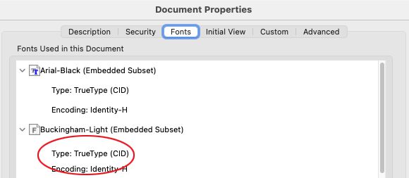
Fortunately, my memory still works well enough that I knew what caused the misprint and where she could look to find evidence of the problem before it went to press. Kari’s issues resulted from fonts being converted to CID when the pages were exported as PDF files from Adobe InDesign.
“I would bet money,” I wrote, “that you’ll find CID fonts listed in your PDF properties in Acrobat.”
Sure enough, there they were.

CID fonts don’t show up as often as they used to. Most designers now use Open Type fonts, which don’t convert to CID when exported. And most CID fonts resulted from Adobe Type1 fonts, which no longer work in the newer versions of InDesign. So when a CID font does cause a printing problem, you can bet it resulted from a TrueType font that looked good on the screen but printed incorrectly on the page.
Kari’s email caused me to think of other problems that show up on the printed page but not always on the screen in the design process.
Images
Newsprint isn’t white. If you haven’t already noticed that, just take a close look. You’ll see gray and brown spots and a tint that might best be described as “off-white.” Through lots of trial and error, we’ve found ways to get our photos looking better, but often don’t have the “pop” we were hoping for. There are a lot of tools in Photoshop to improve the way our pictures look on the page. Before using any of these tools, however, we must set our color settings and resolution correctly.
Once, after working for a few days at a daily newspaper with a press, I received a call from someone at US Ink asking what I had done to the press.
Thinking I had broken something, I answered, “I didn’t do anything to the press. Why are you asking?”
“Well,” he continued, “I’ve never seen a press print this well on newsprint. You must have done something.”
I explained to him that I had simply gone to each computer and correctly set the color settings. He asked what settings I used. I could imagine him frantically writing everything I said to him in his notes.
What did I do that made such a difference in the pages printed on that press? In addition to teaching the staff the best ways to edit photos, I went to each computer and set the “dot gain” to 26 percent and the “black ink limit” to 90. After changing those settings, the correct dot gain and ink limit are saved into each image file. Those two tweaks let the press know how much black ink to drop onto the page.
The other most common issue I experience with newspaper photos is the resolution settings. On newsprint, photos will print best on most presses with a resolution of 240. Not 300. Not 200. 240 works best on most presses. If we were publishing magazines, the optimum resolution would be 300.
Fonts
Let’s face it: We have fewer font issues than just a few years ago. Software has gotten better, printing devices have gotten better, and the entire process of creating quality PDF files is much easier than it used to be. However, fonts can be very problematic.
As I approach my 800-word limit for this column, let me keep things simple by telling you how I deal with fonts. I redesign a lot of newspapers, magazines, and books. When creating a new template, I use only two categories of fonts:
- The first is Adobe fonts. Since most publishers use Adobe products, they have access to the entire Adobe font collection. To me, this alone makes the monthly cost of the Adobe subscription worth the price. I remember when newspapers paid $10,000 or more for Adobe’s font collection.
- In addition to Adobe fonts, I often purchase one or two fonts for a new design. These are always OpenType fonts and always from reputable font vendors.
By using only these two categories of fonts, I’ve eliminated almost all problems that might occur related to fonts.
- ← The AI Dilemma: What You Need to Know About Tristan Harris and Aza Raskin’s Latest Work
- The AI Revolution Hits the Newsroom →


Recent Comments