Critiquing Common Issues
|
Click play to LISTEN to the article below
|
Kevin shares what he learned while critiquing papers in Colorado
The following is a guest post contributed by our friend and partner, Kevin Slimp!
A funny thing happened to me in Denver a few days ago while I was in town to speak at the Colorado Press Association Convention.
I had just finished my fourth presentation of the weekend. The topic was “Designing a Better Newspaper.” Most of the folks in the room had been around for all four of my sessions, and the time to end the workshop had come and gone.
As people were getting up to leave, a voice spoke up. “Do you have a minute to look at my newspaper and give me some advice?”
I told her I’d gladly sit with her and look over her paper. That’s when the “funny” thing happened. Another person asked, “Could I get you to look over mine, too?”
It was as if someone blew a whistle and told everyone to stop in their tracks. Most of the group began walking back toward their seats.
I asked if anyone else would like me to look over their papers. To make a long story short, all but a few people returned to the room and took out copies of their newspapers.
I invited the group to circle me as I sat at a long table. I spread the newspapers across the table and began critiquing them individually. As I finished one paper, I immediately started critiquing the next paper. Another funny thing: no one left. Everyone stayed to see what I would say about the other papers.

We stayed in that room for nearly 90 minutes until I mentioned they were scheduled to attend a banquet in a few minutes.
As I think back to the phenonium of a group electing to stay late at a workshop, I’m reminded of the similarities between their papers. I repeated much of my advice repeatedly as we looked through the newspapers on the table.
Here are a few of the most common critiques that came up in Denver:
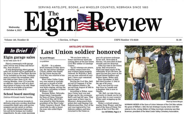
Headlines: Use fewer words and bigger fonts. By using fewer words, it leaves room to use bigger text. Instead of “Rumors of new Amazon distributorship coming to town in November,” I’d suggest something like “Amazon Rumors” in big letters. A subhead underneath the headline could provide more details, “Rumors of distributorship coming to town in November seem to have merit.”
Photos: Fewer small photos should be included with stories. It seemed common for the Denver papers to place three or four smaller images with a front-page story. Because there were so many photos, they drew less attention. In many cases, I suggested a single three or four-column photo to replace the multiple photos with a story.
Page Headings: Cute is out. Consistent is in. Page headings like “Local,” “Agriculture,” and “Features” should have similar looks. As tempting as it is to use a big piece of clipart at the top of the Classified page, don’t do it. Keep the page consistent with the others.
Borders: Yes, have borders around your photos. And get rid of the drop shadows. They (drop shadows) were in five years ago, but not so much now. A thin border, .4 or .5 in width, should do the trick nicely around images. Don’t forget to keep the border inside the frame so it doesn’t stick outside the column.
Color: In my designs and redesigns, you’ll find color in only three places: color photos, ads, and kickers (those short bits of text like “County Commission” above a headline). I rarely include color in the flag (top of the front page) unless it’s in a teaser photo above it. Leave the cute clipart for the high school newspapers and church newsletters.
Above the Fold: Check out the top half of the front page (above the fold). Does it make the reader want to pick up the paper or put it down? The area above the fold should always entice the viewer to pick up the paper.
Everyone laughed as I feigned heart issues while looking over pages. I jokingly uttered, “I’ve seen worse, but I can’t remember when,” a few times. The truth is most of the papers looked pretty good, but there’s almost always a lot we can do to improve the look of our papers. And when our newspapers look better, it encourages people to pick them up and read them. Let’s face it, that’s what it’s all about.
I’ll be leading a publisher’s event in Washington state in a few days. I think I’ll encourage everyone to bring copies of their paper. It just makes my job easier.
- ← Protecting Your Content from AI: Webinar Takeaways
- Navigating the Shifting Sands: The Decline of Social Media Referrals to News Websites →


Recent Comments