The Newsletter Plugin Gets a Facelift
|
Click play to LISTEN to the article below
|
Interface Updates
Default Dashboards
We’re thrilled to announce an exciting update to our newsletter plugin! This update brings a fresh, intuitive interface designed to streamline your workflow and unlock new possibilities for engaging your subscribers. In this blog post, we’ll take you on a tour of the updated interface, highlighting the key improvements and comparing it with the legacy version. Get ready to discover how these changes can elevate your newsletter game and help you build stronger connections with your audience!
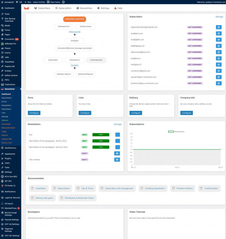
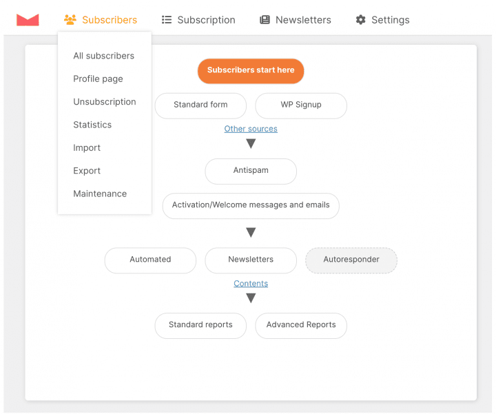
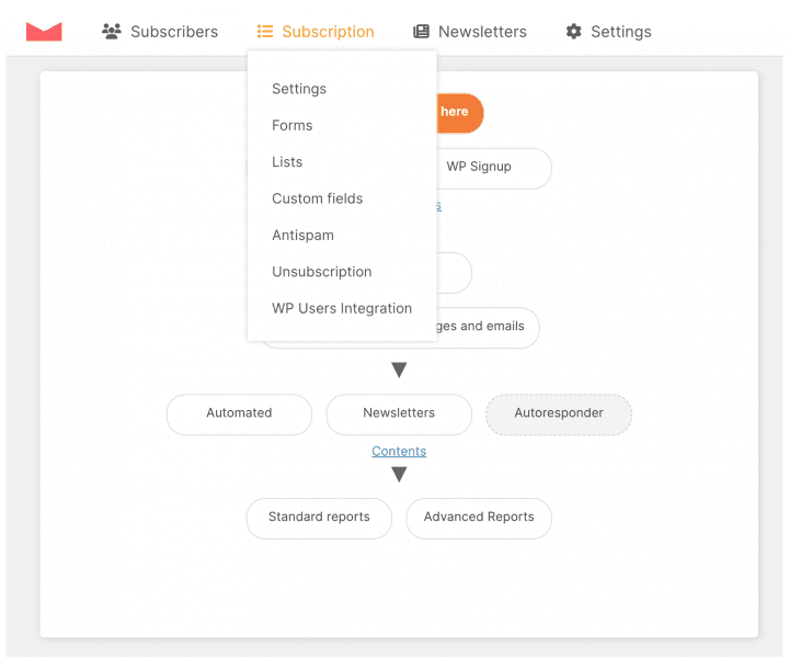
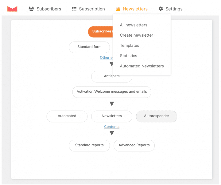
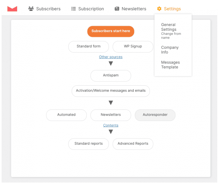
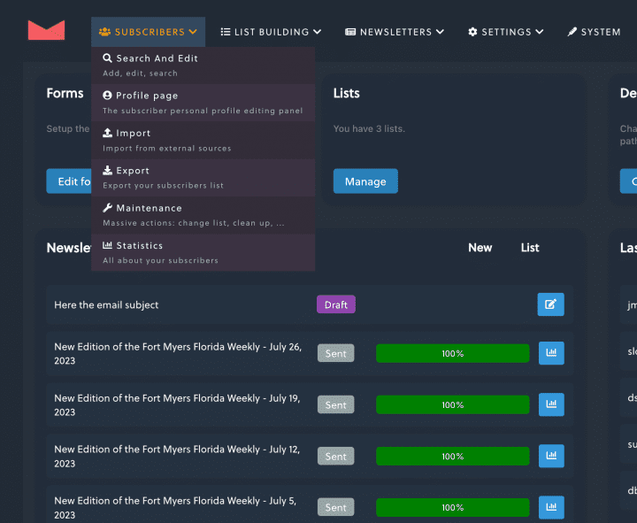
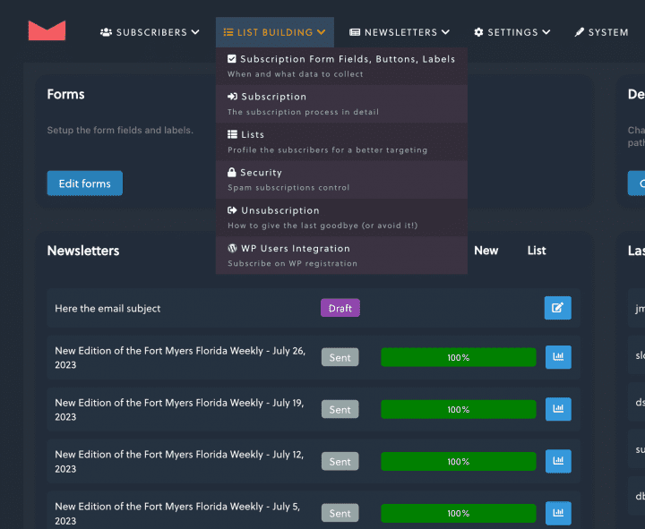
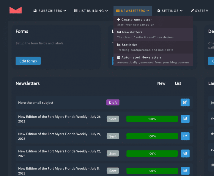
You will immediately notice from the screenshots of the legacy and updated dashboards that the widget layout is quite different as are the navigation menus for the plugin. Most notable is a new Subscriber Funnel graph that provides you with quick links to the most used settings for onboarding, such as email templates, and security settings.
We will cover these new widgets and some other exciting new features in a subsequent post. For now let’s get oriented to the new interface.
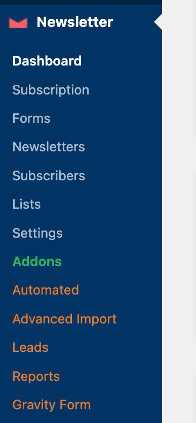
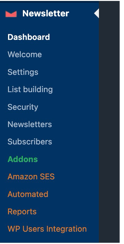
Left Navigation Menus
Plugin Menus
Updated Menu
Legacy Menu
Be on the lookout for future post new features such as 2-step Unsubscribe, Form Integrations, and a Leads feature for managing popups and other CTA. Please reach out to us at ops@our-hometown.com to learn more!
- ← Boost SEO with Author Profiles | OHT Webinar Replay
- Artificial Intelligence: Make a Plan Before Jumping In Too Deep →




Recent Comments