Creative Text Layouts in the Block Editor

|
Click play to LISTEN to the article below
|
Shared Style and Typography Settings
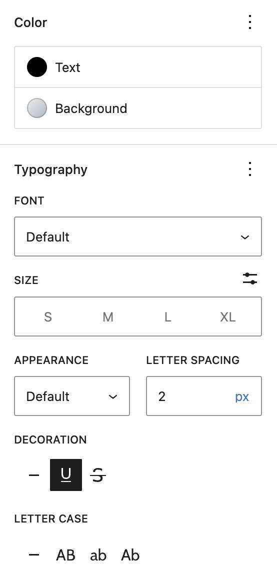
Settings for Styles (text and background colors) and Typography (Bold, Italic, etc.) are found in the right panel and are common to many text blocks:
The Color panel contains options for text color and background color/gradient for the individual block, allowing for quick styling of section headings, callouts, infoboxes, etc.
The Typography panel provides toggles to activate various additional text controls for Sizing, Appearance (various font weights for bold text), Letter Spacing, Decorations (strikethrough, underline) and Letter Case (all caps, etc.).
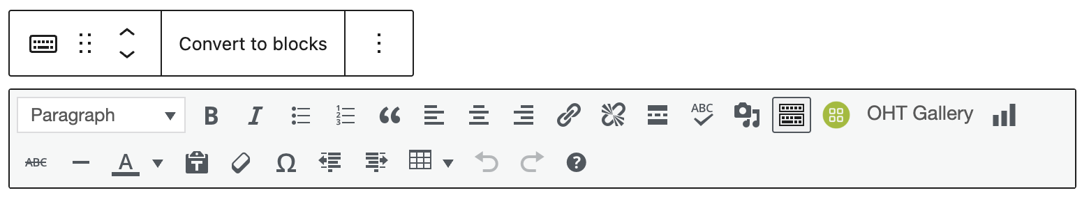
Floating Toolbar Options
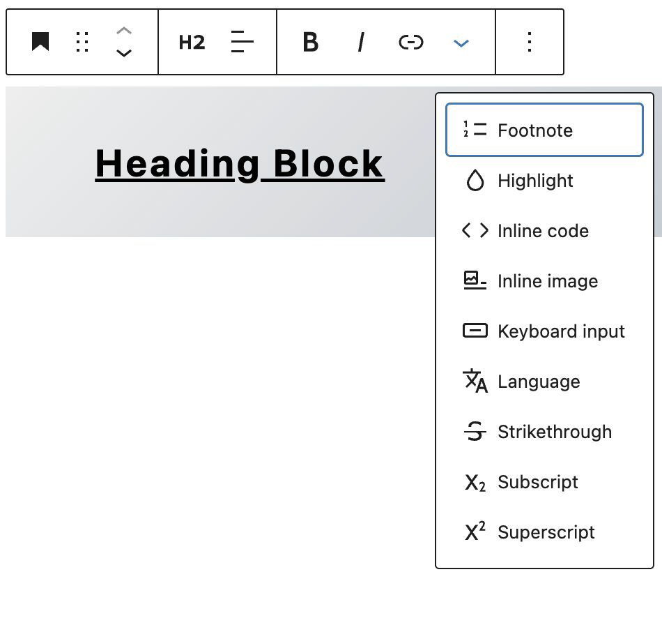
The floating toolbar contains options for block transformations, arrows for vertical ordering, text decorations, adding links to text and an additional options dropdown.
The additional options include inline insertions, and other less-used decorations, such as strikethrough, formatted code and sub/superscript.
The Inline Image option can be useful for inserting a small icon graphic directly in the text flow of a block:

The small image above has been placed inline between sentences in a single paragraph block.
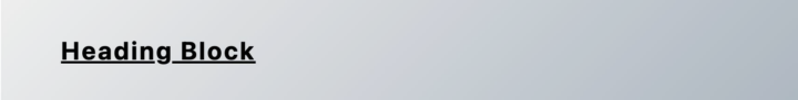
Heading Block
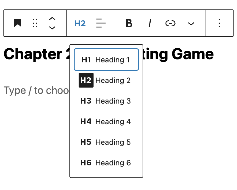
The Heading block shares all the same styling and typography settings as other text blocks, with the addition of setting a specific Heading level to delineate structure in your article.
Paragraph Block
The style and typography settings for the Paragraph block share the same options as discussed previously, but with the addition of limited alternative font selection, and a Drop Cap toggle.
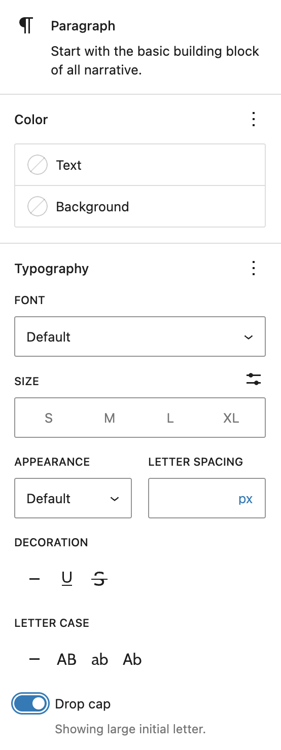
The floating toolbar offers the same options for alignment, decorations and links, although with specific transformations, allowing you to convert a paragraph into a heading or list, etc.
List Block
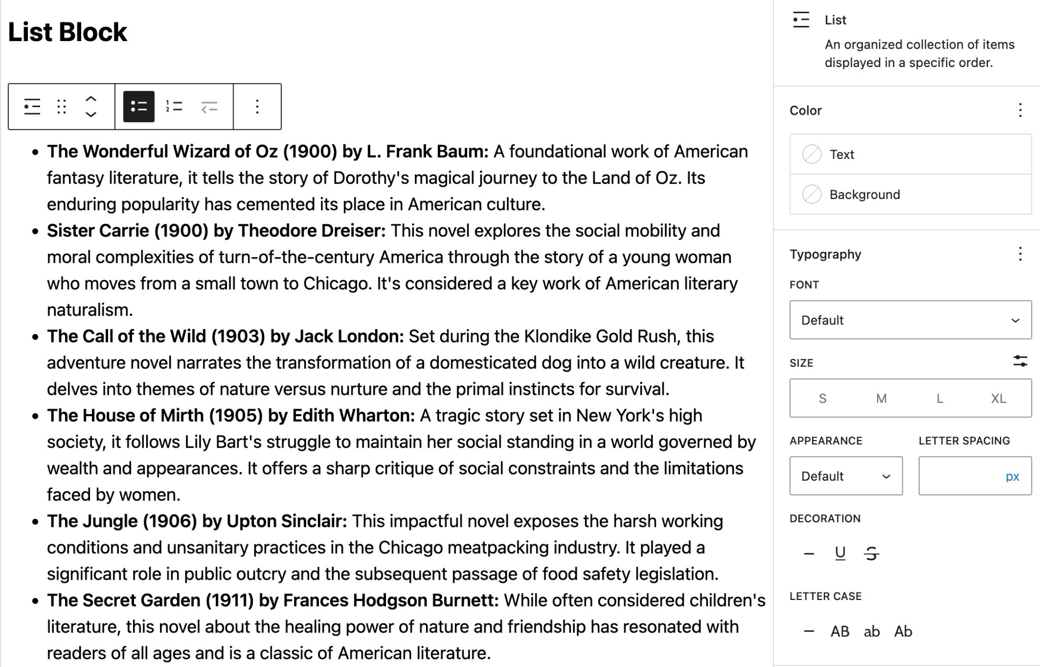
Use the List block to organize text in numbered or bulleted lists.
Style are typography options are the same as paragraph blocks.
The floating toolbar offers options for numbered vs. bulleted lists.
Note that this block is a container for individual List Item blocks.
List Item Block
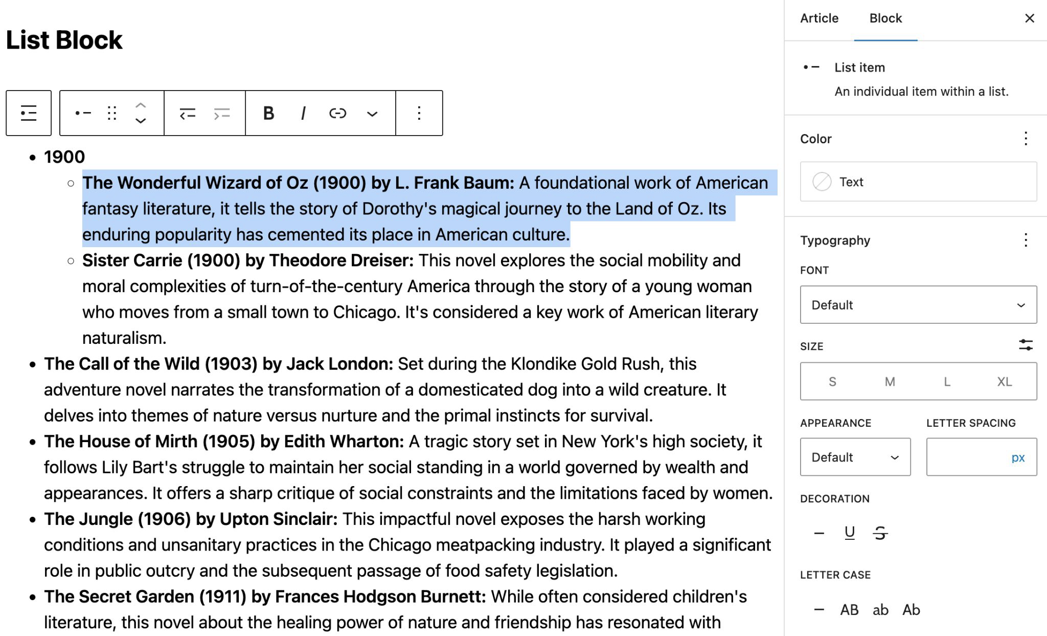
List items have a limited subset of styling options (only the text color can be changed), but the typography options are the same.
Additionally, the floating toolbar for a single List Item provides the same text options for text decoration and links, plus buttons for increasing or decreasing the list depth of an item.
Ordered (Numbered) Lists
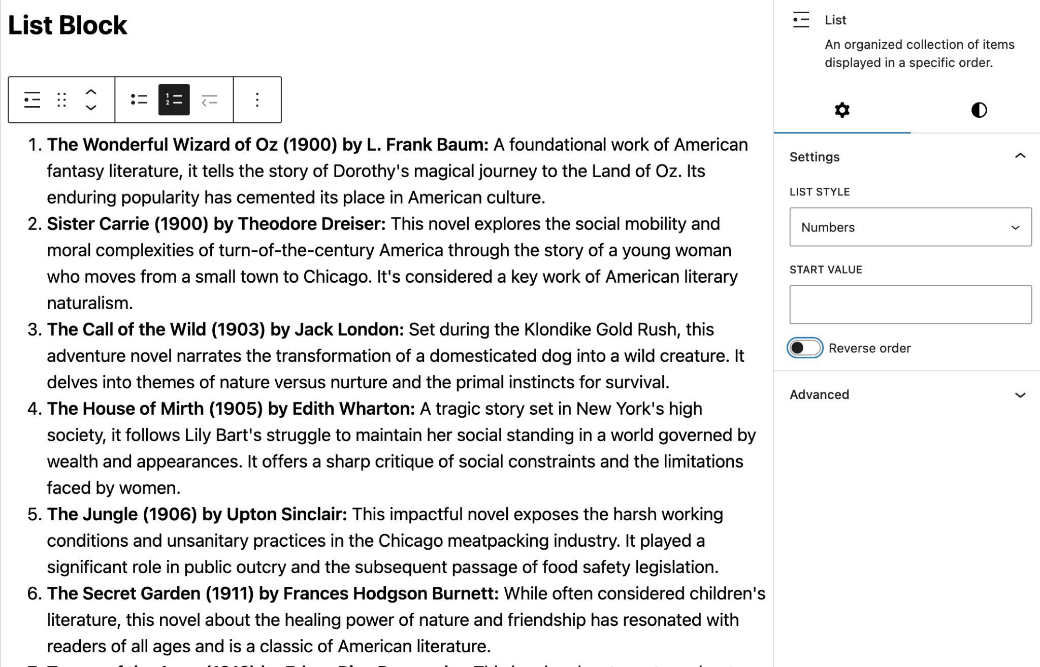
For Ordered Lists, the settings panel provides format options (Numbers, Upper / Lowercase Letters, or Upper / Lowercase Roman Numerals.
You can also specify a starting value if the list is a continuation of a previous one.
The order can also be reversed for a countdown-style list.
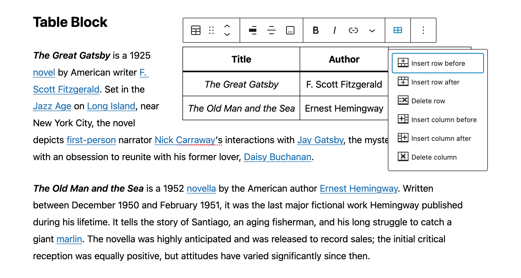
Table Block
Table creation has been limited to the tools in the Classic Paragraph block (similar to the classic article editor itself), however we now have a dedicated Table block with some customization and styling options, plus all the normal table editing tools one might expect: adding/deleting columns and rows, showing header and footer sections, creating striped row delineation and more.
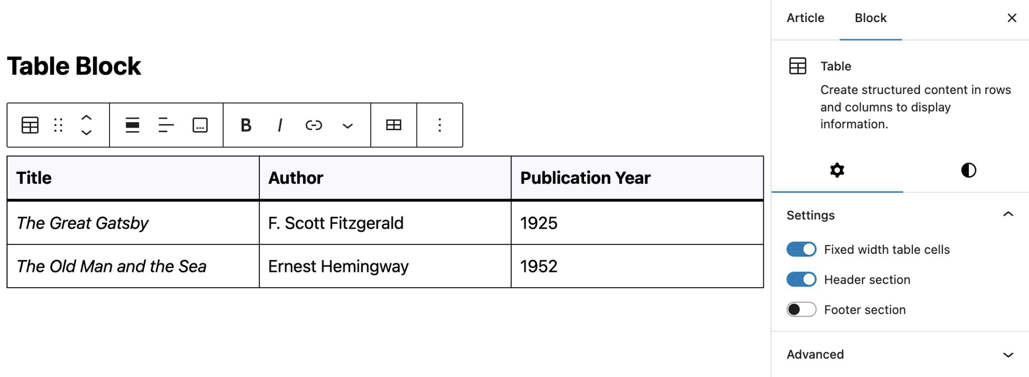
Table Block Settings
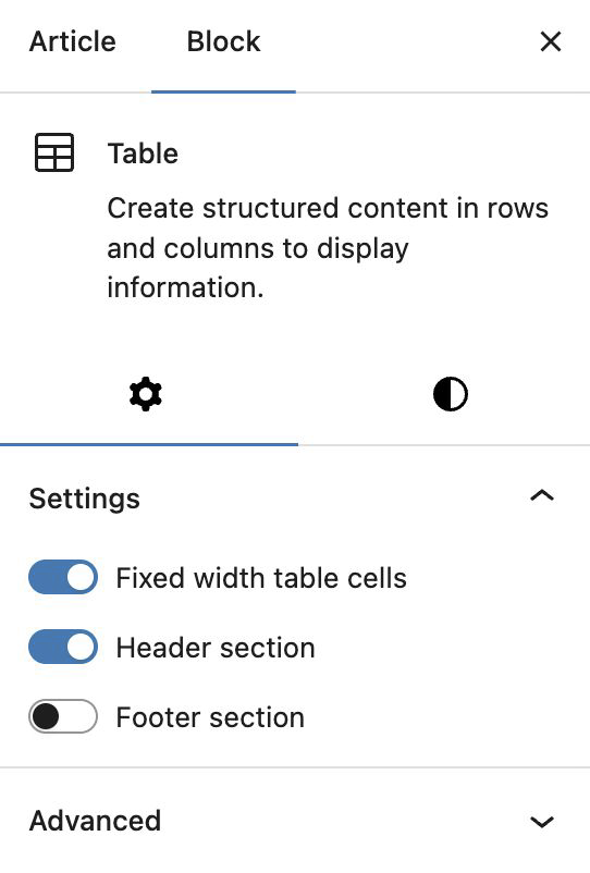
You have the option to tell the table to use “Fixed width table cells“, which means all columns will be equal in width rather than adapting the column widths to the content of the table.
The Header section and Footer section will each add an additional row to your table. The header section is typically used to add titles to the top of each row. The footer can be used to add an additional row at the bottom.
Table Block Styles
There are two styles available for tables: Default and Stripes:
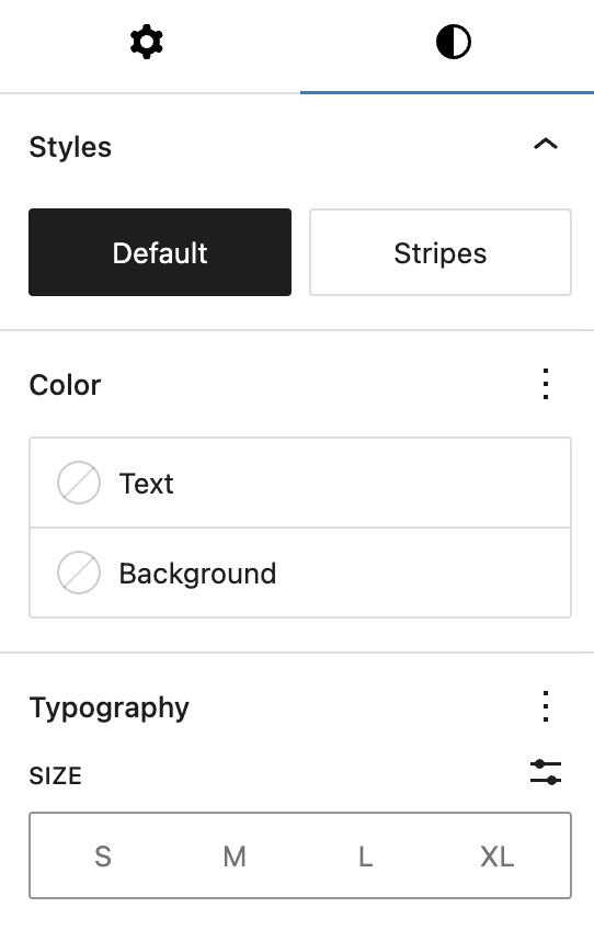
- The Default style has a plain background and borders around the cells.
- The Stripes style has alternating row background colors.
- The Color and Typography panels are identical to those in the Paragraph block settings.
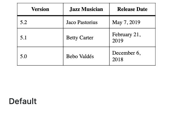
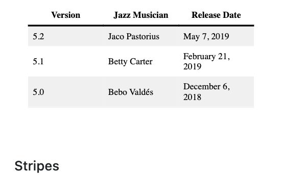
Table Block Toolbar
The floating toolbar for the Table block provides similar text options as other text blocks, but has an additional menu for editing the table itself: Inserting or deleting columns or rows. This behavior is very similar to other table editing operations in many common document editors.
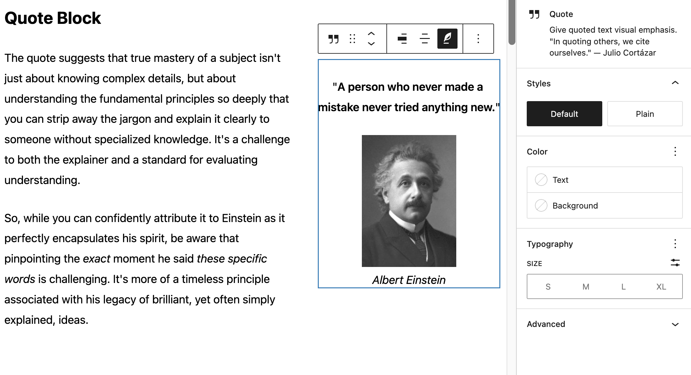
Quote Block
The Quote block is similar to the List block in that it contains other blocks. The main difference is the citation toggle (indicated by the quill icon) for quote attribution. An inline image is attached to the citation text and the entire Quote block is right-aligned for a more engaging design.
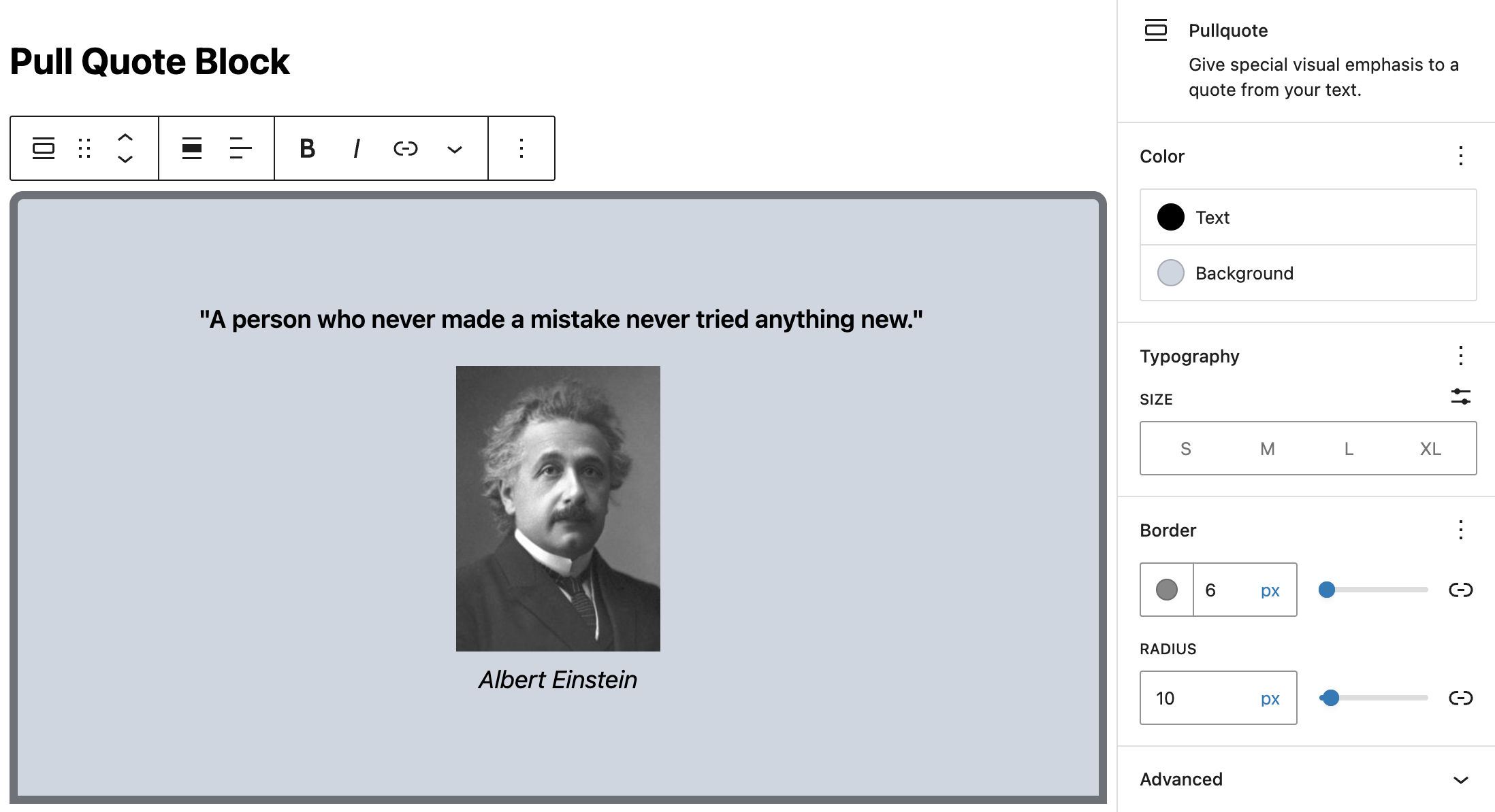
Pull Quote Block
The Pull Quote block offers additional styling options, such as a border with an adjustable radius. Notably the Pull Quote block doesn’t contain other blocks, it has just the two text fields for the quote and citation (although the example below is also using the inline image option for the headshot).
Details Block
The Details block is a block that allows you to include content hidden under a parent block with a text summary. This works like an accordion, with the text summary expanding to show nested content. This nested content, similar to other “container-style” blocks, can be anything you’d like. This block is often use for things such as FAQs, or directory-type listings.
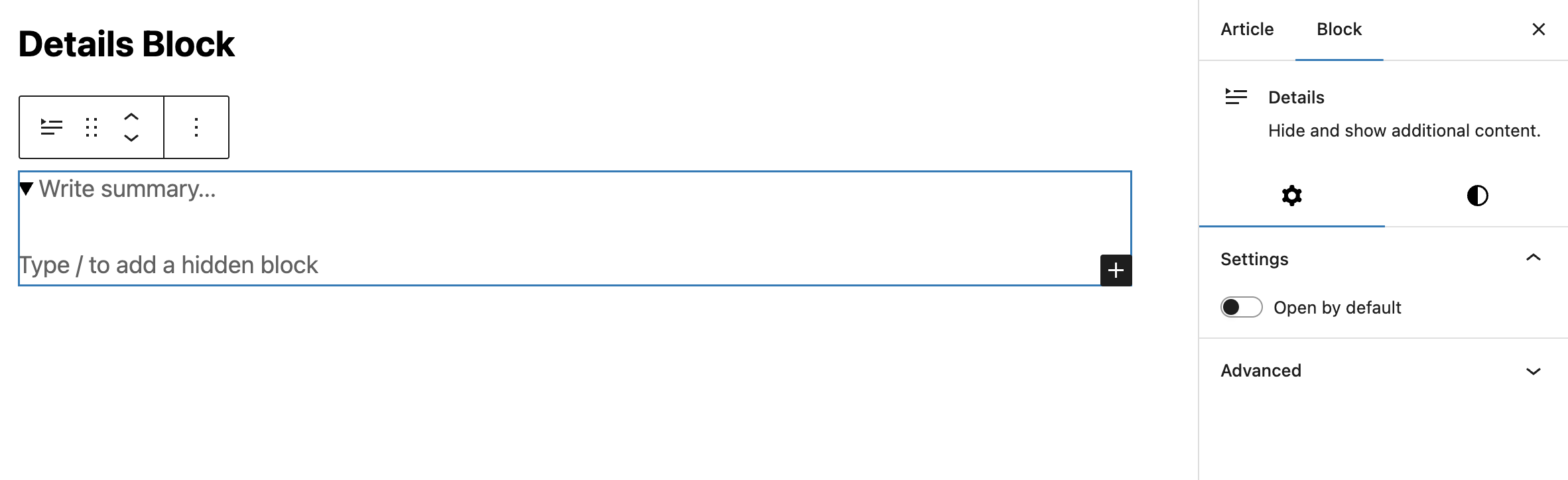
For example:
Quote of the Day
“A person who never made a mistake never tried anything new.”
Albert Einstein

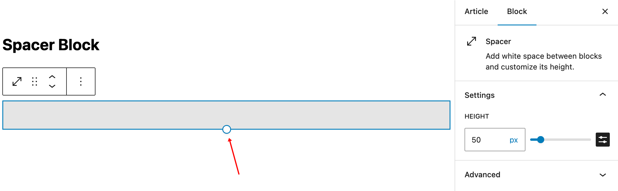
Spacer Block
The Spacer block provides a resizable element that adds vertical space between other blocks. The size can be specified either in the settings panel or by dragging the circular handle at the bottom of the Spacer when it is selected.
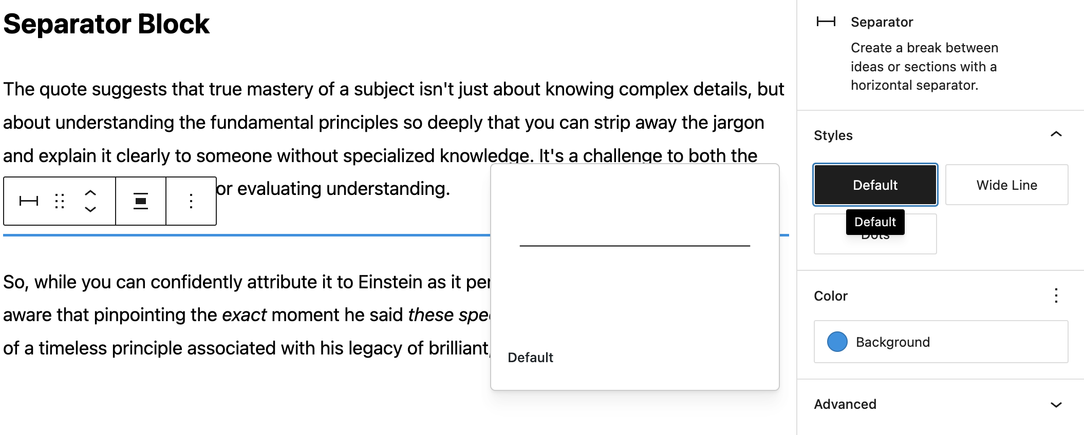
Separator Block
Similar to adding a Horizontal Line in the Classic Editor, this block will add a simple line to delineate content in the flow of your article. There are options for line-style, thickness and color settings.
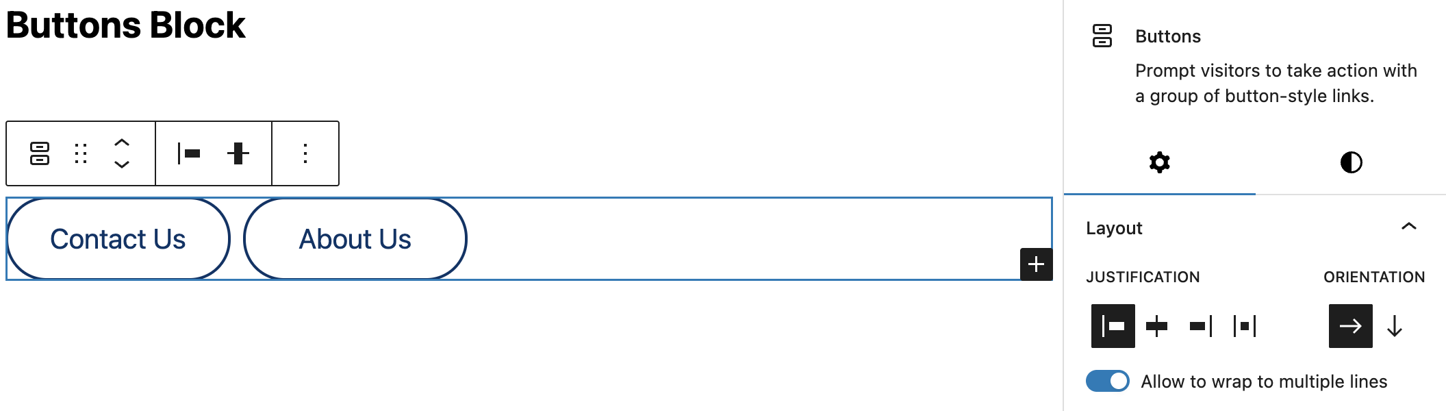
Buttons Block
You can add buttons to your website to create links to pages, products, or any other locations. Buttons help guide visitors to take action, such as signing up, purchasing, or learning more.
The Buttons block is similar to the List block in that it contains individual Button, each with separate styling options. Also the layout settings for a group of Buttons (the Buttons block) are very similar to the Row block, with vertical and horizontal justification, and the toggle to wrap the buttons onto additional rows depending on the width of the individual buttons.
The small + icon at the bottom left of the block highlight is used to add additional buttons to the Buttons block.
Button Settings
After you add the block you will be presented with a single button ready for text and styling.
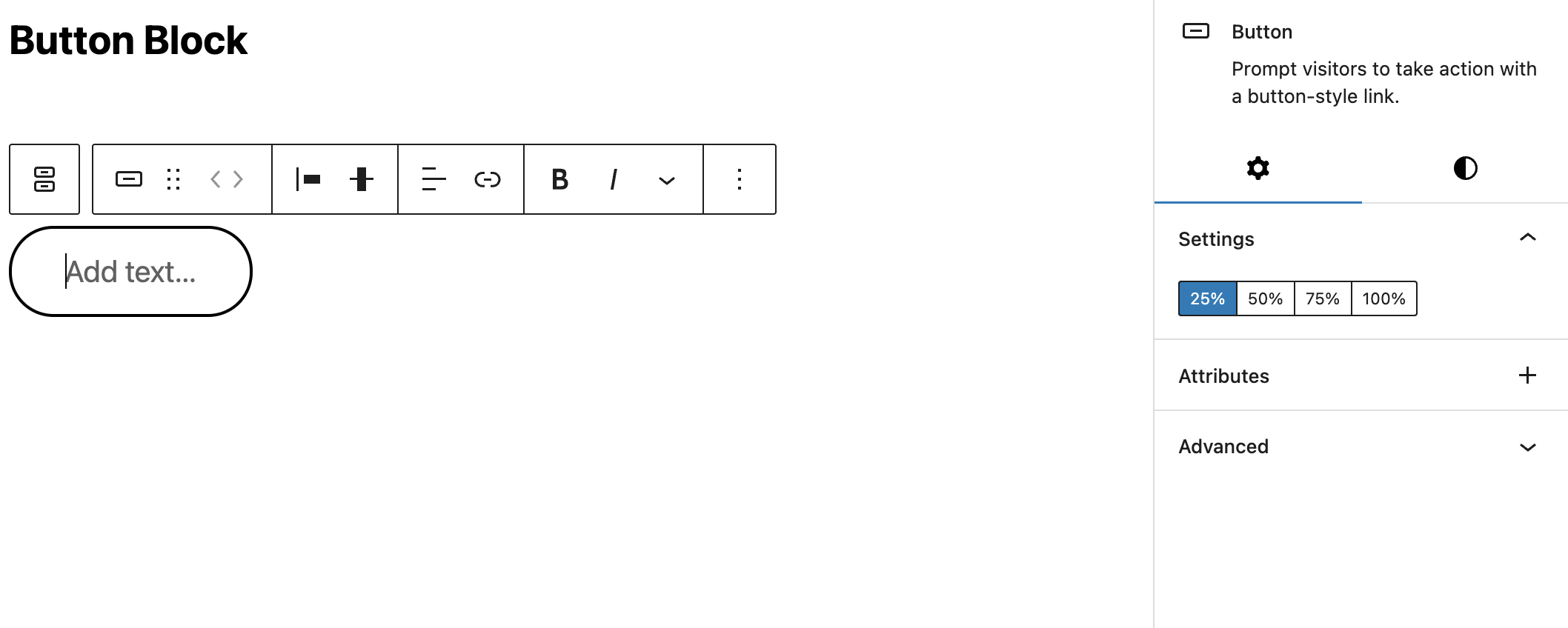
The width of the button can be set as a percentage of the container using the Settings switches in the side panel, e.g. 50% will stretch the button to half the size of the available width.
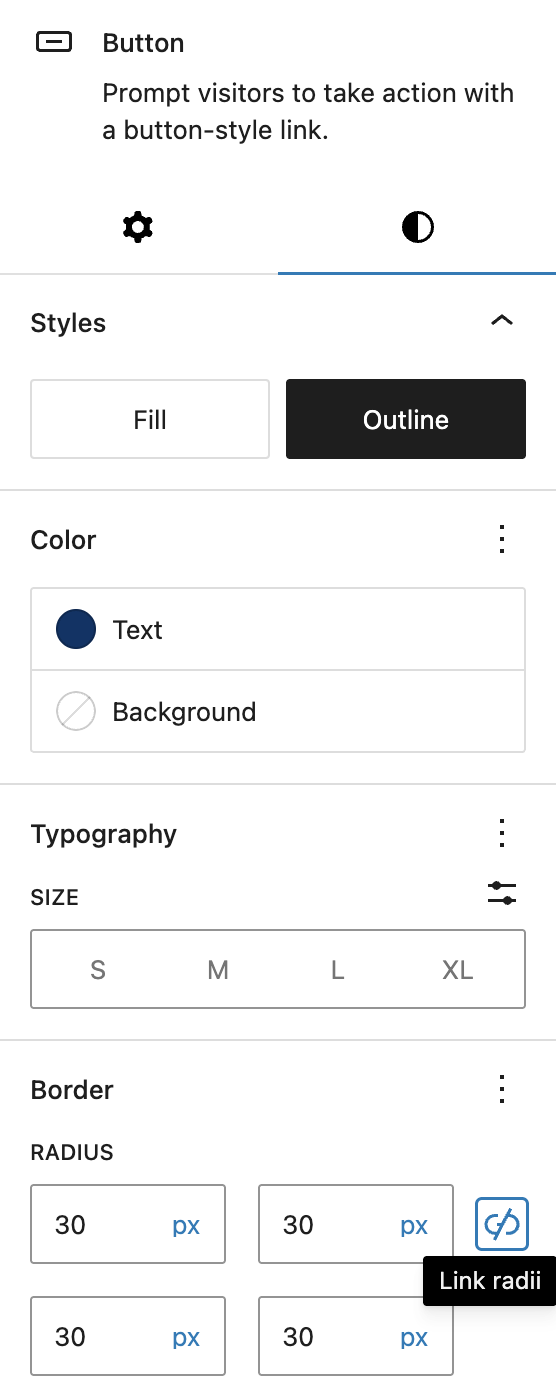
Button Styles
The style panel provides options for solid vs outline buttons, color settings, and a slider for adjusting the border radius, i.e. how round the corners of the button are. Note the border color will follow the color set for the text, while the background color will fill the button (regardless of the solid vs. outline setting. The Outline style only adds a border to the button with the text color.
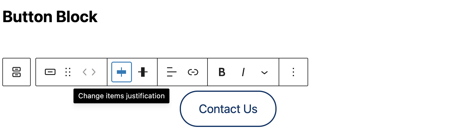
The vertical and horizontal alignment of the buttons as well as the text alignment and decorations are all set in the floating toolbar.
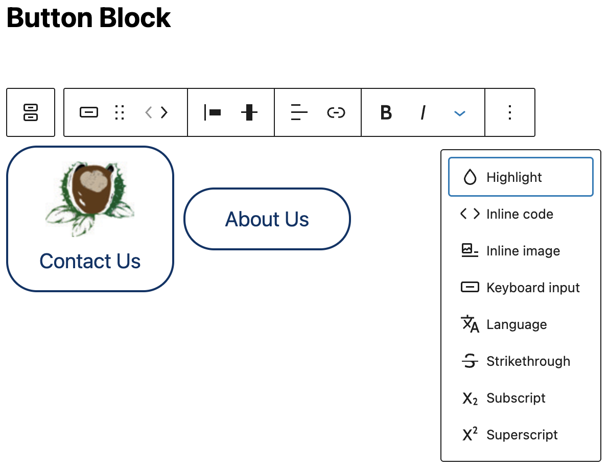
You can even us the inline image option to add a graphic to your button:
Classic Block
The Classic block brings the legacy functionality of the Classic Editor into a single block in your content area. This allows for the use of established classic designs in your newer layouts integrating with other blocks as any other.
The block provides the same toolbar as the Classic editor, with the additional meta option to convert all content within the Classic block to individual content blocks, i.e. all paragraphs in the Classic block will become individual paragraph blocks after this process.
Custom HTML
The Custom HTML block is used most often for embeds that don’t have a native block. Depending on what plugins are installed you may have several blocks for embedding social media content, YouTube videos. etc. However this block will render any valid HTML code such as an iframe snippet from an online puzzle provide or even just a simple HTML design created in other software.
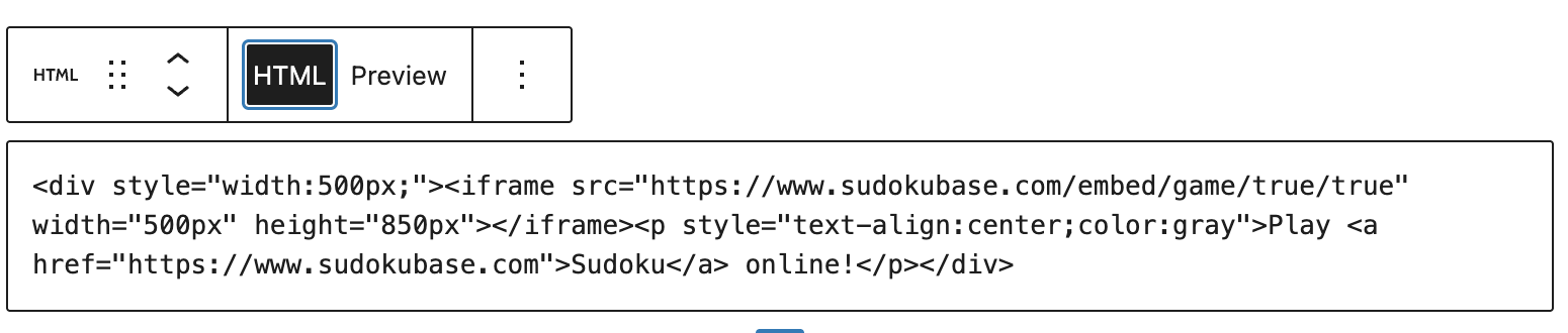
Play Sudoku online!

- ← Introducing Our-Hometown’s Fully-Featured Weather Widget
- Block Editor Overview: Creative Text Layouts on May 16th, 11AM EST →
Recent Comments