Article Widget Customization: A Complete Guide
|
Click play to LISTEN to the article below
|
In this post we will go through the majority of available customization options for the Article Widgets that display article excerpts and links in various layouts on your website. Theses widgets are placed and managed through the Customizer Tool found in the admin bar of your website.
Slider Widget
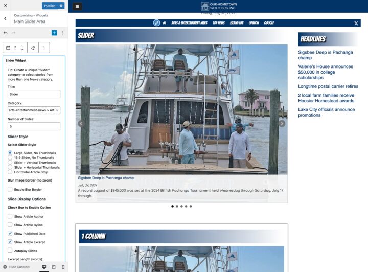
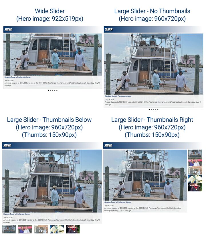
Because the Slider widget displays only a single image, options are limited simply to a extra-wide or a large featured image, with or without thumbnail navigation (which can be placed either to the right or below).
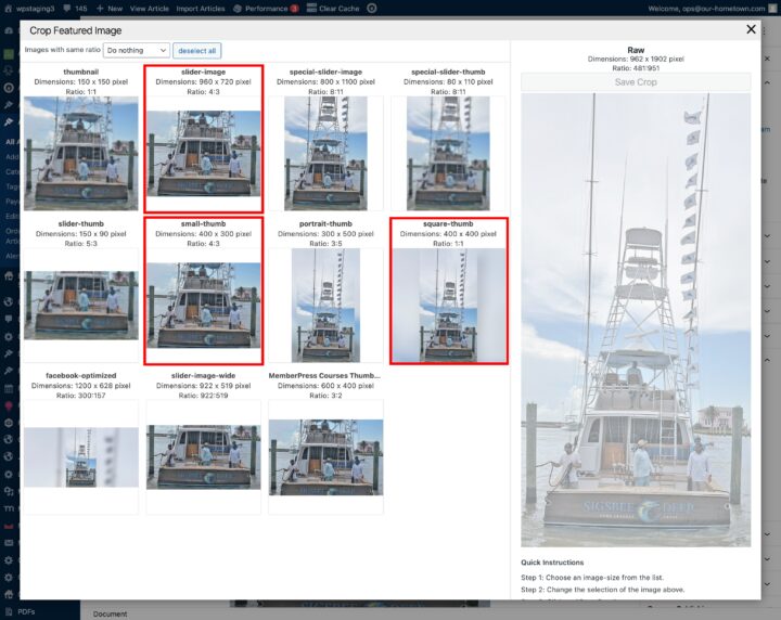
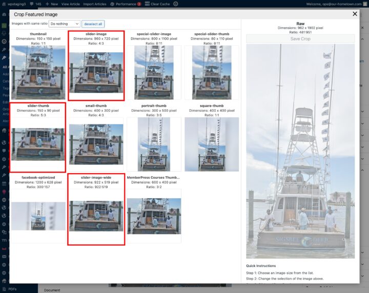
You will notice in the graphic above that the ‘hero’ image is the same 960x720px version (slider-image) for all but the Wide Slider which uses an alternate 922x519px (slider-image-wide) version. In addition the small navigation thumbnails all use the same 150x90px (slider-thumb) format. Below are these sizes previewed in the Featured Image Cropping tool.
Article Widget
Thumbnail Format and Layout Options
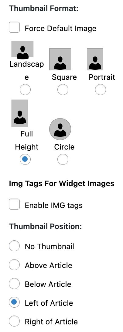
Thumbnail Format Sizes
- Landscape: 960x720px (slider-image)
- Square: 400x400px (square-thumb)
- Portrait: 300x500px (portrait-thumb)
- Full Height: 400x0px (original aspect)
- Circle: 400x400px (with full radius)
One Column Layout
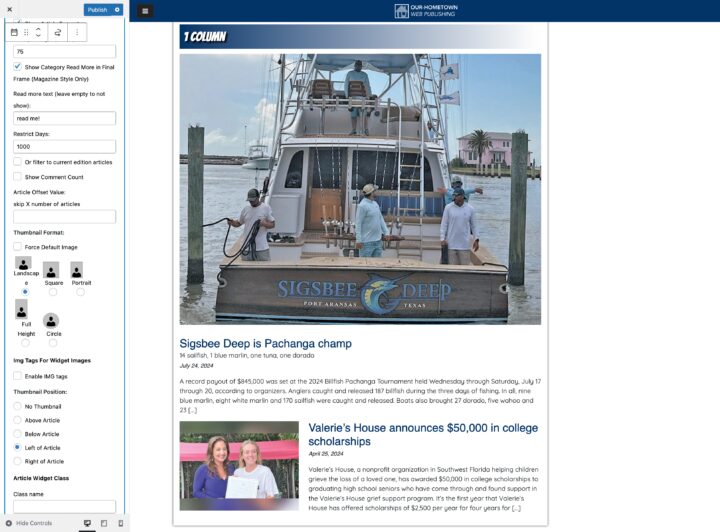
This layout features a full width hero image, with three options for subsequent thumbnails when placed to the left or rigth. Alternatively, the Full Height format still uses the Slider format for the hero image, but is scaled to the same thumbnail width as the rest of the story list. Finally choosing the Thumbnail above option, will display the Slider format above regardless of the image format choice.
Below is a visual guide for these options:
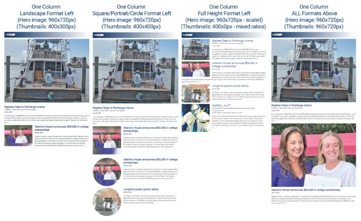
Again, the ‘hero’ image is the same 960x720px version (slider-image) for all formats. Thumbnails for remaining articles are determined by the chosen format:
- Landscape (small-thumb – 400x300px)
- Square/Portrait/Circle (square-thumb – 400x400px)
- Full Height (400x0px – image with original ratio)
Two Column Layout
This layout features a large hero image, with multiple options for subsequent thumbnails when placed to the left or right, top or bottom. The Full Height Left format deviates, by shifting the hero image to the left of the first story.
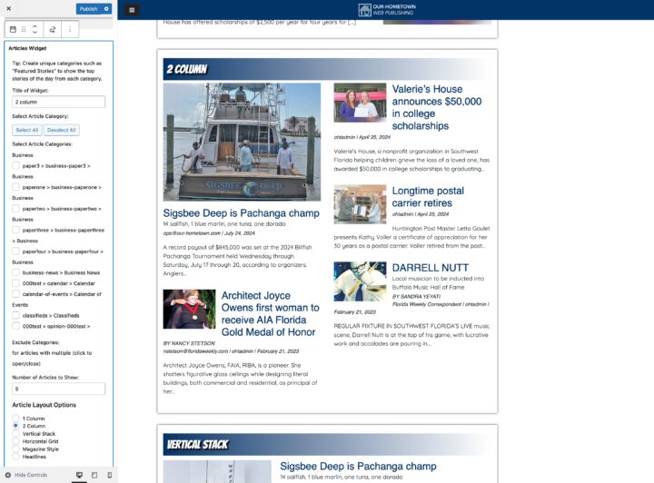
Below is a visual guide for these options:
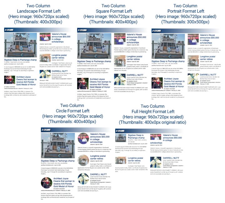
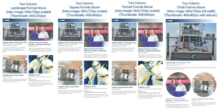
Similar to the one column layout, the ‘hero’ image is the same 960x720px version (slider-image) for all formats. Thumbnails for remaining articles are determined by the chosen format:
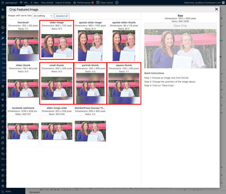
- Landscape (small-thumb – 400x300px)
- Square (square-thumb – 400x400px)
- Portrait (portrait-thumb – 300×500)
- Full Height (400x0px – image with original ratio)
- Circle (square-thumb – 400x400px with radius)
Below are these formats previewed in the Crop Featured Image tool:
Vertical Stack
This layout does NOT use a hero image, instead all thumbnails follow the layout and placement settings when set to left or right placement. Any ABOVE placement settings will only display the (slider-image) above each entry. Also this (and the Horizontal Grid) are the only layouts that will display the various thumbnail formats for the first story in the block.
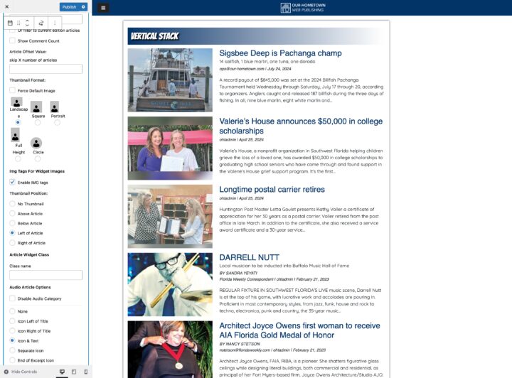
Below is a visual guide for these options:
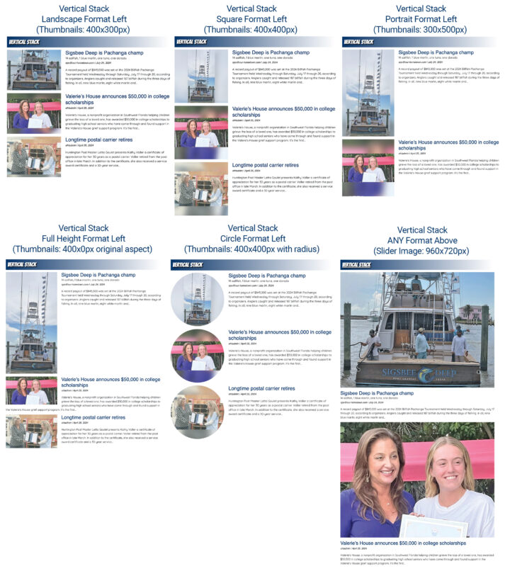
Note that the cropping formats relevant to the Vertical layout are the same as the Two Column layout:
- Landscape (small-thumb – 400x300px)
- Square (square-thumb – 400x400px)
- Portrait (portrait-thumb – 300×500)
- Full Height (400x0px – image with original ratio)
- Circle (square-thumb – 400x400px with radius)
- Thumbnail Above (slider-image – 960x720px)
Horizontal Grid
This layout also does not use a hero image, instead all thumbnails follow the layout and placement settings when set to left or right placement. Any Left/Right placement displays the thumbnail quite small, so we will focus on the ABOVE placement settings.
Below is a visual guide for these options:

The cropping formats relevant to the Horizontal layout are the same as the Vertical Stack layout.
Magazine-Style Layout
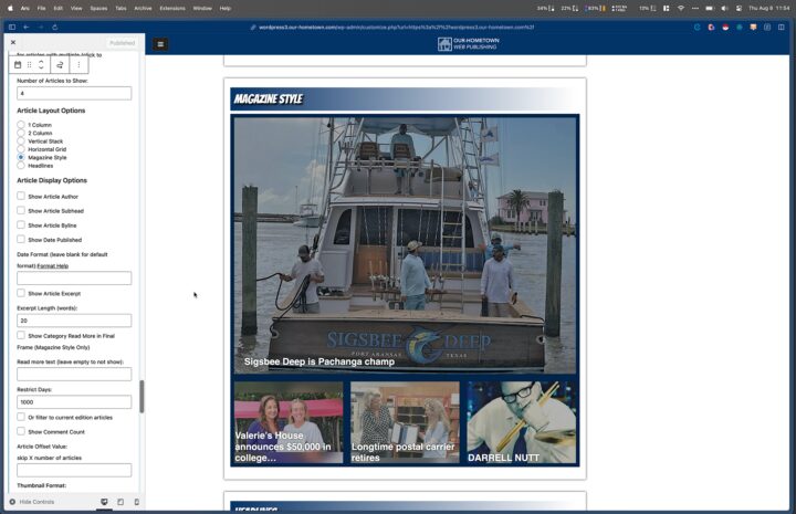
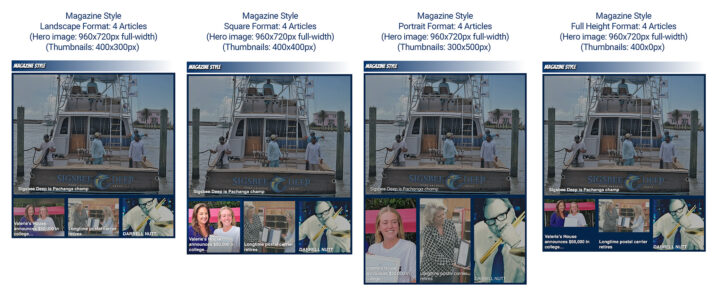
This is a very popular layout with built-in overlays, borders and background colors. The number of articles displayed in the layout determine the flow, with the first story keeping its ‘hero’ status like in the column-based layouts. While this layout is very adaptable, this requires some custom CSS code to bring it in line with a particular setup. For this demo we’ll focus on a three and four-article layout.
Three Article Configuration
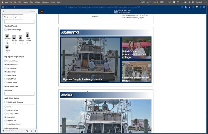
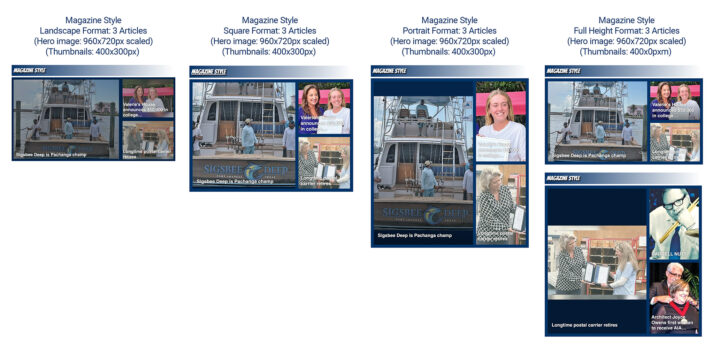
Four Article Configuration
Headlines Layout
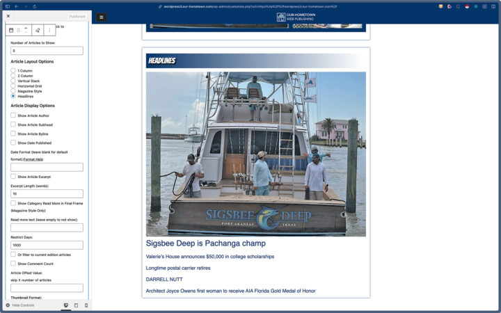
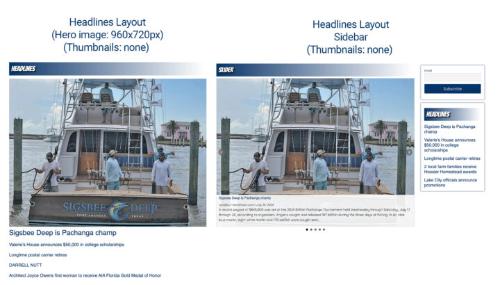
By default this layout option displays only the headlines of articles and includes just a ‘hero’ featured image for the first entry. We often hide this with CSS to have a Headline-only layout for Trending Stories, etc. The hero image is the same 960x720px slider-image for any cropping adjustments.
While this is a highly detailed summary of most of the available Widget Customization options, we realize it can be a bit overwhelming, so our team is always available to help you determine which layouts can serve which needs and how to fully customize them as well. Please don’t hesitate to reach out to us at ops@our-hometown.com.
- ← Dashboard Optimization: What Publishers Need to Know
- Mastering User Acquisition Tracking in Matomo Using Goals →

Recent Comments