Block Editor Updates — New Layout Features
|
Click play to LISTEN to the article below
|
In this post we’ll take a look at often-used Layout blocks and some of the new feature and interface updates.
Layout Blocks
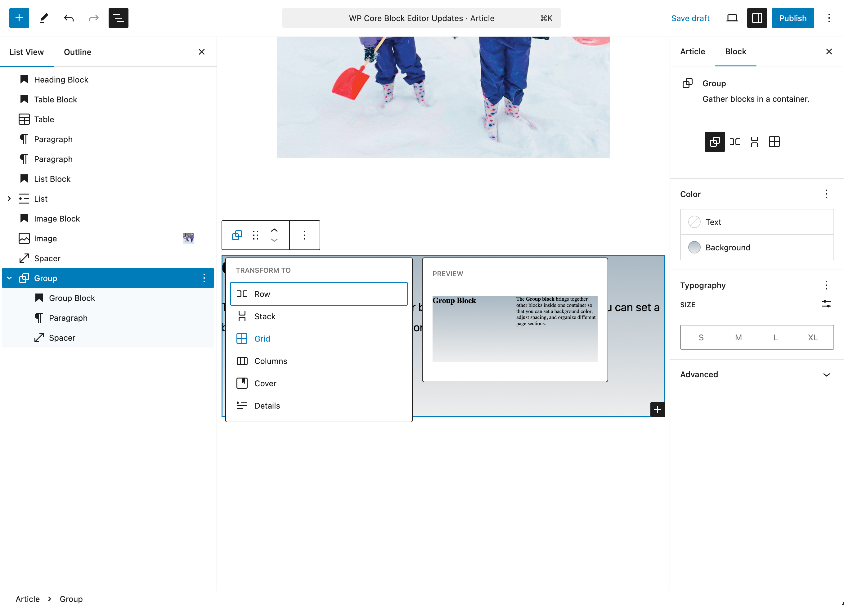
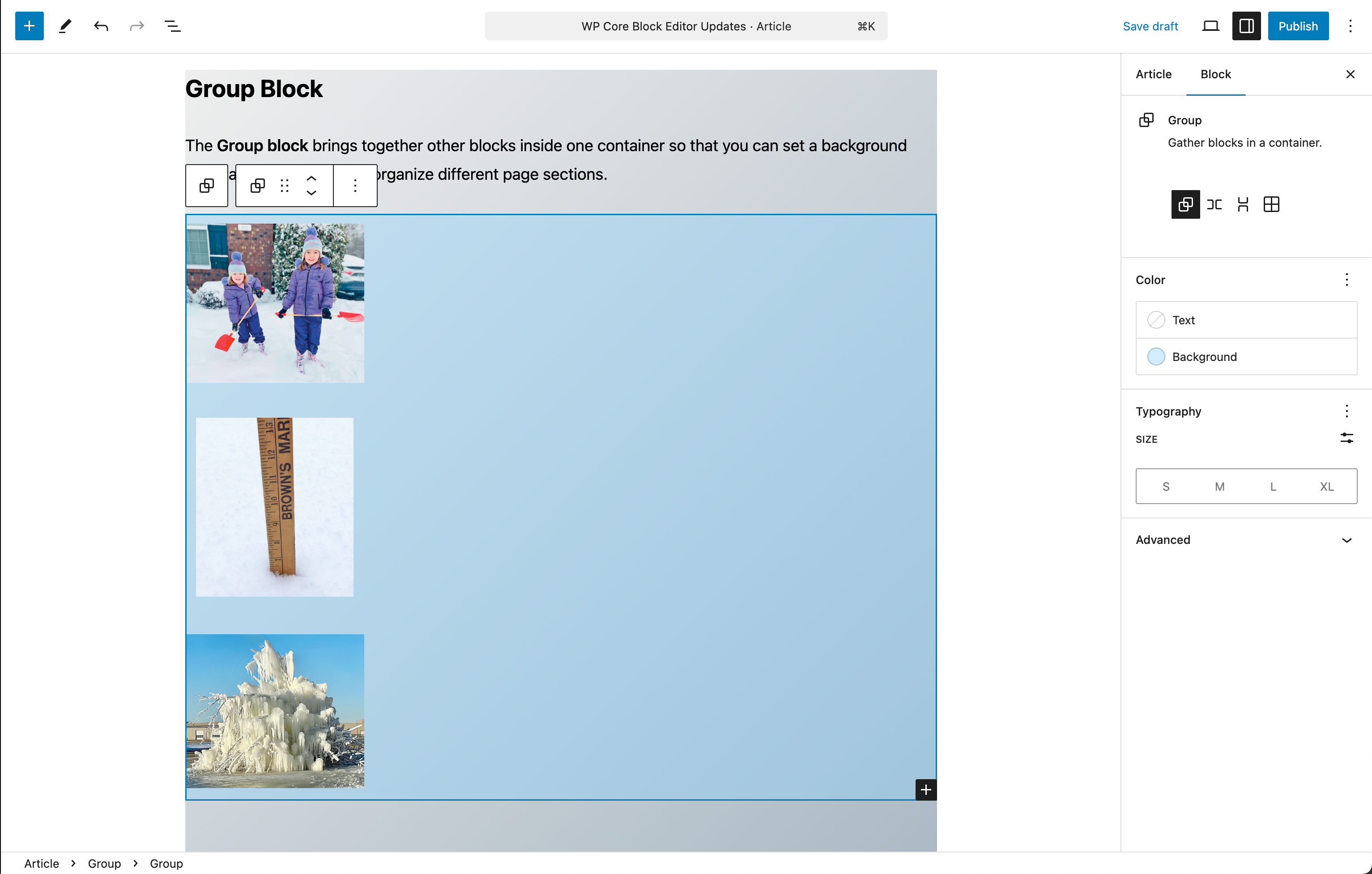
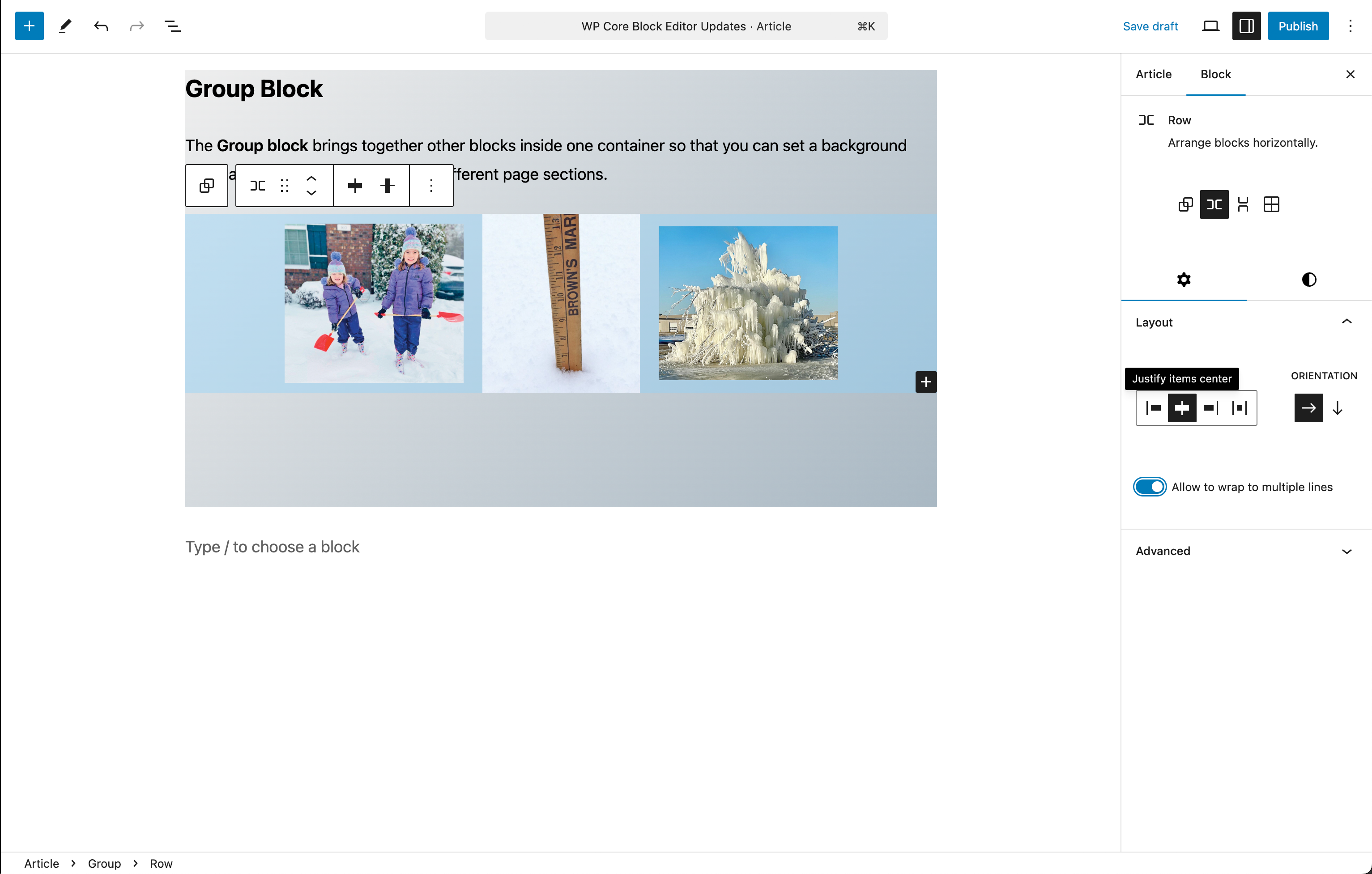
Group Block
The Group block brings together other blocks inside one container so that you can set a background color, adjust spacing, and organize different page sections.
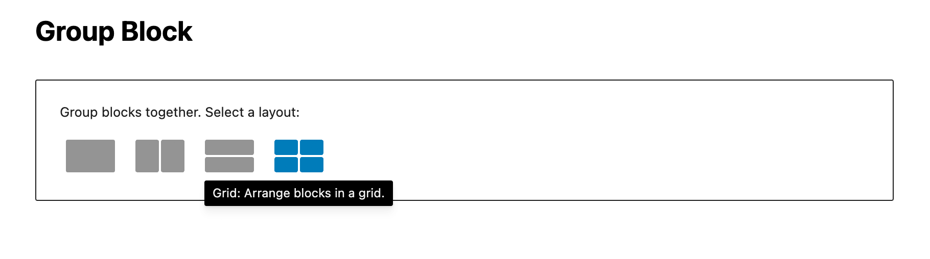
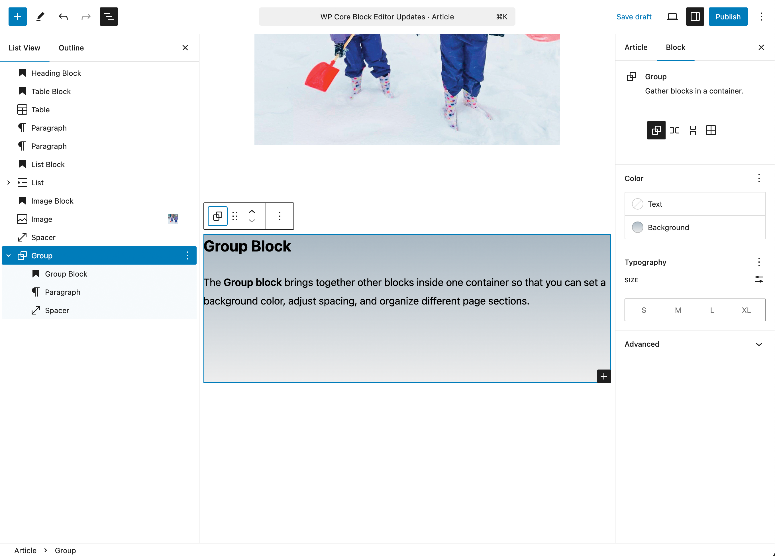
In addition to being able to choose between the four different Group layouts when you initially add a Group block, you can also transform a group between those layouts at anytime after, depending on the needs of the Group content.
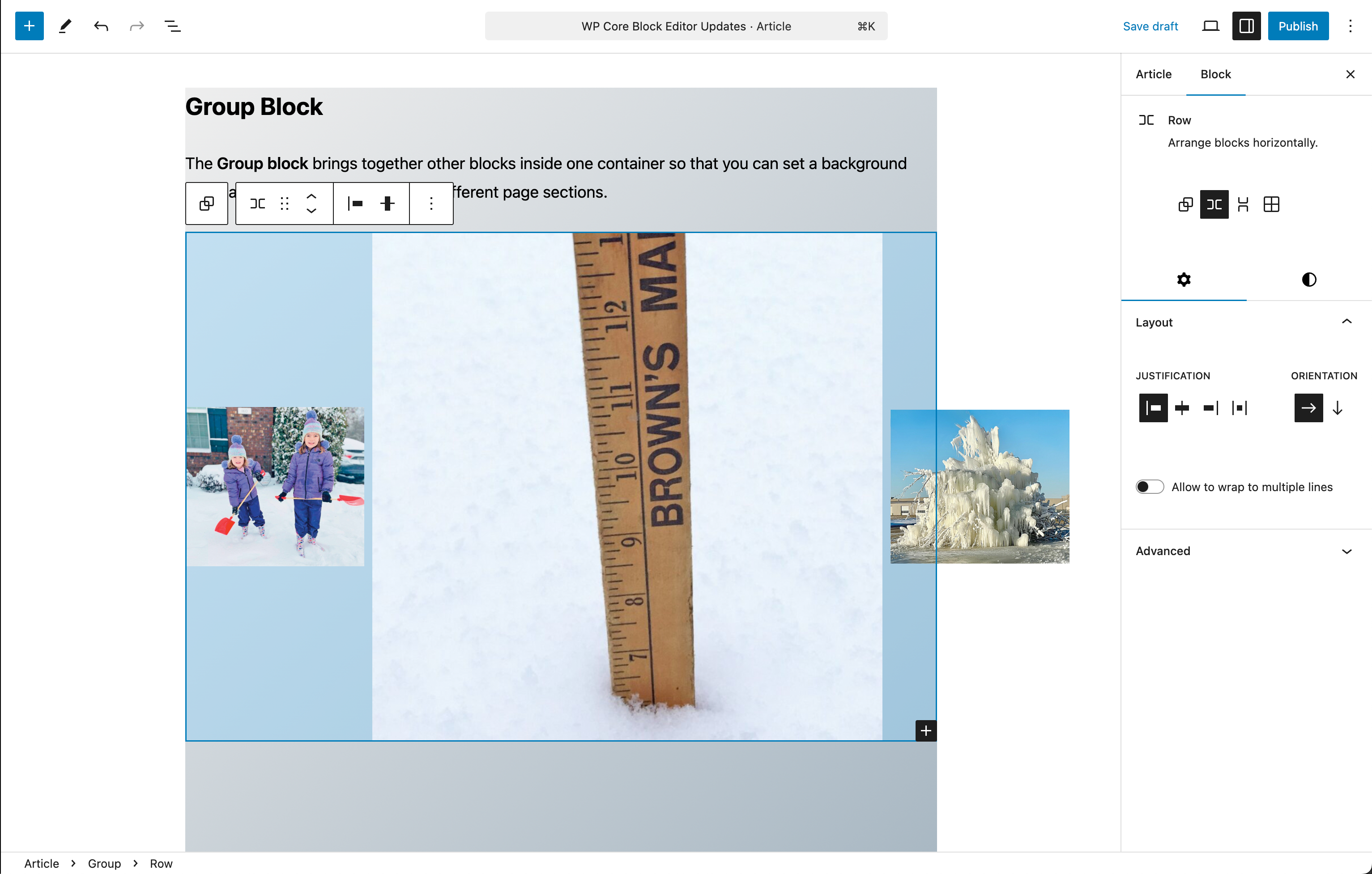
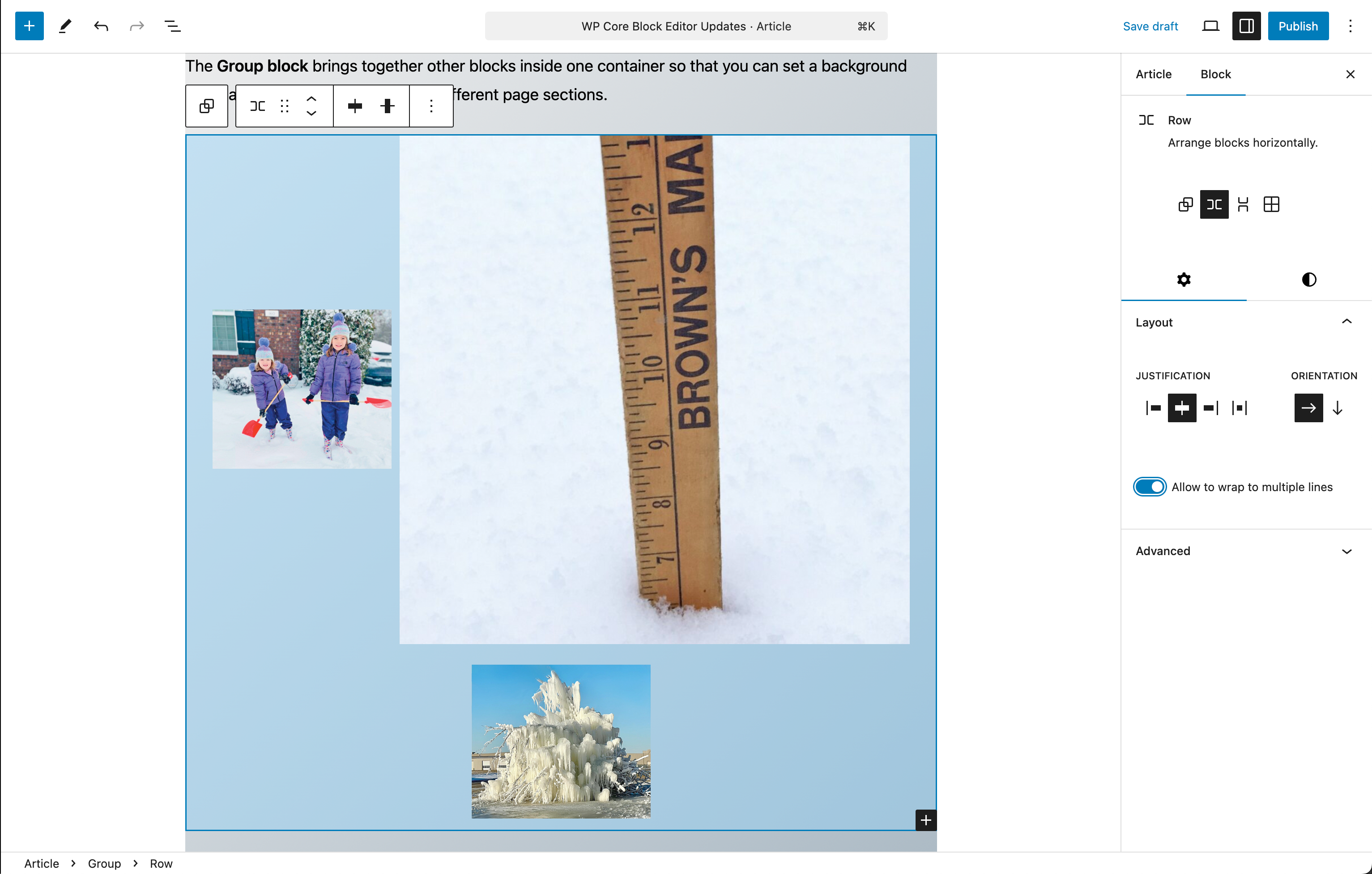
Row and Stack Blocks
The Row block and the Stack block are containers for other blocks. Use them to organize multiple blocks and adjust the color, text style, width, and position of all blocks inside the container. These blocks are variations of the Group block.
For both of these block types color and typography settings are available as in the other layout blocks, with additional controls for justification and orientation of the block contents.
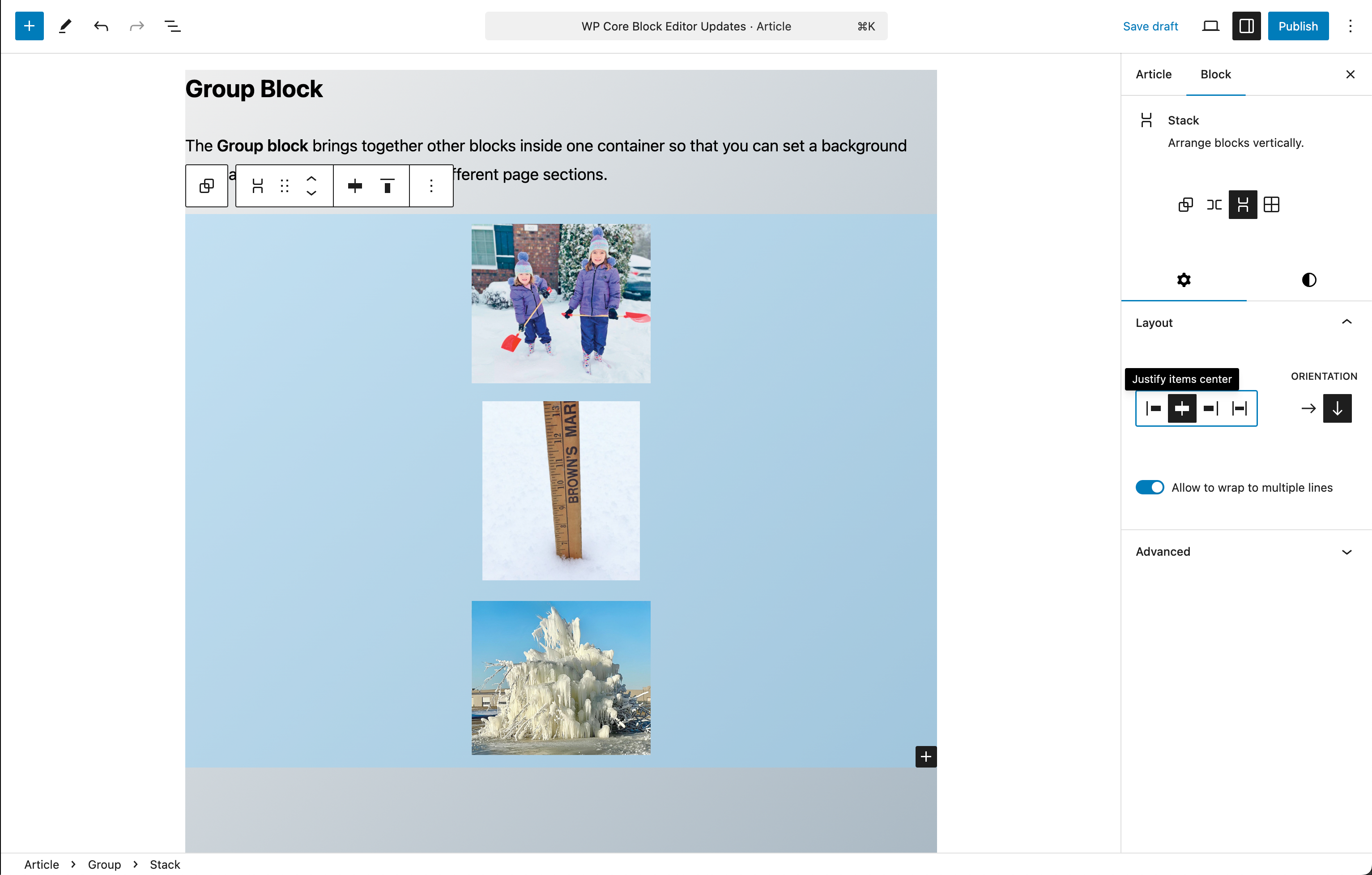
Note that the size of the image content is not altered by the layout settings, but retains the sizing from the settings for each individual image. This is when the “Allow to wrap to multiple lines” option is useful.
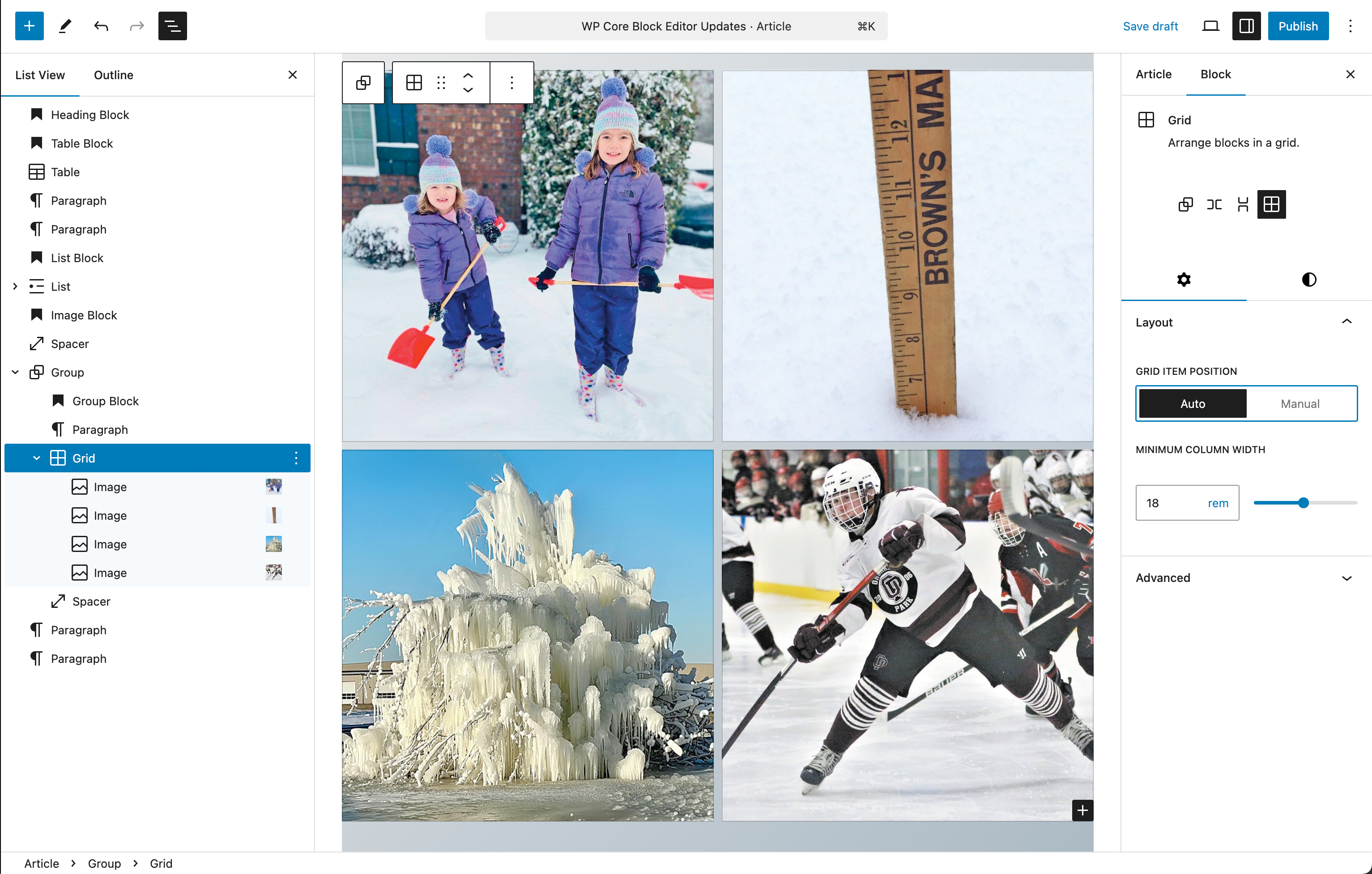
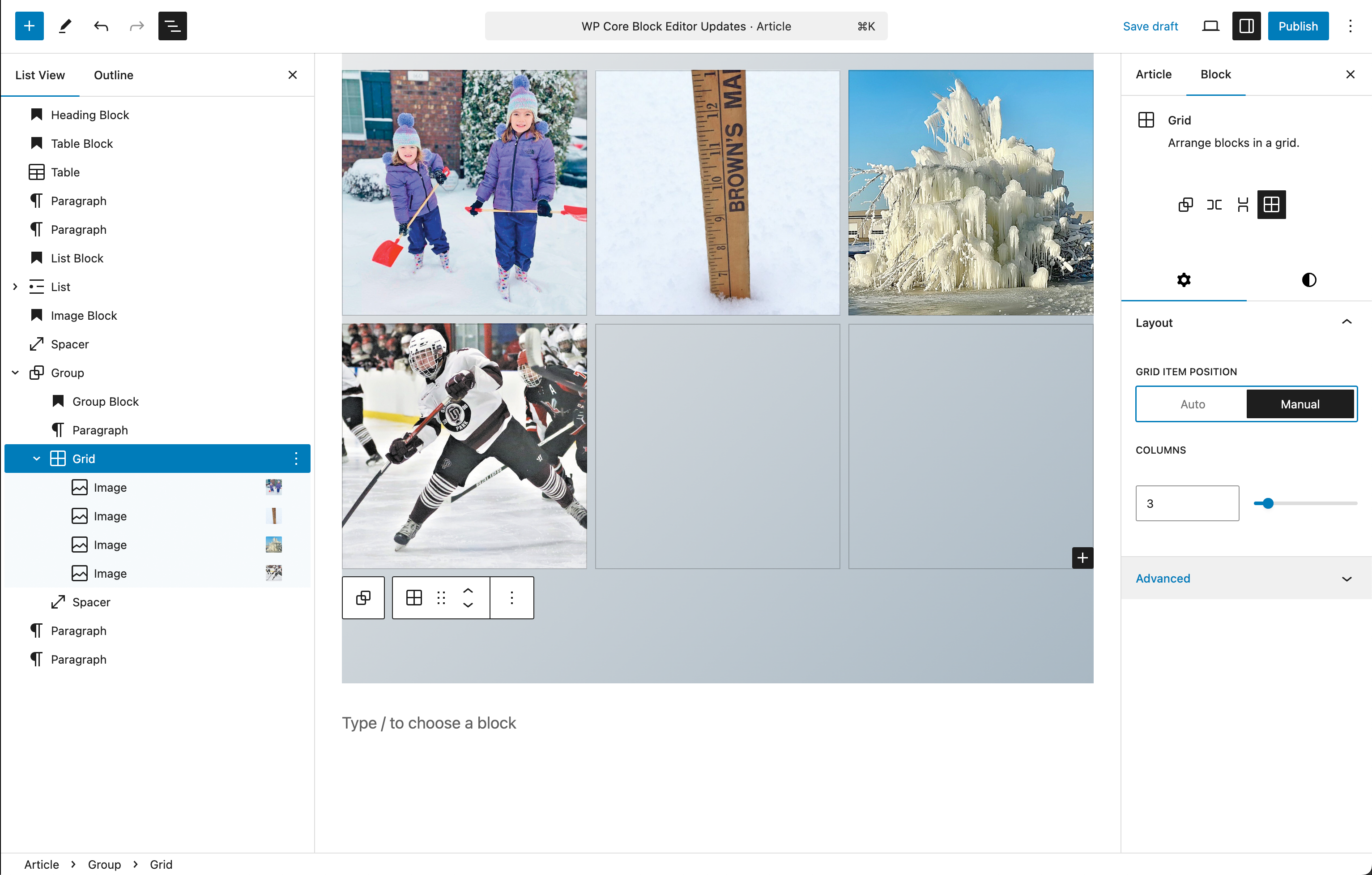
Grid Block
In the Layout settings, you can choose the number of columns in the Grid block, based on whether the column widths are automatically or manually sized:
- Selecting Auto will automatically add columns of the specified minimum width to fit the block.
- Selecting Manual will automatically divide the block into the number of columns you specify.
Similar to the Columns block, the number of columns in the grid can be defined by setting a minimum column width or by manually setting the number of columns.
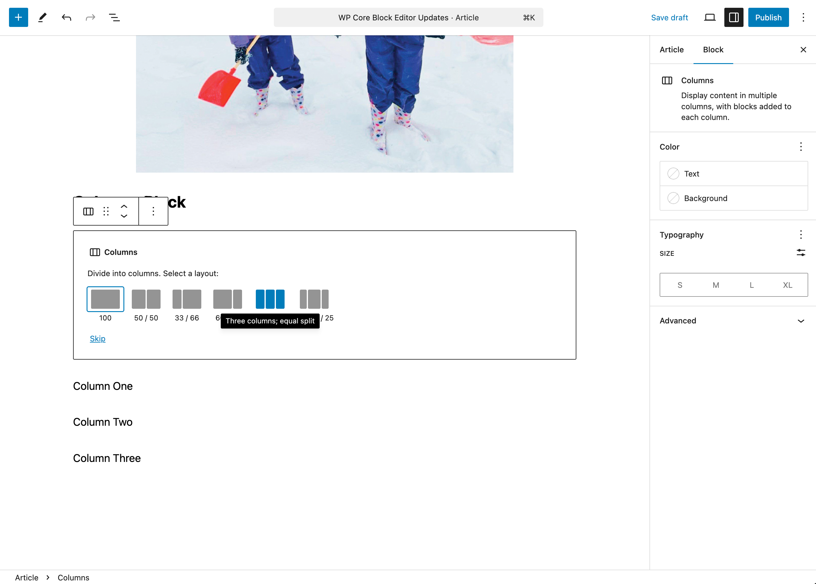
Columns Block
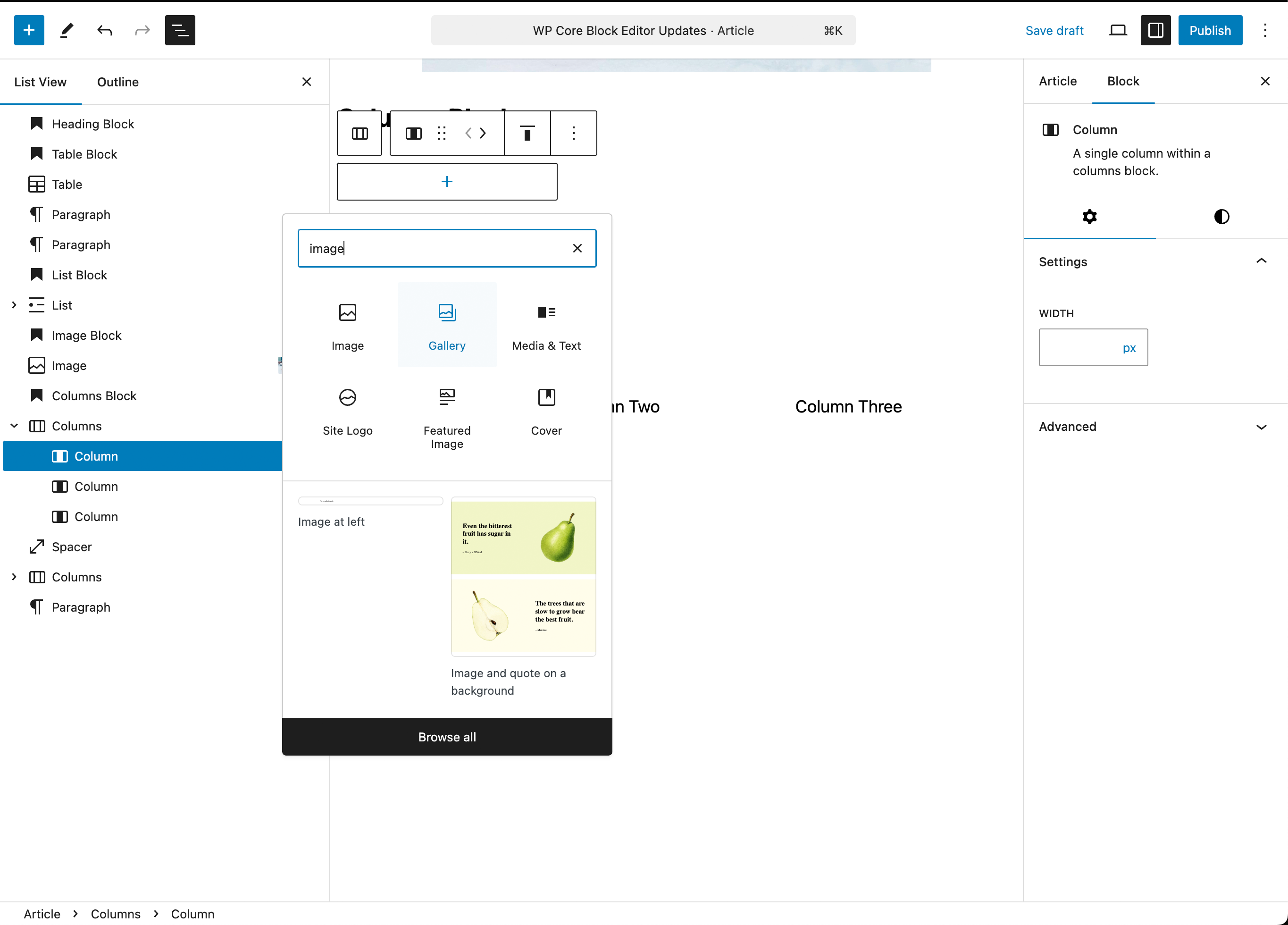
Add a Columns Block
To add an empty Columns block, click the + Block Inserter icon and search for “columns”. Click it to add the block to the post or page. You can then choose the number of columns divisions for the block.
Create Columns from existing Blocks
If you have inserted multiple blocks one after another and you want to turn them into columns, you can follow the steps below:
- Select all the desired blocks you want to turn into columns.
- The floating toolbar will appear. Click the first option on the left side of the block toolbar.
- Under the list “Transform to”, select Columns.
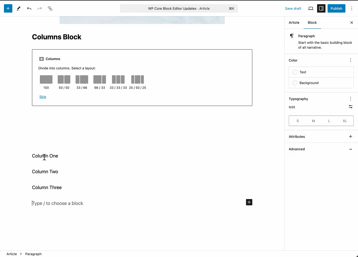
Add content to the Columns Block
You can use the + icon to add any widget to an individual column within the Columns block.
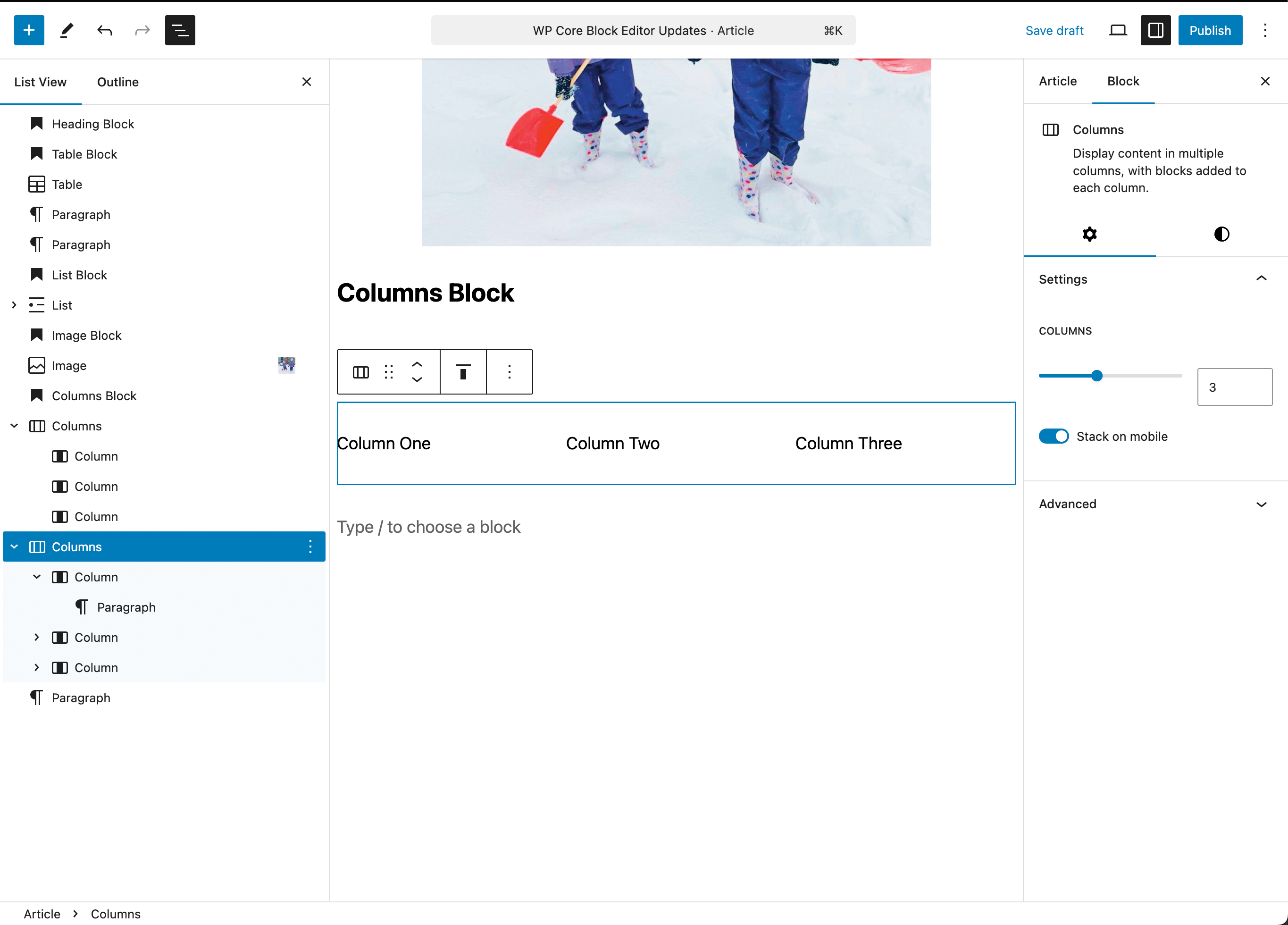
Columns Block Settings
Overall Columns Settings
Here you can change the number of columns in the block, and toggle whether the columns will stack in a mobile view or not. Notice that you can select the Columns block, individual Columns and Column Content using the List View panel on the left.
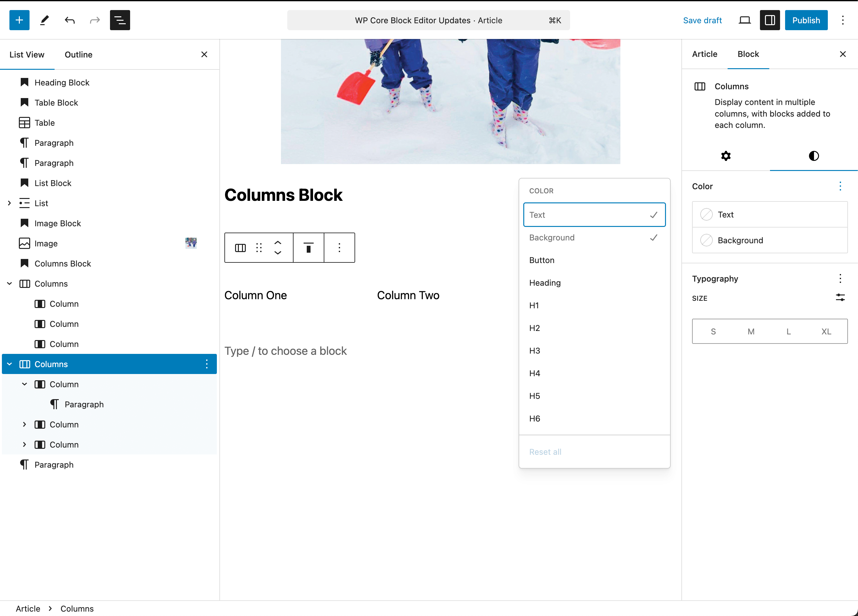
Similar to other blocks the styles panel allows you to set overall color and typography settings for the Columns block.
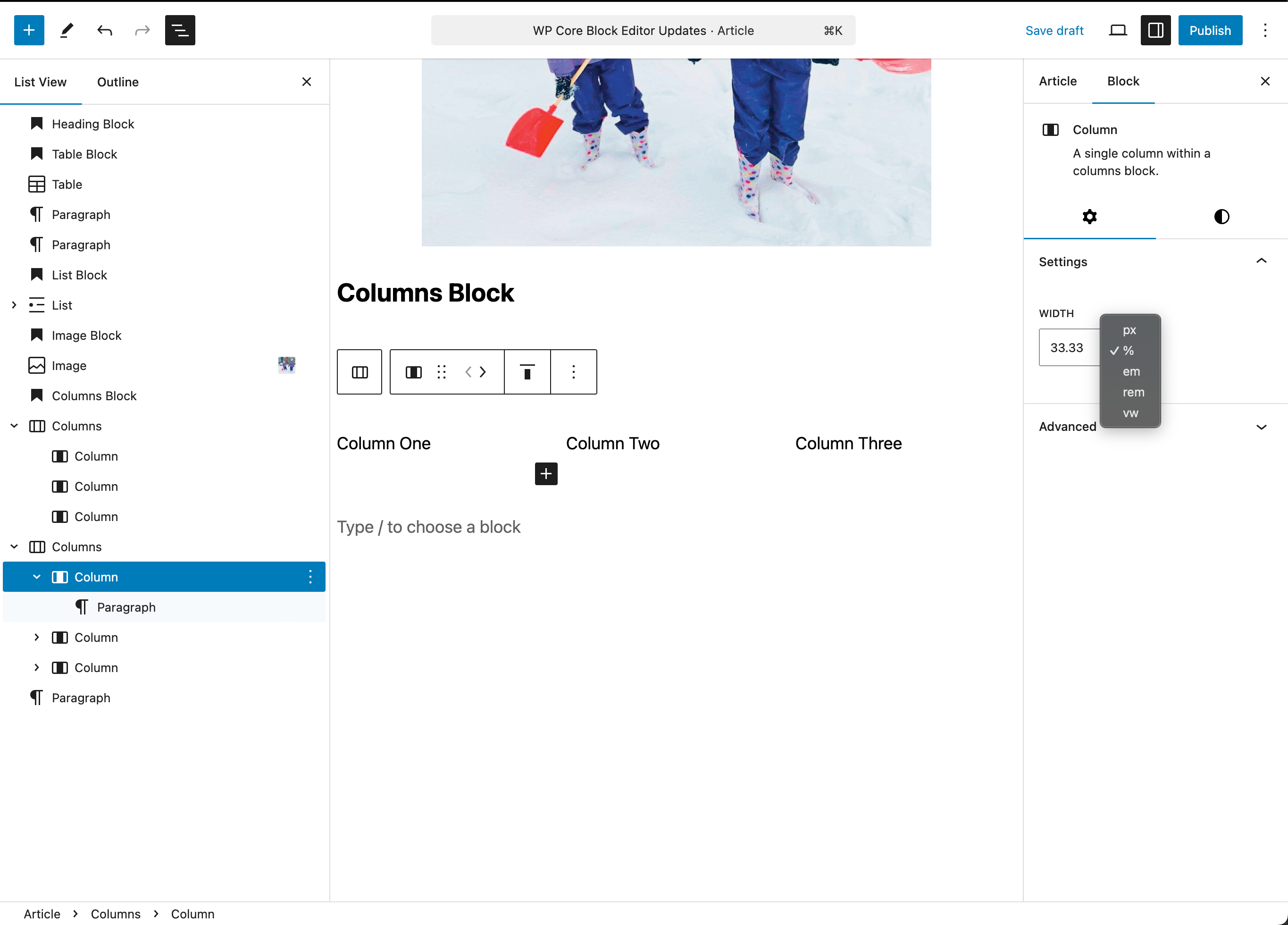
Individual Column Settings
While the same typography and color settings are available for an individual column, you can also specify a specific width using percentage, pixels, em, rem or viewport width values.
Arranging Blocks in the List View
The list view provides a quick and easy way to not only select and target particular blocks to access their settings, but you can also drag and drop any block (including groups, columns, grids, etc.) to alter the order AND the nesting, i.e. you can drag an image from outside to inside a columns block.
This feature allows you to quickly change your layouts by dragging content blocks into and within layout blocks.

- ← Our-Hometown mourns the loss of founder Stephen Larson
- Our-Hometown maintenance this weekend; brief downtime expected →
Recent Comments