Navigating the Block Editor
|
Click play to LISTEN to the article below
|
Getting Acquainted with the Interface
Upon opening a new post or page, you’ll immediately notice the difference. Here’s a breakdown of the key interface elements:
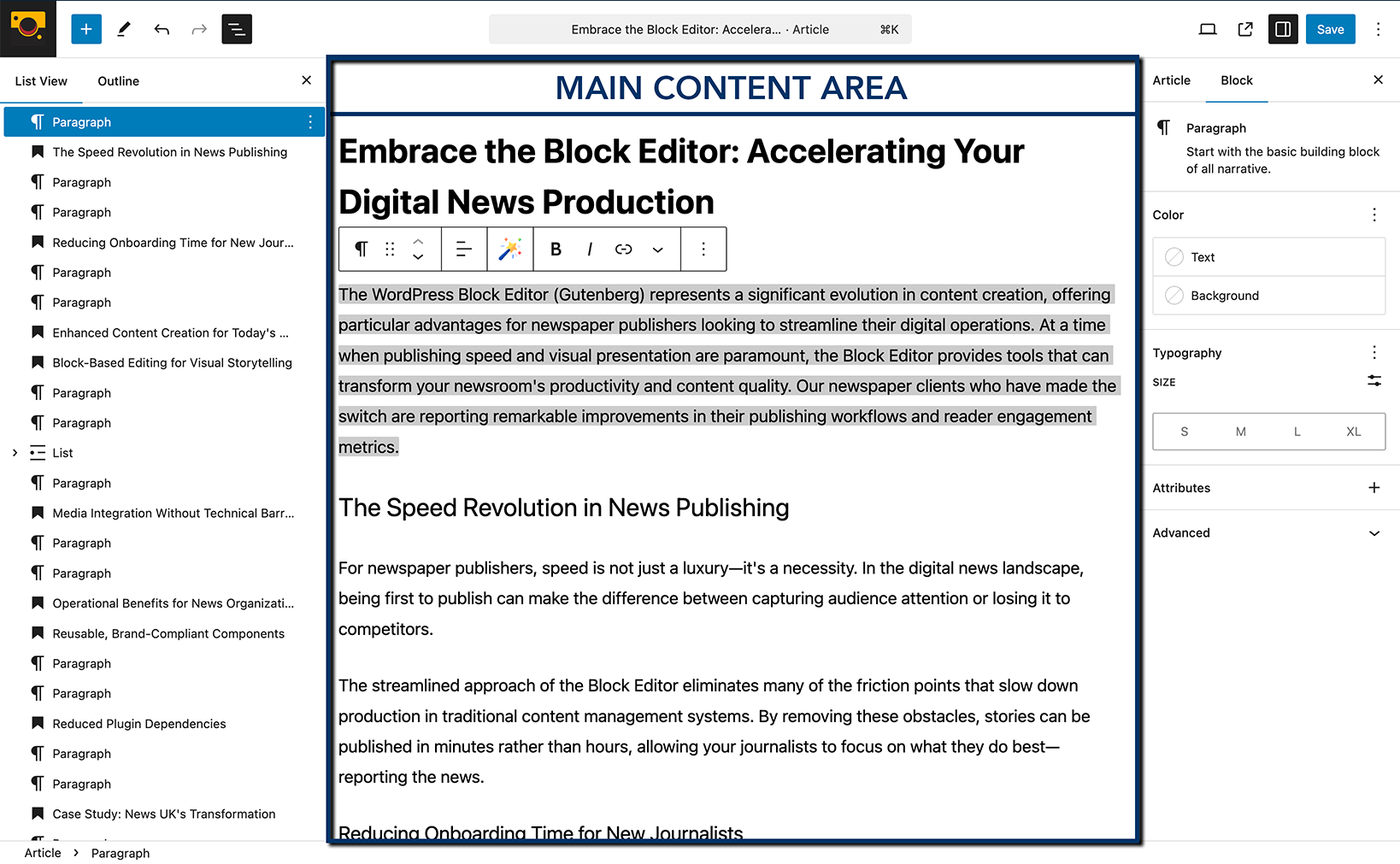
- The Main Content Area: This is where you’ll see your content taking shape, block by block. It offers a more visual representation of how your final output will look.
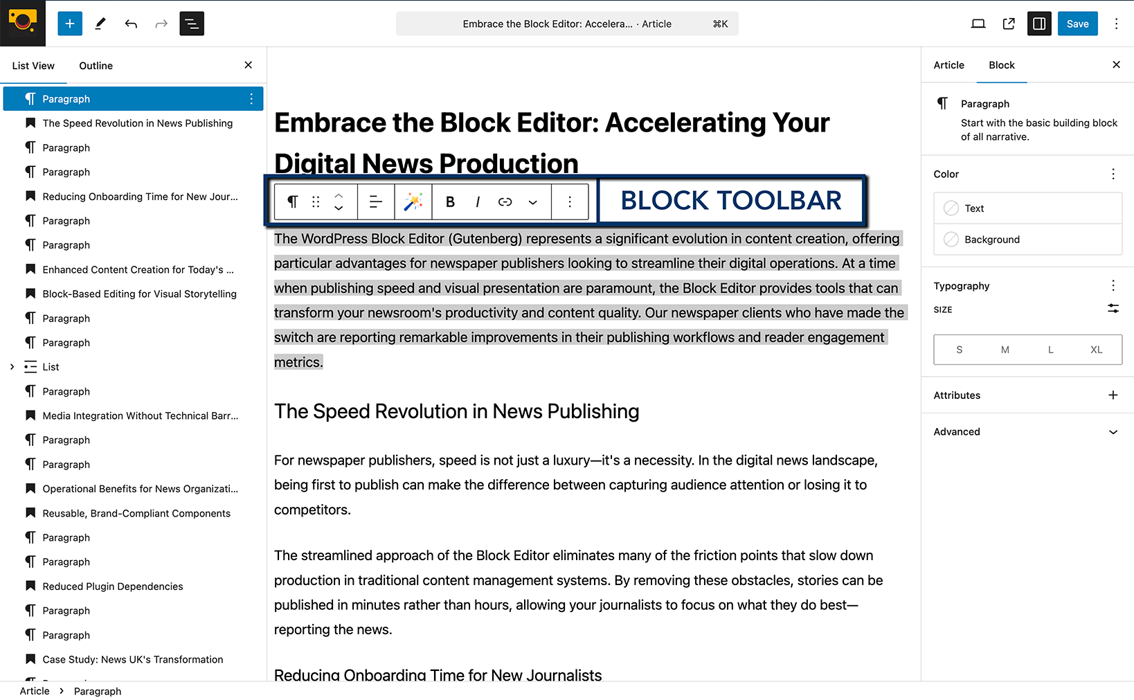
- The Top Toolbar: This persistent toolbar provides quick access to essential actions:
- The Plus (+) Icon (Block Inserter): Click this to open a panel where you can browse and add new blocks to your content. Think of this as your library of content elements. You can search for specific blocks or explore categories.
- Undo/Redo Arrows: Essential for correcting mistakes quickly.
- Content Structure Icon (List View): This icon (often looks like stacked lines) opens a sidebar that displays an outline of all the blocks on your page. This is incredibly helpful for navigating complex layouts and reordering sections.
- Block Settings Cog Icon: This toggles the Settings Sidebar on the right.
- View: Allows you to preview your post or page.
- Update/Publish Button: Saves or publishes your work.
- The Block Toolbar: When you select a block, a contextual toolbar appears directly above it. This toolbar contains options specific to the selected block type. For example, a paragraph block will have options for alignment, bold, italics, adding links, and more. An image block will have options for alignment, adding alt text, and cropping.
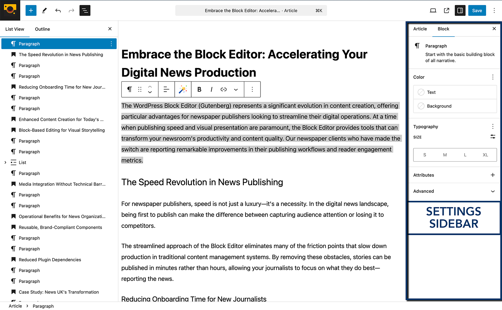
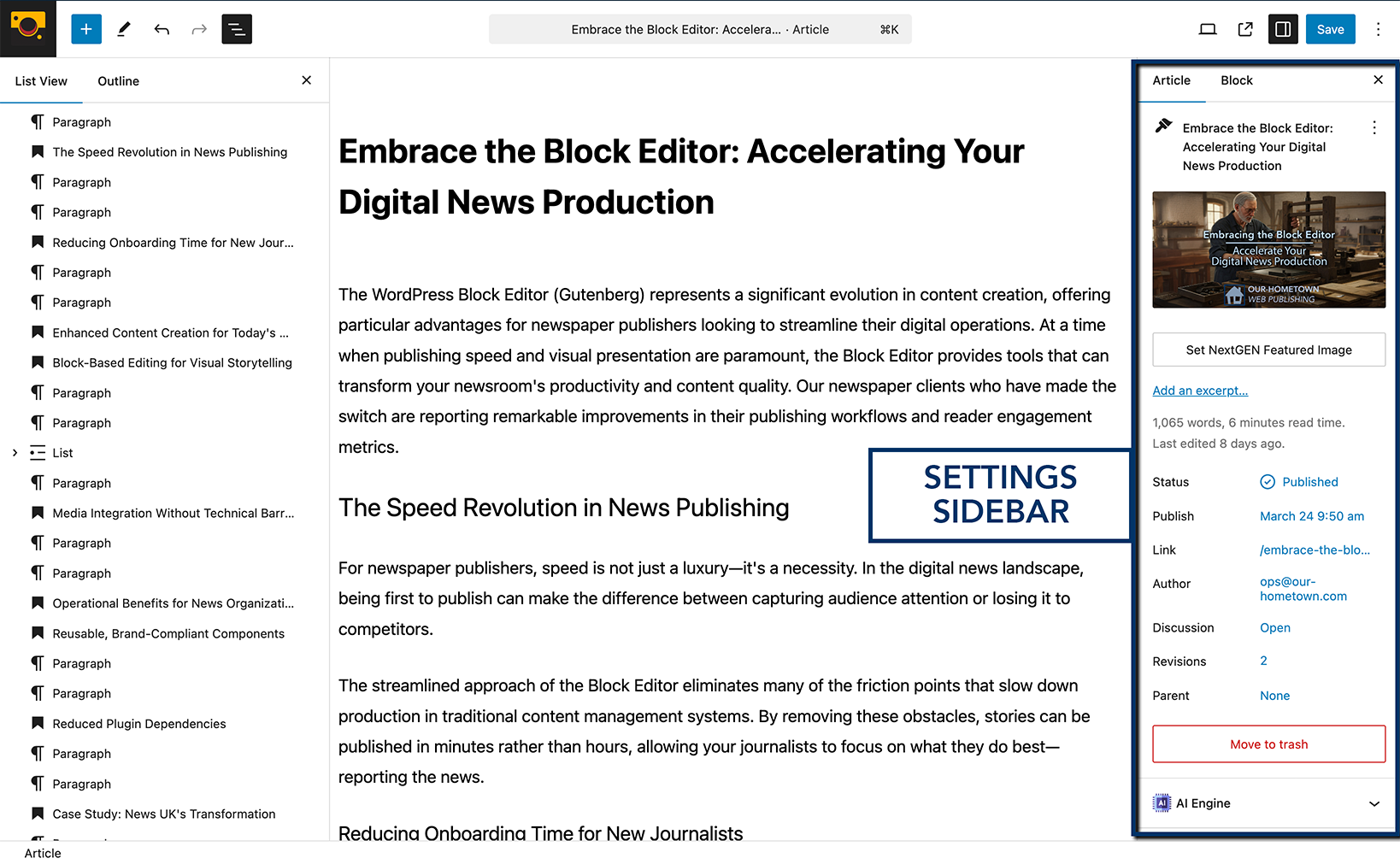
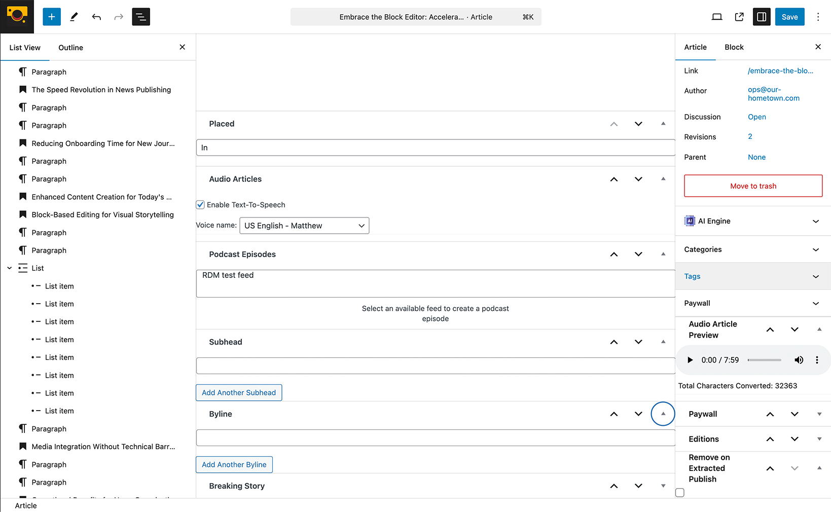
- The Settings Sidebar: This sidebar, toggled by the cog icon in the top toolbar, provides more advanced settings for the currently selected block and for the overall post or page. It’s divided into two tabs:
- Block Tab: This tab displays settings specific to the block you have selected. This is where you’ll find options for typography, color, dimensions, and advanced settings depending on the block type.
- Article/Page/Post Tab: This tab contains settings related to the entire post or page, such as status, visibility, permalink, categories, tags, featured image, and more – familiar territory for Classic Editor users.
Managing Your Blocks: The Building Blocks of Content
Working with blocks is fundamental to the Block Editor experience:
- Adding Blocks: As mentioned, click the Plus (+) Icon in the top toolbar or the “+” icon that appears when you hover between existing blocks. Explore the categories or use the search bar to find the block you need.
- Moving Blocks: When you have block selected, you’ll see arrows (up and down) on the left side of the Block Toolbar. Click these to move the block up or down. Alternatively, you can click and drag the block using the six-dot handle that appears next to the arrows. The List View (Content Structure icon) also allows for easy drag-and-drop reordering.
- Selecting Blocks: Simply click on a block in the content area to select it. The Block Toolbar will appear above it, and the Settings Sidebar will update to show the settings for that block.
- Deleting Blocks: Select the block you want to remove. In the Block Toolbar, click the three vertical dots (Options) and then select “Remove Block.”
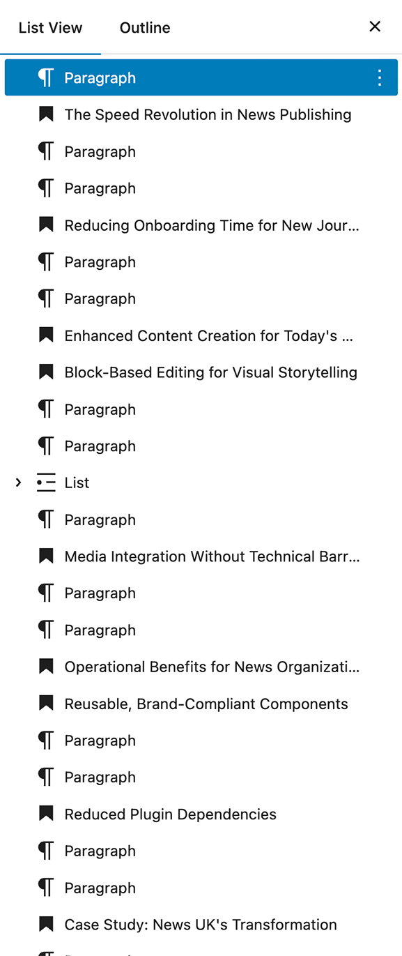
The Power of the List View: A Structural Overview
The List View, accessed by clicking the Content Structure Icon (stacked lines) in the top toolbar, opens a sidebar that provides a hierarchical outline of all the blocks in your content. This is more than just a table of contents; it’s an interactive tool for managing your content’s structure.
Here’s how the List View helps in managing blocks:
- Clear Visual Hierarchy: For complex layouts with nested blocks (like Columns, Groups, or Cover blocks), the List View clearly displays the parent-child relationships, making it easier to understand the structure of your content.
- Effortless Navigation: Instead of scrolling through a long page, you can quickly jump to any block by clicking on its name in the List View. This is especially useful for lengthy posts or pages.
- Drag-and-Drop Reordering: The List View provides a simple and intuitive way to reorder blocks. Just click and drag a block’s name in the sidebar to its new position. This can be much easier than using the up/down arrows on the Block Toolbar, especially when moving blocks across larger distances or within nested structures. You can also drag blocks into other container-type blocks, such as moving multiple paragraph blocks into a Grid or Group block allowing you to treat the blocks together and even add styling to the container block itself.
- Selecting Blocks with Precision: Sometimes, selecting a specific nested block directly in the content area can be tricky. The List View allows you to select any block with a single click, ensuring you’re working with the intended element.
- Quick Actions via the Three Dots: Hovering over a block’s name in the List View reveals three vertical dots (Options). Clicking these dots provides quick access to actions like:
- Duplicate: Create an exact copy of the selected block.
- Insert Before/After: Add a new block above or below the selected one.
- Remove Block: Delete the selected block.
- Edit as HTML: Directly modify the HTML of the block.
- Group: Enclose the block within a Group block for unified styling or layout control.
- Batch Selection (with Shift or Ctrl/Cmd): You can select multiple adjacent blocks by holding down the Shift key and clicking on the first and last blocks you want to select. For non-adjacent blocks, use Ctrl (Windows) or Cmd (Mac) while clicking. Once multiple blocks are selected in the List View, you can perform actions like moving or deleting them together.
The List View becomes an indispensable tool as your content grows in complexity, offering a structured and efficient way to manage your blocks beyond the immediate visual editor.
The Power of Block Transformations
One of the handy features of the Block Editor is the ability to transform certain types of blocks into other related block types directly from the Block Toolbar. This can save you time and effort when you realize a different block structure might better suit your content.
Here’s how block transformations work:
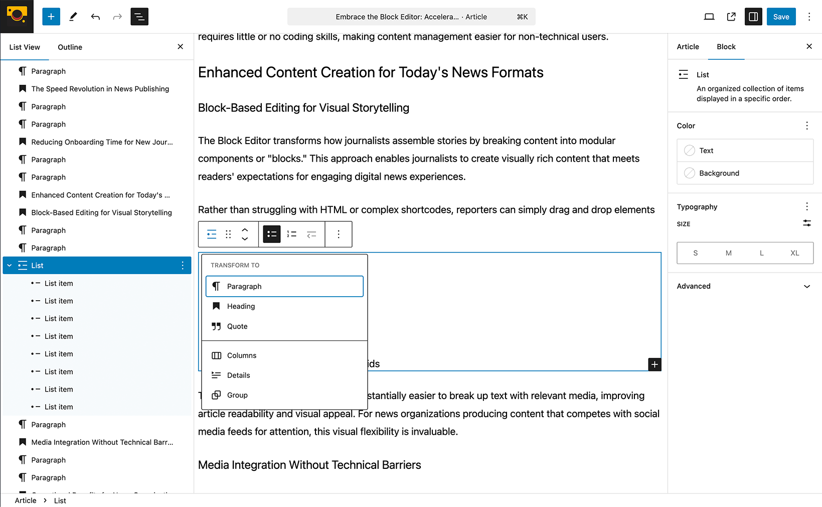
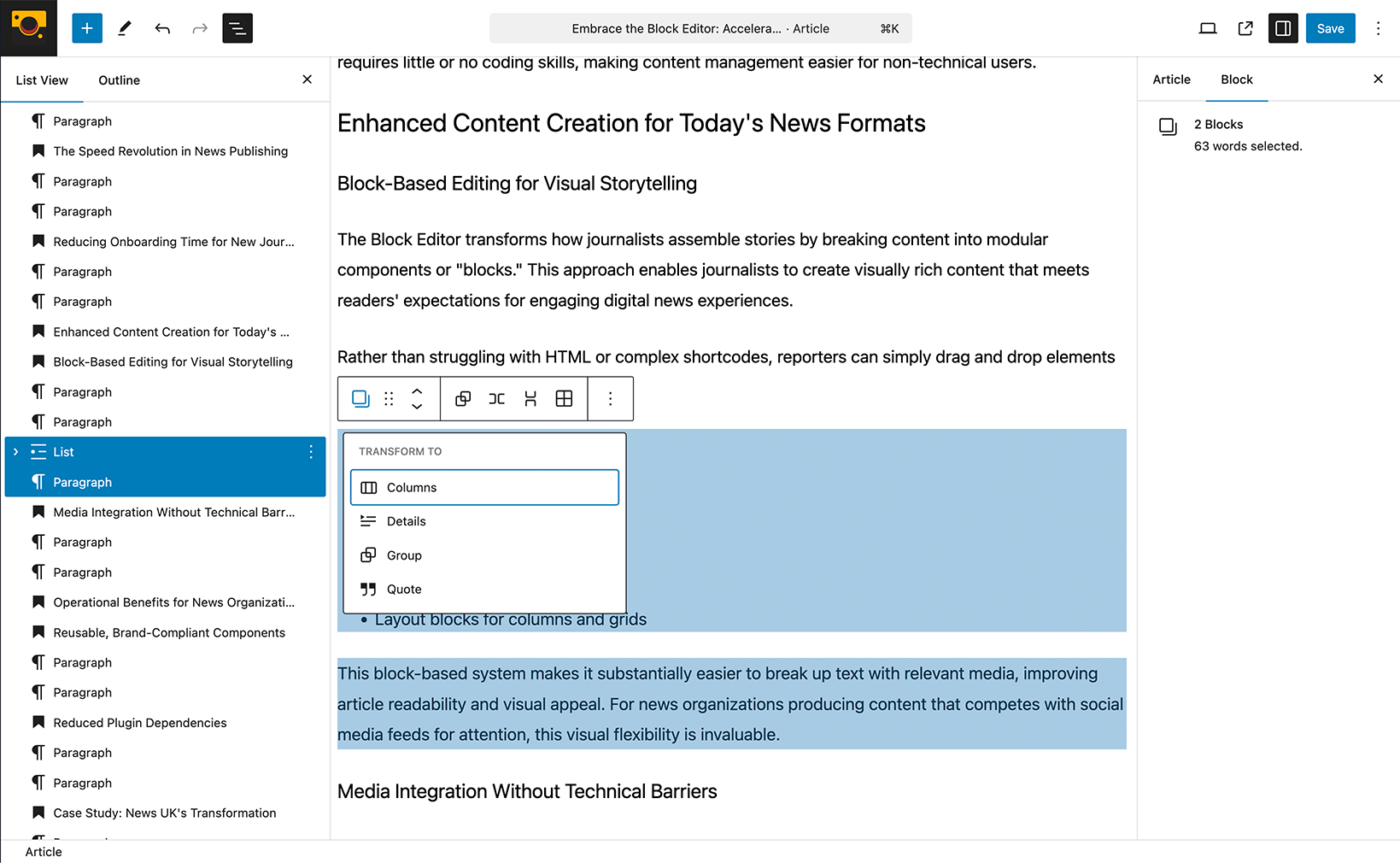
- The Transform Icon: When you select a block that can be transformed, you’ll typically see an icon in the Block Toolbar that resembles a shape shifting or different block icons arranged together. Hovering over this icon will often display a label like “Transform to.”
- Available Transformations: Clicking this icon will reveal a menu of block types that the current block can be transformed into. The available options depend on the original block type. For example:
- Paragraph to Heading: If you’ve written a line of text that would work better as a subheading, you can easily transform a Paragraph block into a Heading block (H1, H2, H3, etc.). The text content will be preserved.
- Heading to Paragraph: Conversely, you can transform a Heading back into a regular Paragraph.
- List (Bullet or Numbered) to Quote: You might decide that a series of points would be more impactful as a blockquote.
- Quote to Paragraph: Or transform a quote back into regular text.
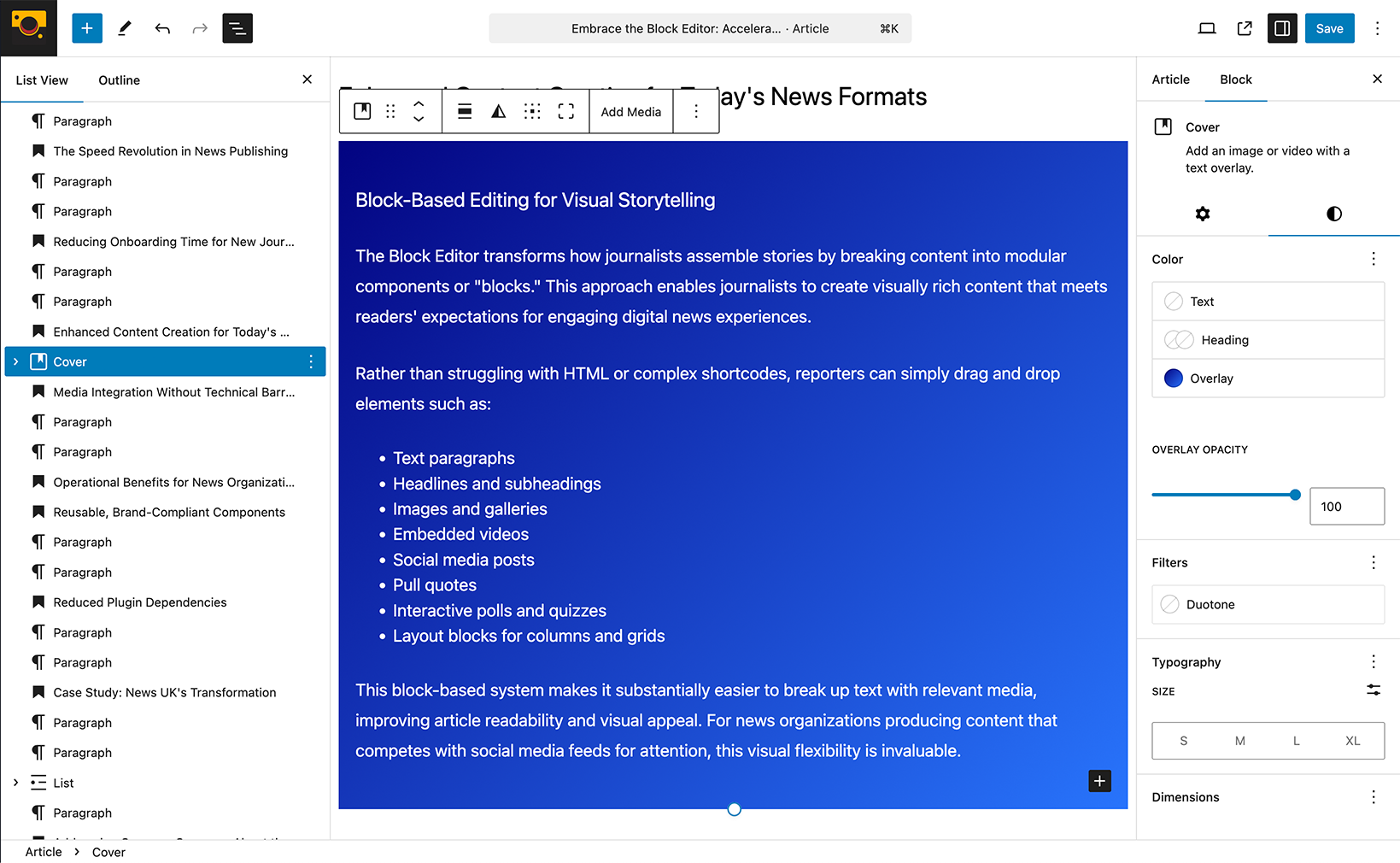
- Image to Cover: Turn a simple image into a Cover block with the option to add text overlay.
- Individual Blocks to Group: Select multiple blocks and transform them into a Group block to apply unified background colors or spacing.
- Group to Columns or Grid/Stack/Row: Transform a Group of blocks into a multi-column or grid layout (with optional stack an row options).
- Preserving Content (Where Possible): The Block Editor intelligently tries to preserve your content during transformations. For instance, when transforming a Paragraph to a Heading, the text remains. However, some specific formatting might be lost if the target block type doesn’t support it.
- Experiment and Discover: The best way to understand the transformation options is to select different block types and see what transformations are available in their respective Block Toolbars.
Block transformations offer a flexible way to adjust your content structure without having to delete and recreate blocks from scratch. Keep an eye out for that transform icon in the Block Toolbar!
Typography: Styling Your Text
In the Classic Editor, typography options were often limited to basic formatting within the visual editor or required delving into HTML. The Block Editor offers more intuitive control:
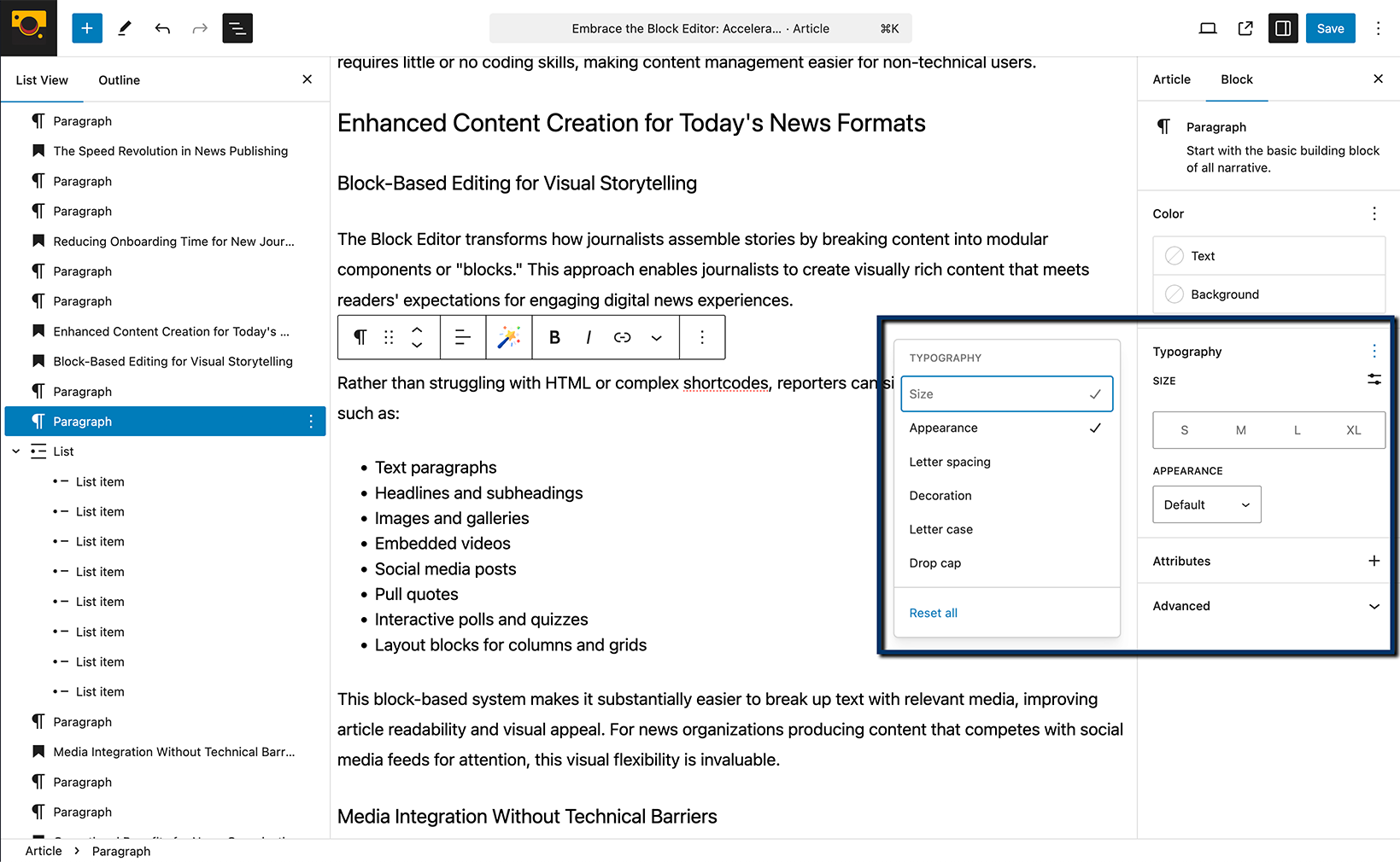
- Paragraph and Heading Blocks: When you select a Paragraph or Heading block, you’ll find basic formatting options (bold, italics, links) in the Block Toolbar. For more advanced typography settings, look to the Block Tab in the Settings Sidebar. Here you might find options for:
- Font Size: Choose from predefined sizes or enter a custom value.
- Line Height: Adjust the vertical spacing between lines of text.
- Letter Spacing: Control the horizontal spacing between characters.
- Text Color: Select a color for your text.
- Appearance (for some themes): Options for font weight or style variations.
- Other Text-Based Blocks: Blocks like Quotes and Code will have their own relevant typography or styling options within their respective Block Toolbars and Settings Sidebar.
Styling Options: Beyond the Basics
The Block Editor provides more granular control over the visual appearance of your content:
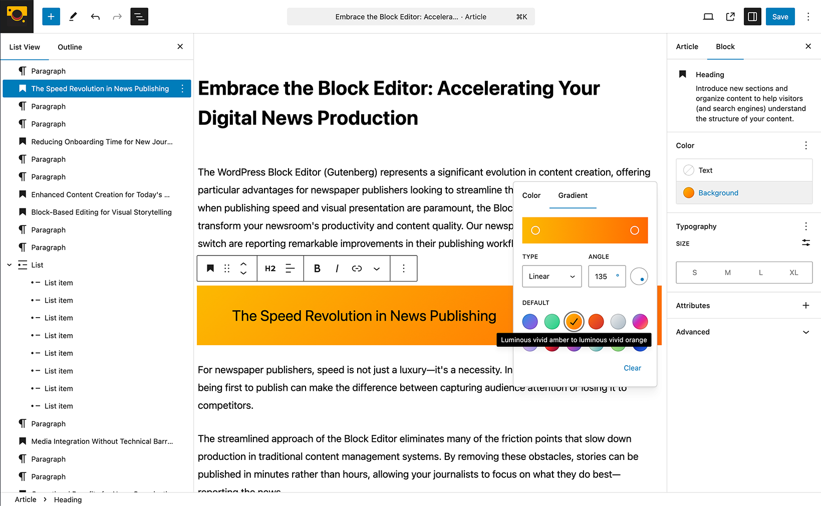
- Color Settings: Many blocks offer color options in the Block Tab of the Settings Sidebar. This might include text color, background color, or link color, depending on the block type.
- Background Options: Some container blocks, like the Group or Cover block, allow you to set background colors or images.
- Dimensions and Spacing: You might find options for padding and margins within the Block Tab, allowing you to control the spacing around and within your blocks.
- Border Options: Some blocks allow you to customize borders, including color, style, and width.
- Theme Styles: Remember that your active WordPress theme plays a significant role in the available styling options. Themes can provide their own sets of color palettes, typography presets, and block styles, which will appear in the Settings Sidebar.
Where Did That Go? Finding Classic Editor Features
If you’re transitioning from the Classic Editor, you might be wondering where some familiar features have moved:
- Visual/Text Editor Tabs: These are gone. The Block Editor is inherently a more visual experience, aiming for a “what you see is what you get” (WYSIWYG) approach. For direct HTML editing of a specific block, select the block, click the three vertical dots (Options) in the Block Toolbar, and choose “Edit as HTML.”
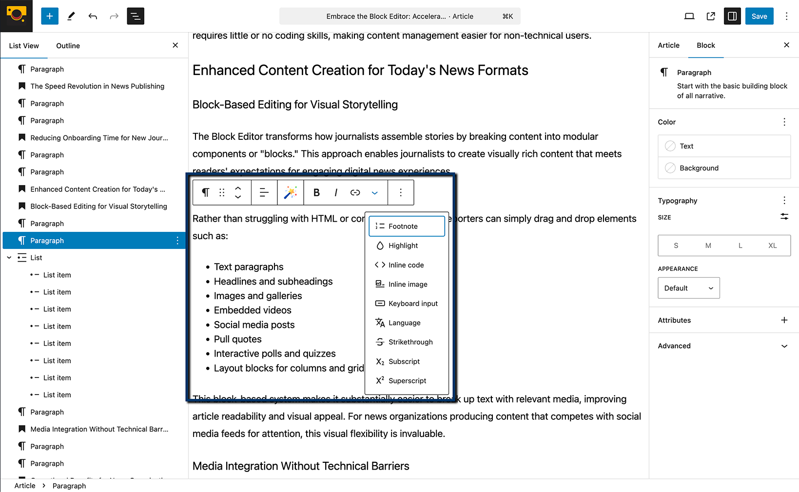
- Formatting Buttons (Underline, Justify, etc.): Some less commonly used formatting options are now often found within the “More rich text tools” dropdown (the down arrow) in the Block Toolbar of text-based blocks. Justification, in particular, might depend on your theme’s support.
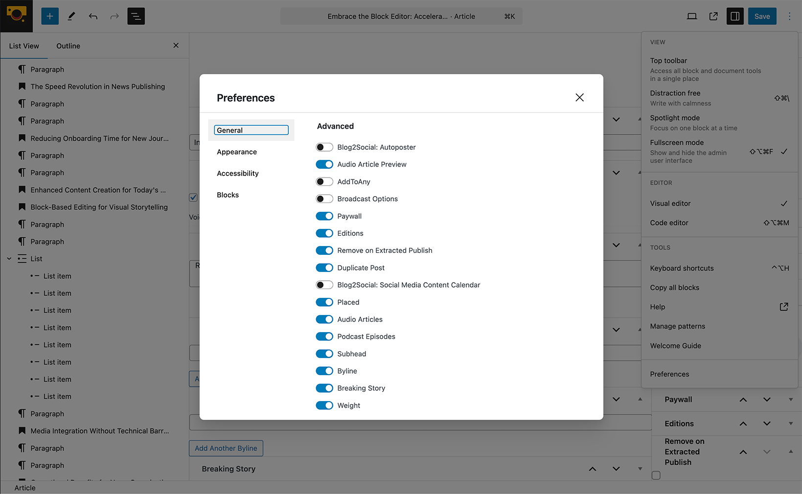
- Meta Boxes: These haven’t disappeared entirely! Meta boxes for plugins and custom fields are typically found below the main content area in the Block Editor interface. You can also move them to the sidebar by going to the three vertical dots in the top right corner of the screen, selecting “Preferences,” then “Panels,” and checking the “Meta boxes” option.

- ← Block Editor Overview Part 2: Navigating the Block Editor on April 11th, 11AM EST
- The Power of Patterns: Block Editor Basics →
Recent Comments