Platform Updates and New Block Editor Features

|
Click play to LISTEN to the article below
|
Text Blocks
There are several new options in the right sidebar for styling and handling typography in text-containing blocks:
- Headings
- Paragraphs
- Lists
- Tables
Each panel in the right sidebar now has a 3-dot menu allowing you to toggle additional controls for that particular text block:
- The Color panel contains options for text color and background color/gradient for the individual block, allowing for quick styling of section headings, callouts, infoboxes, etc.
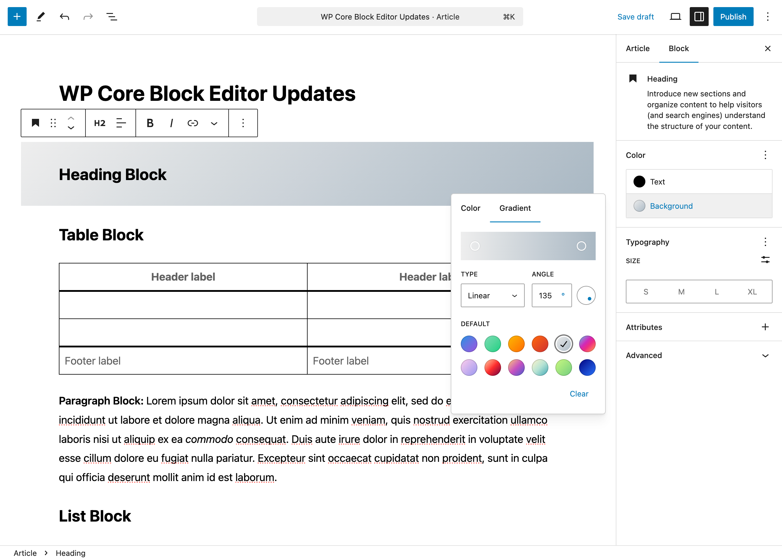
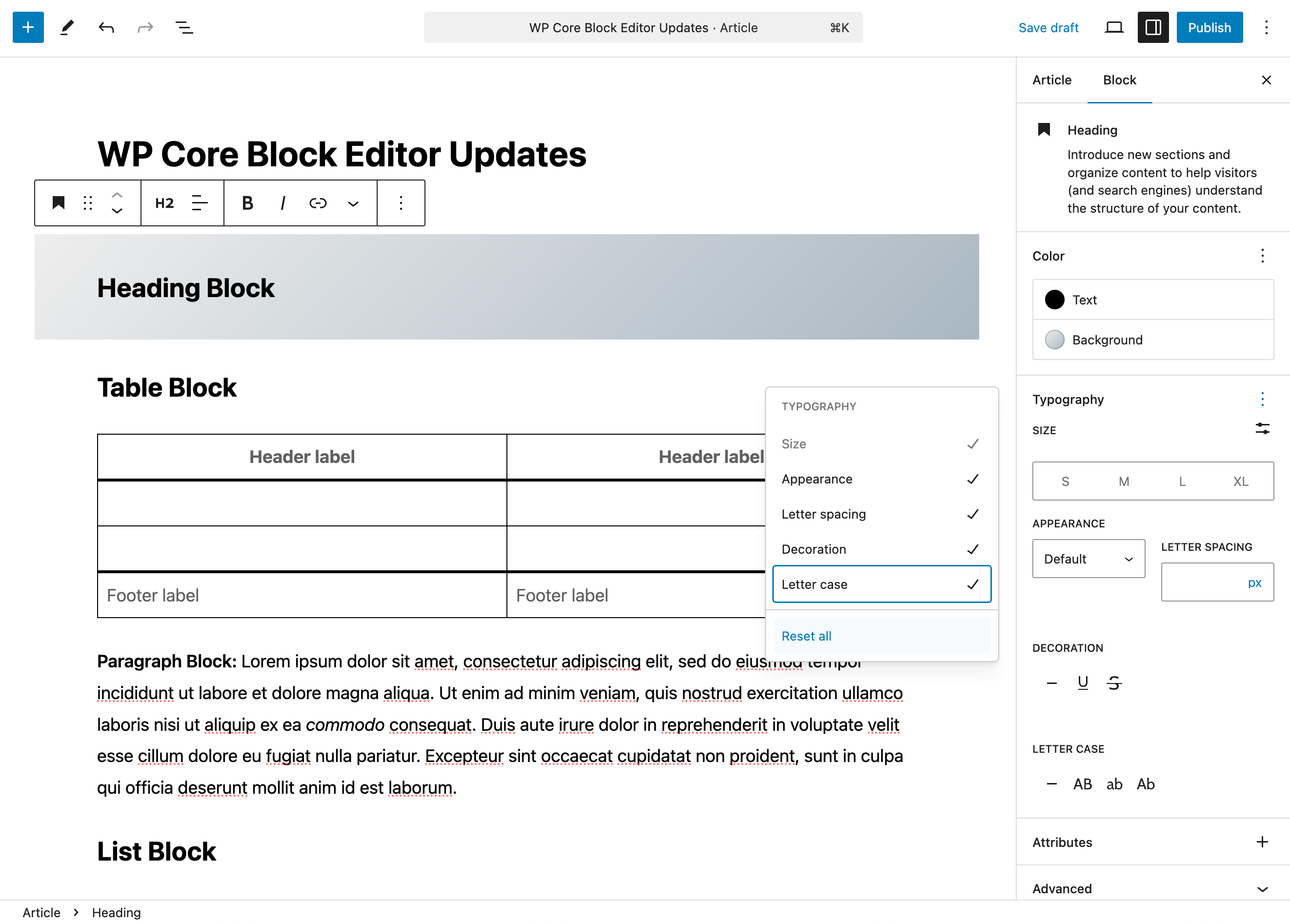
- The Typography panel provides toggles to activate various additional text controls for Sizing, Appearance (various font weights for bold text), Letter Spacing, Decorations (strikethrough, underline) and Letter Case (all caps, etc.).
- In addition to the normal alignment, bold and italic options found in the floating toolbar above a text block, the arrow dropdown menu gives you access to options to style individual words or groups of words within the text block.
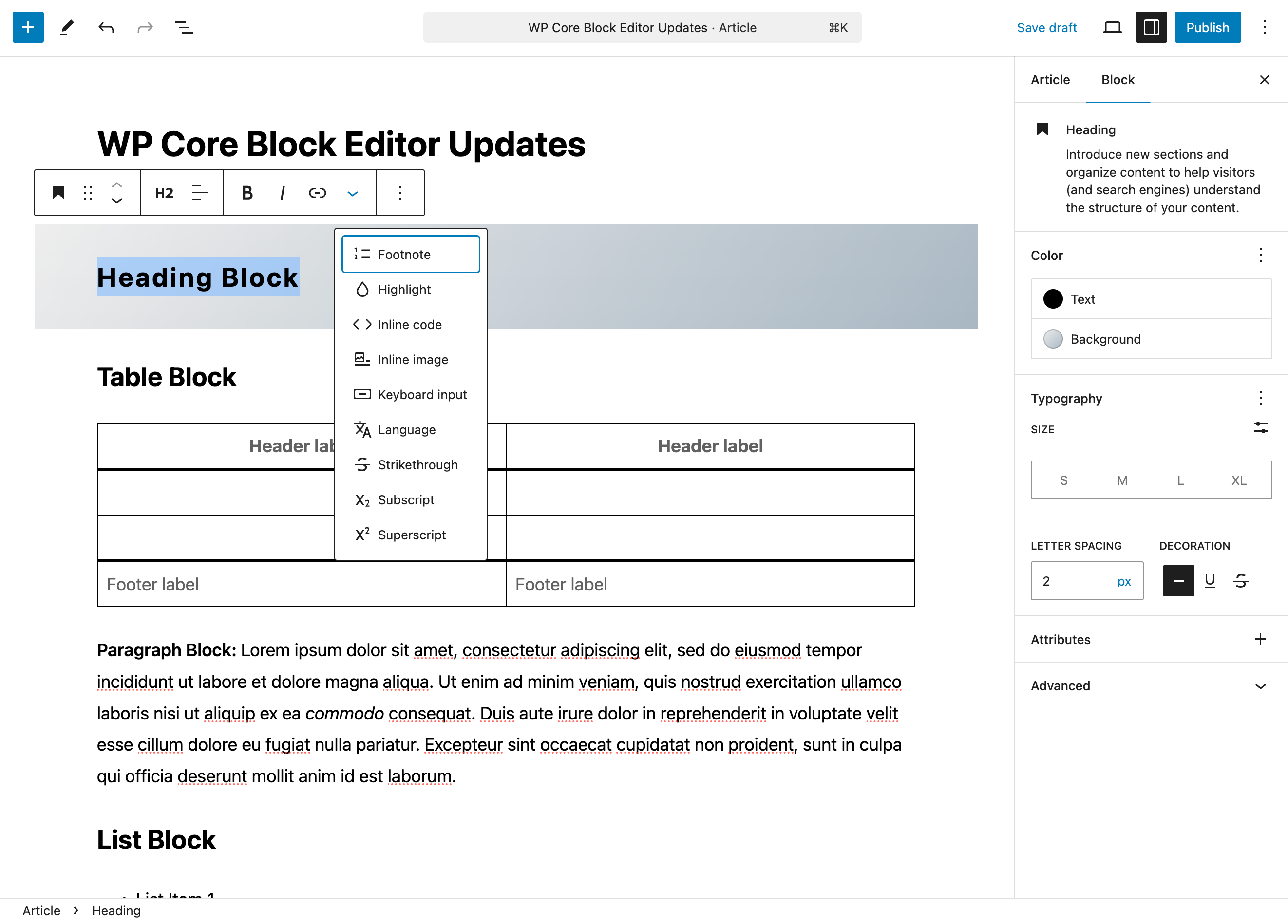
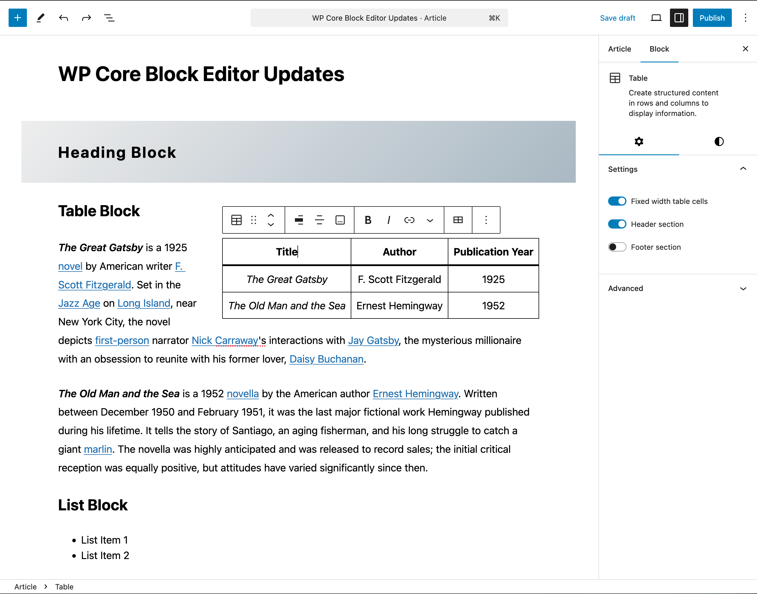
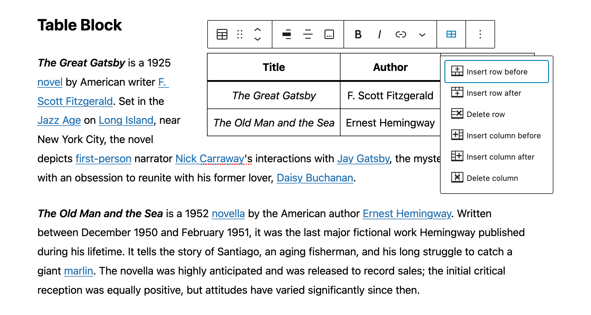
Table Block
Table creation has been limited to the tools in the Classic Paragraph block (similar to the classic article editor itself), however we now have a dedicated Table block with many customization and styling options, plus all the normal table editing tools one might expect: adding/deleting columns and rows, showing header and footer sections, creating striped row delineation and more.
Settings
You have the option to tell the table to use “fixed width table cells“, which means all columns will be equal in width rather than adapting the column widths to the content of the table.
The header section and footer section will each add an additional row to your table. The header section is typically used to add titles to the top of each row. The footer can be used to add an additional row at the bottom.
Styles
There are two styles available for tables: Default and Stripes:
- The Default style has a plain background and borders around the cells.
- The Stripes style has alternating row background colors.
- The Color and Typography panels are identical to those described above in the Text block settings.

The floating toolbar provides several options from left to right:
- Add a link to the text in the cell.
- Change block type.
- Drag the block.
- Move the block up or down.
- Change table alignment (allowing for other blocks to flow around the table itself).
- Change individual column alignment.
- Bold the text of your cell.
- Italicize the text of your cell.
- The arrow dropdown provides the same inline text options as the toolbar for the text blocks discussed previously.
- The “Edit table” option (the symbol looks like a table with four cells) let’s you:
- Insert a new row immediately before the row you have selected.
- Insert a new row immediately after the row you have selected.
- Delete the currently selected row.
- Insert a new column immediately before the column you have selected.
- Insert a new column immediately after the column you have selected.
- Delete the currently selected column.
Layout Blocks
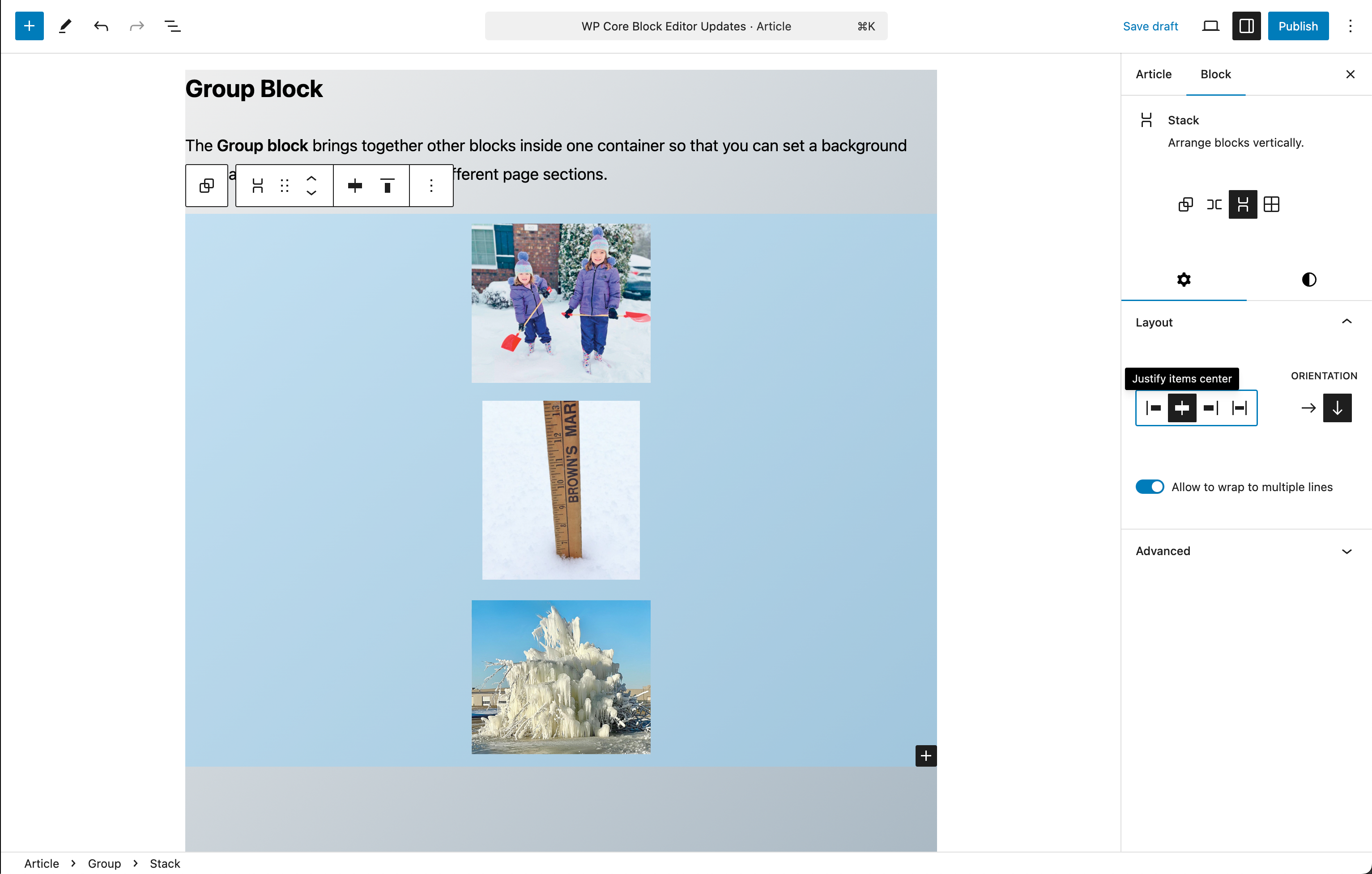
Group Block
The Group block brings together other blocks inside one container so that you can set a background color, adjust spacing, and organize different page sections.
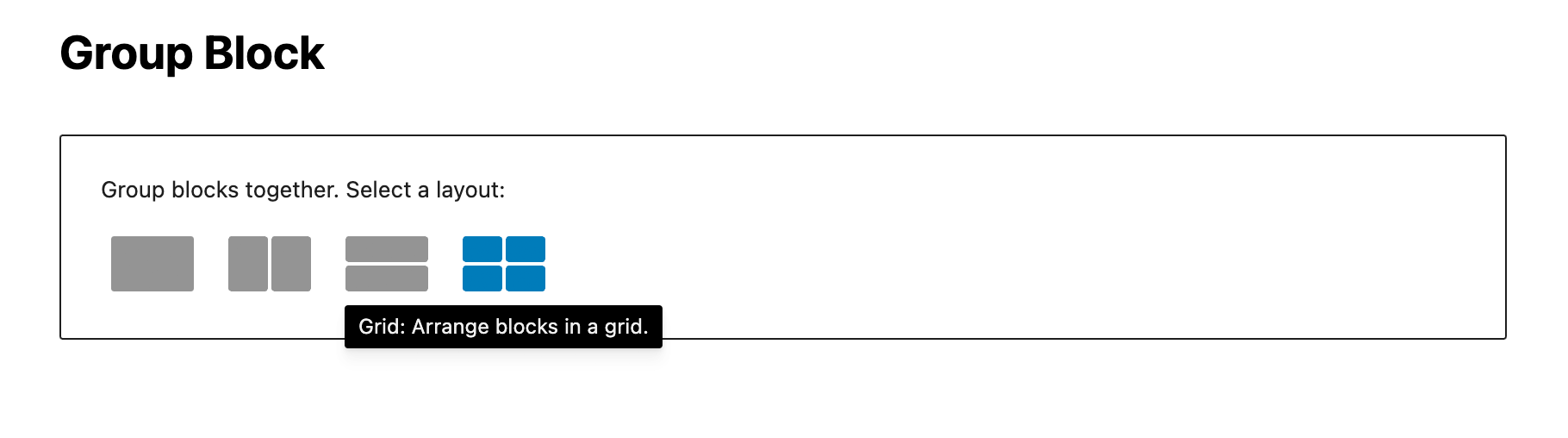

In addition to being able to choose between the four different Group layouts when you initially add a Group block, you can also transform a group between those layouts at anytime after, depending on the needs of the Group content.
Row and Stack Blocks
The Row block and the Stack block are containers for other blocks. Use them to organize multiple blocks and adjust the color, text style, width, and position of all blocks inside the container. These blocks are variations of the Group block.
For both of these block types color and typography settings are available as in the other layout blocks, with additional controls for justification and orientation of the block contents.
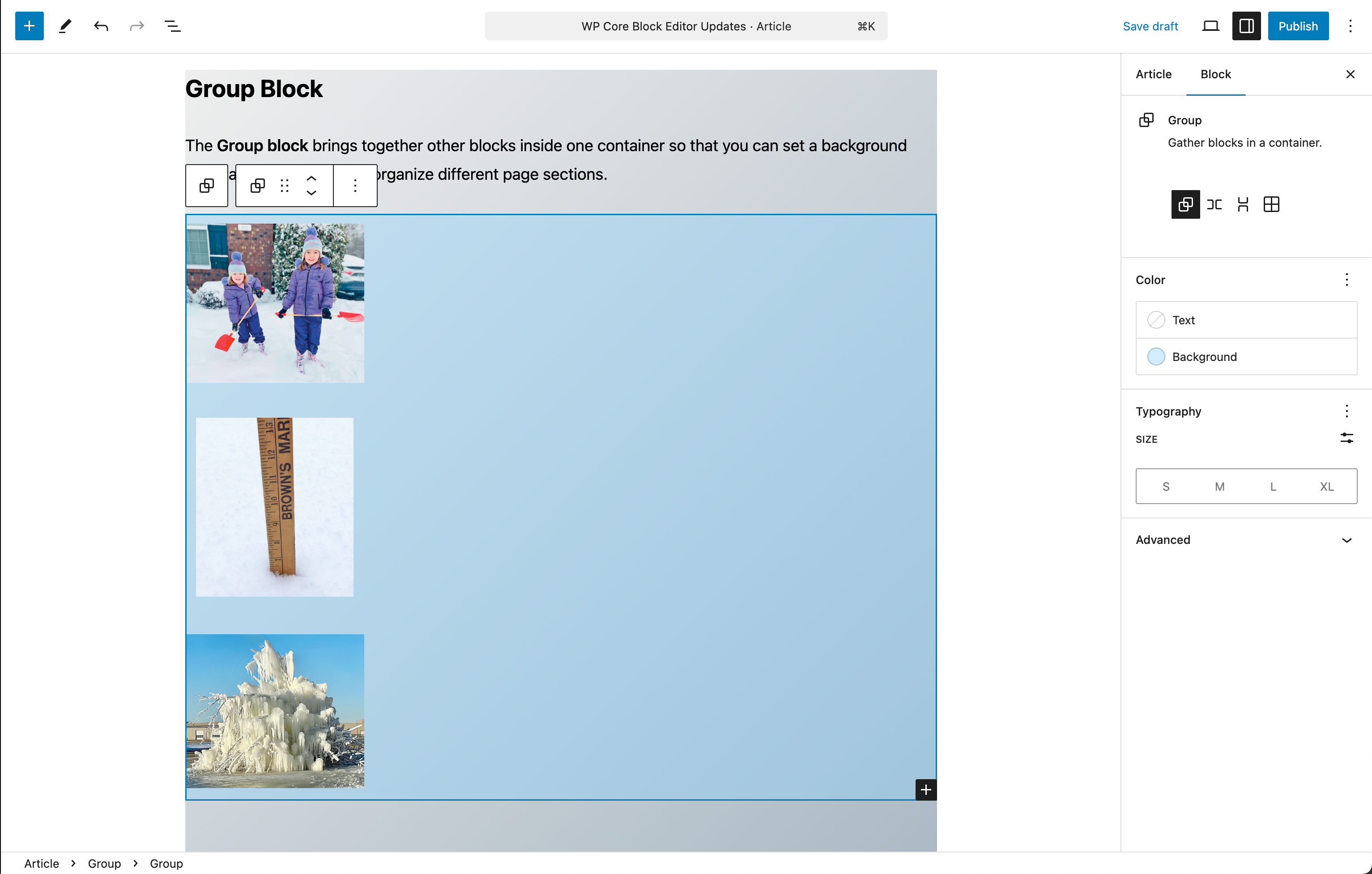
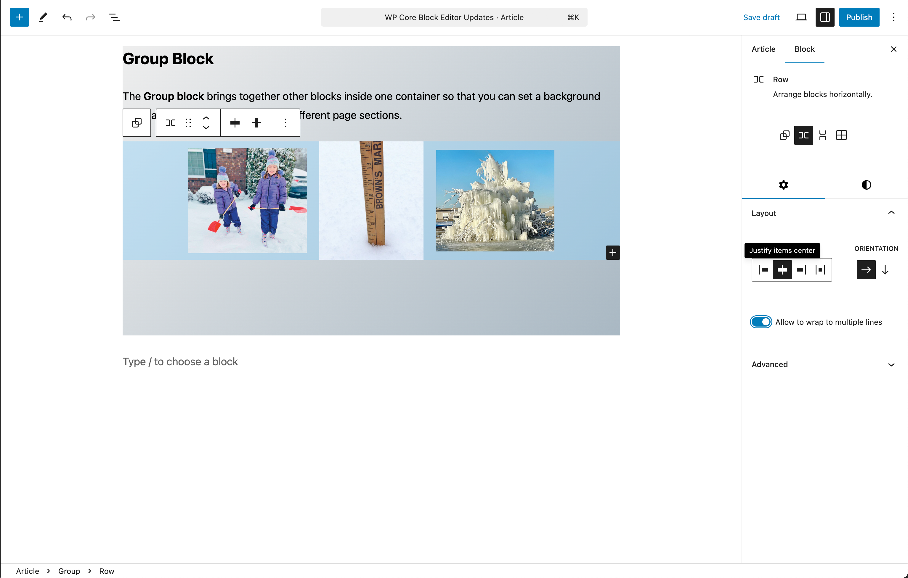
Note that the size of the image content is not altered by the layout settings, but retains the sizing from the settings for each individual image. This is when the “Allow to wrap to multiple lines” option is useful.


Grid Block
In the Layout settings, you can choose the number of columns in the Grid block, based on whether the column widths are automatically or manually sized:
- Selecting Auto will automatically add columns of the specified minimum width to fit the block.
- Selecting Manual will automatically divide the block into the number of columns you specify.
Similar to the Columns block, the number of columns in the grid can be defined by setting a minimum column width or by manually setting the number of columns.


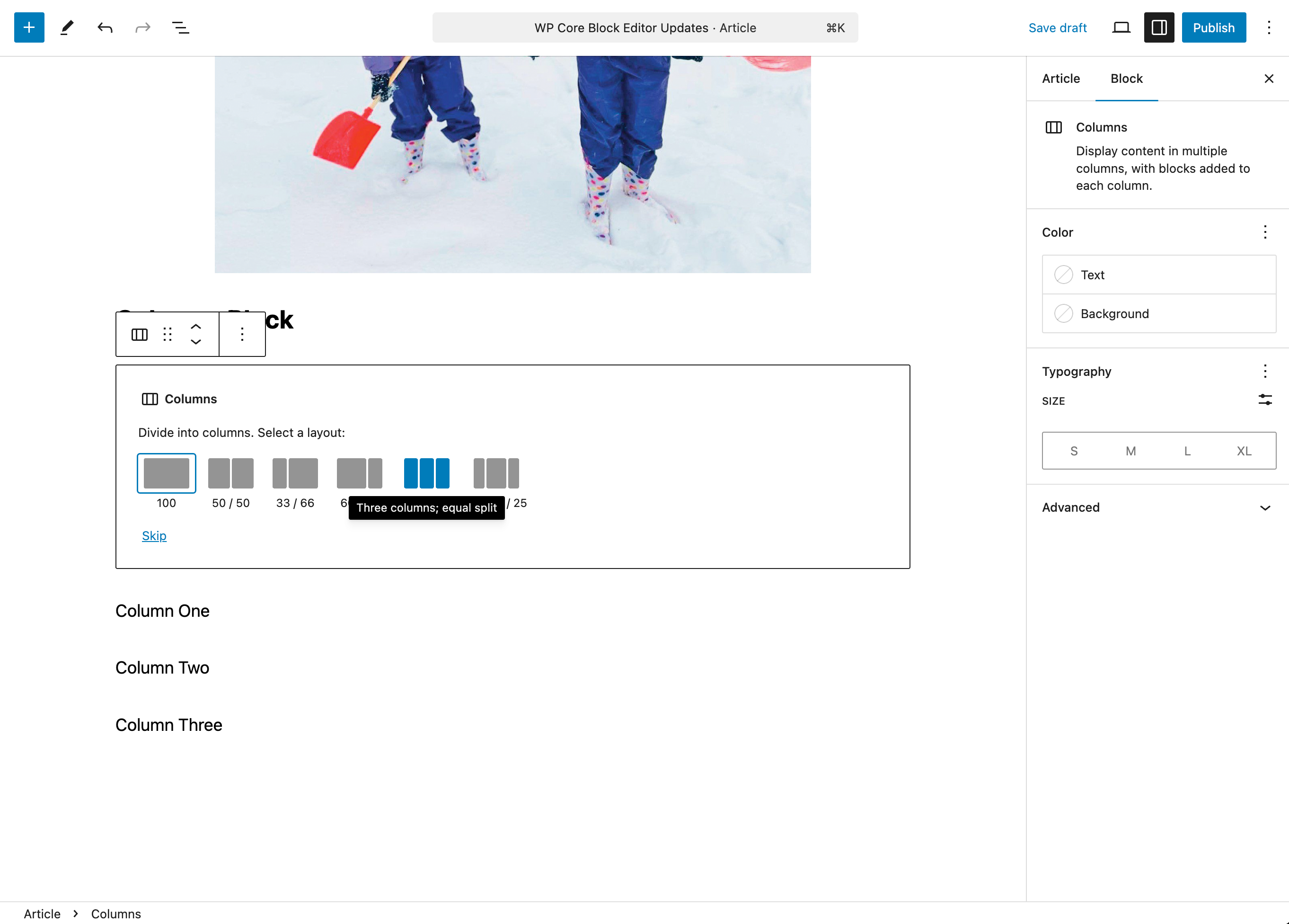
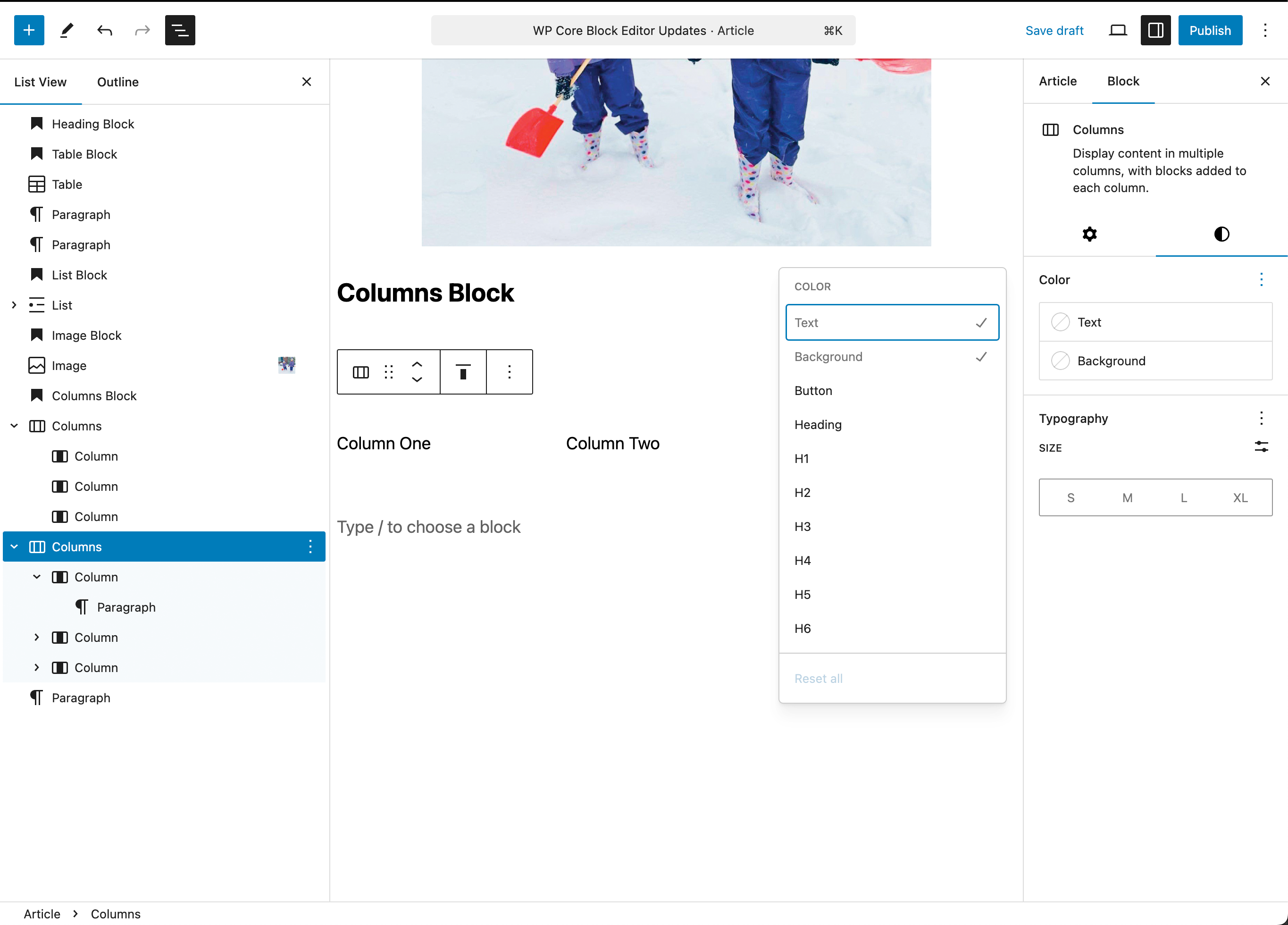
Columns Block
Add a Columns Block
To add an empty Columns block, click the + Block Inserter icon and search for “columns”. Click it to add the block to the post or page. You can then choose the number of columns divisions for the block.
Create Columns from existing Blocks
If you have inserted multiple blocks one after another and you want to turn them into columns, you can follow the steps below:
- Select all the desired blocks you want to turn into columns.
- The floating toolbar will appear. Click the first option on the left side of the block toolbar.
- Under the list “Transform to”, select Columns.
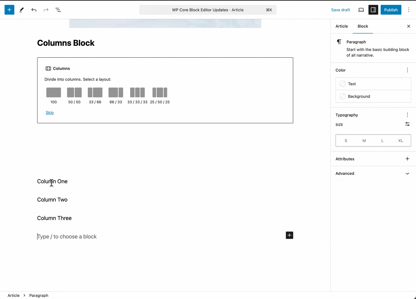
Add content to the Columns Block
You can use the + icon to add any widget to an individual column within the Columns block.

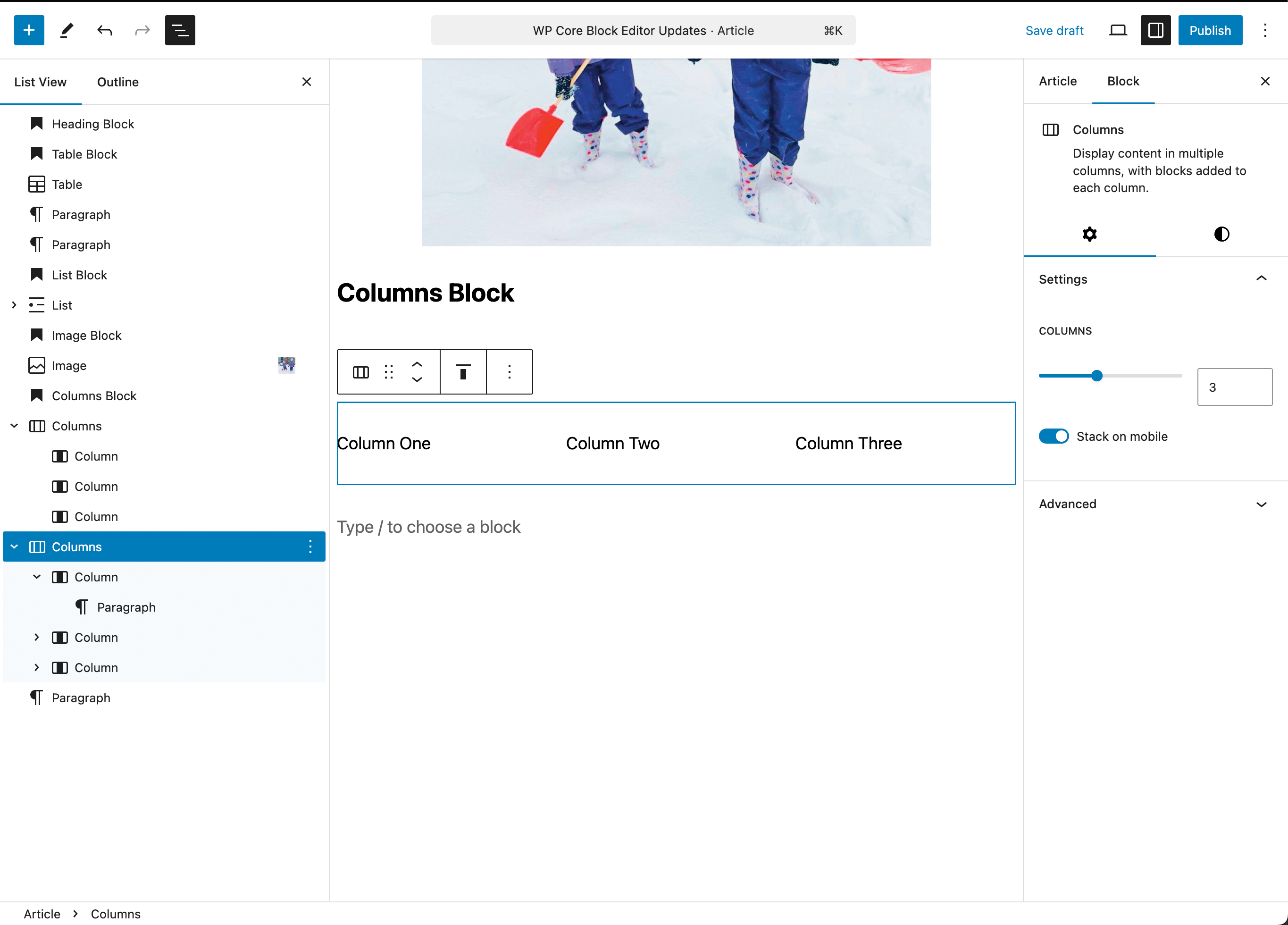
Columns Block Settings
Overall Columns Settings
Here you can change the number of columns in the block, and toggle whether the columns will stack in a mobile view or not. Notice that you can select the Columns block, individual Columns and Column Content using the List View panel on the left.
Similar to other blocks the styles panel allows you to set overall color and typography settings for the Columns block.
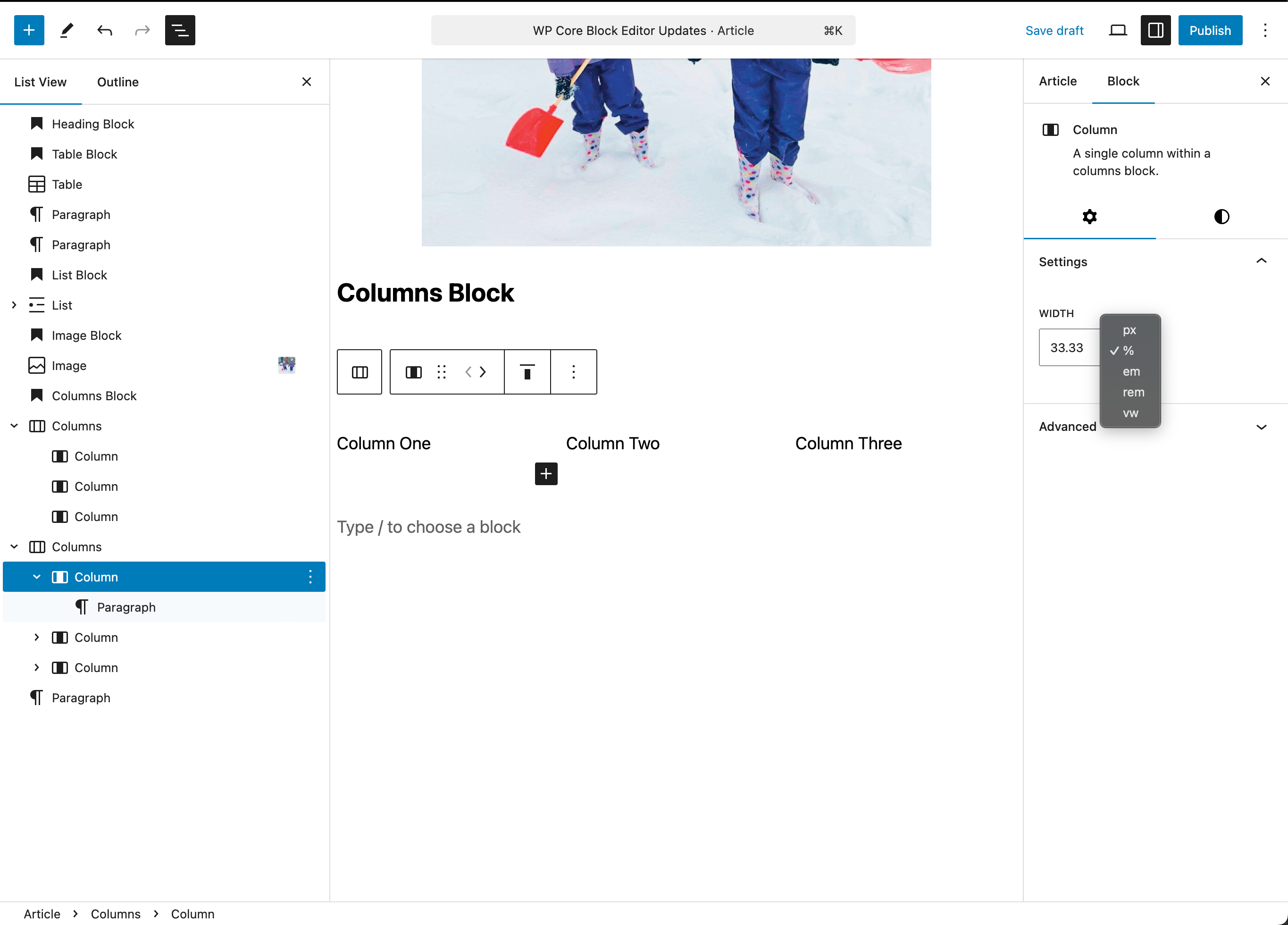
Individual Column Settings
While the same typography and color settings are available for an individual column, you can also specify a specific width using percentage, pixels, em, rem or viewport width values.
Arranging Blocks in the List View
The list view provides a quick and easy way to not only select and target particular blocks to access their settings, but you can also drag and drop any block (including groups, columns, grids, etc.) to alter the order AND the nesting, i.e. you can drag an image from outside to inside a columns block.
This feature allows you to quickly change your layouts by dragging content blocks into and within layout blocks.
Media Blocks
Image Block
Once you add the Image block, you will be presented with three methods to select your image: Upload an image file, pick one from your media library, or add one with a URL.

Once the image has been added, you can change the size directly in the editor. Click the image to reveal the resize handles that look like dots around the image. Then, click on a resize handle and drag the image to your desired size

Otherwise the settings panel in the sidebar provides many sizing options via the Aspect Ratio dropdown.
Aspect Ratio Options
- Original – The same aspect ratio as when you uploaded the image.
- Square – 1:1
- Standard – 4:3
- Portrait – 3:4
- Classic – 3:2
- Classic Portrait – 2:3
- Wide – 16:9
- Tall – 9:16
When an aspect ratio other than the original is selected, the Scale option will be available. Scale refers to how your image fits within your selected aspect ratio with the following options:
- Cover: Your image will scale larger within the space to fill it completely. You will lose content from the image.
- Contain: Your image will scale to ensure the entire content of the image is displayed within the space. The image will resize smaller in order to fit.
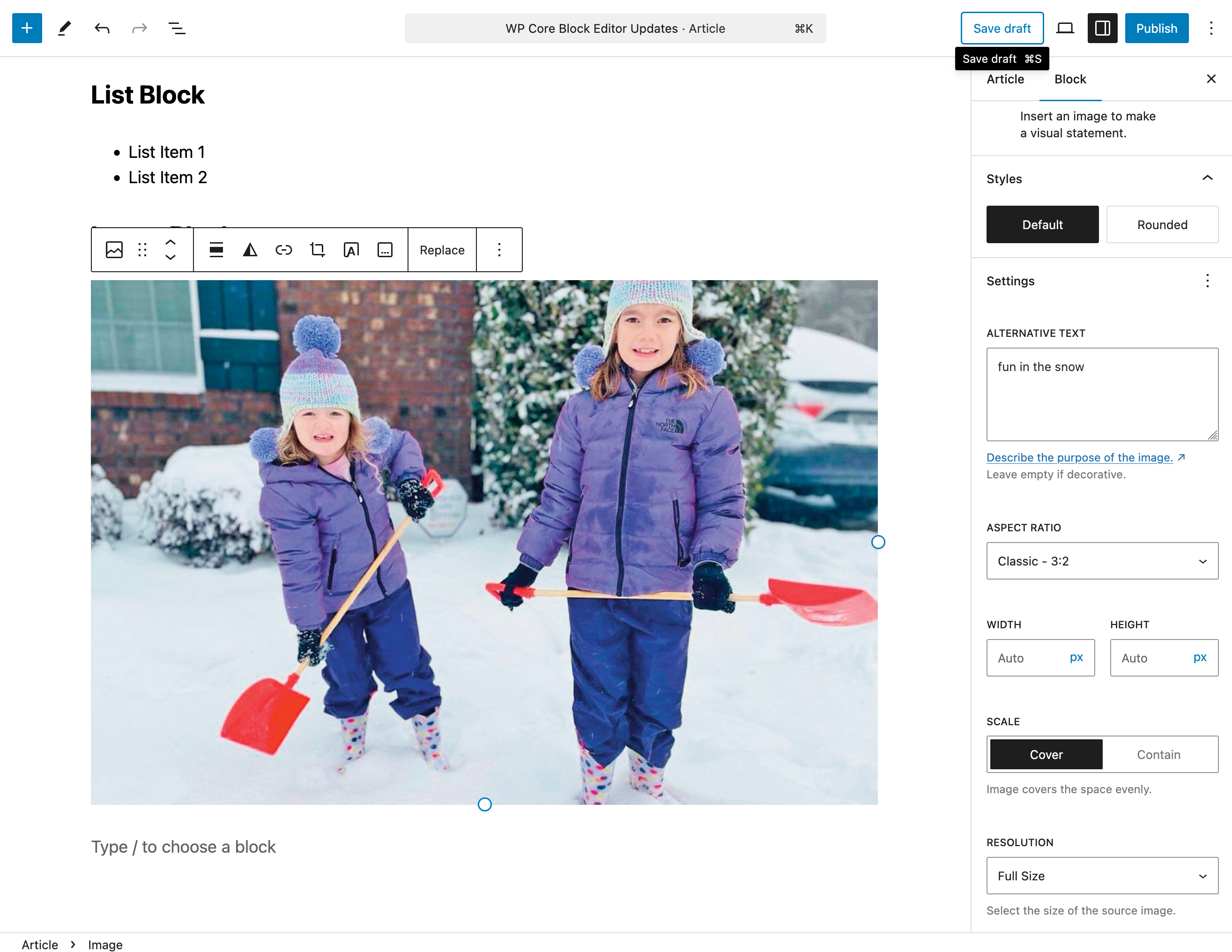

The Resolution setting chooses which size of the original image you would like to display, although it can still be adjusted with the other options.
Gallery Block
The Gallery block contains individual Image blocks for each image and arranges them in an responsive way. Options for cropping, column layout and color options are available. Note unlike a Grid block, the Gallery block can only contain Image blocks.

Using the List View you can easily drag and drop image blocks to reorder them, as well as dragging images from into or out of the Gallery block itself as necessary. Clicking on an individual Image block reveals its settings as described above.


Recent Comments