From Imagination to Pagination
- February 17, 2023
- /Christopher Winders
- /Content, Design, Feature Highlights, General, Media
- /No Comments
|
Click play to LISTEN to the article below
|
Below we provide an overview of article creation on your website, managing images, ads, and reverse publishing content to Adobe InDesign.
Article Creation
- Log in to your WordPress Dashboard.
- Click the ‘Articles’ tab.
- Click the ‘All Articles’ sub-tab.
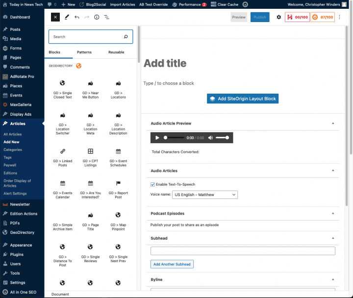
- On the All Articles Tab look for Add New and select the drop down arrow and click on Block Editor.
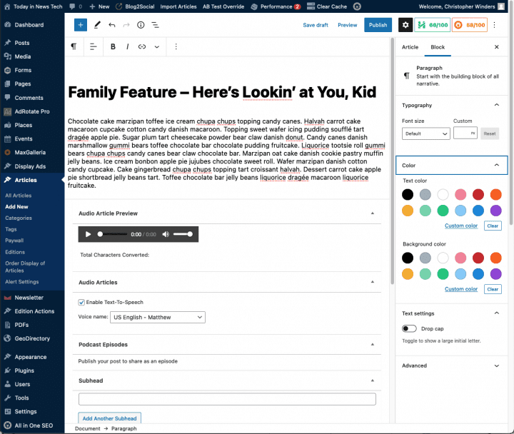
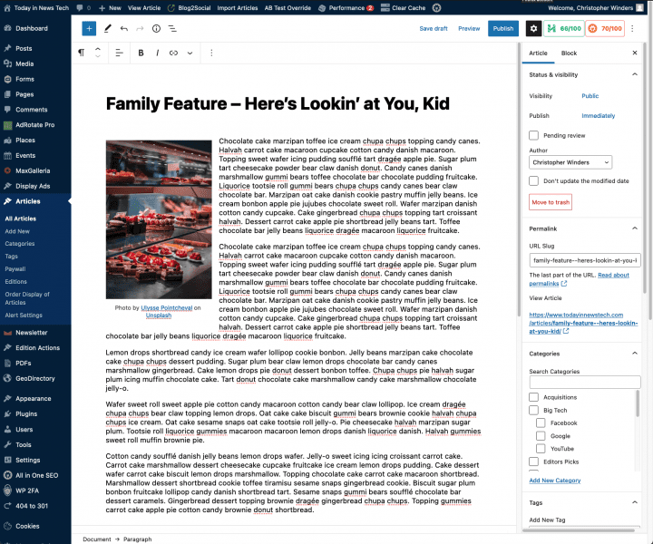
- Start filling in the blanks: enter your article title in the upper field.
- There will already be a Paragraph block below the title where you can enter your body copy.
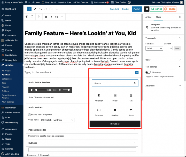
- The + symbol at the top left of the editor will bring up a listing of all available blocks, such as Paragraph, Heading, List, Image, etc. Simply click on one and it will be inserted at the bottom of the content. You can then move the block with the Up/Down arrows in the top options bar.
- This options bar also allows you to adjust font settings and insert hyperlinks.
- As needed, select a category, add tags, and make other selections from the sections below the article. (Each of these sections is explained below.)
- When you are ready, click Pending Review, Publish, or Set a Future Date for Publish. (save as a draft if you’re still working on it).
This is the title of your post for online only. You can use any phrases, words or characters. Avoid using the same title twice as that will cause problems with search results.
You can use commas, apostrophes, quotes, hyphens/dashes and other typical symbols in the article like “Family Feature – Here’s Lookin’ at You, Kid.”
Once you save your draft, WordPress will then clean it up to generate a user-friendly and URL-valid name of the post (also called the “post slug”) to create the permalink for the post.
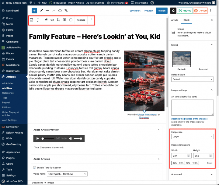
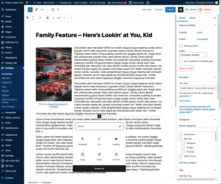
The simplest way to add an image block to your article is to use the Block listing popover. When you hover your mouse just below and existing block, a dark gray + icon will appear. Clicking on the icon will bring up a popover where you can search and/or choose a block to add at that position in the Layout. In the case of images you will choose the Image Block.
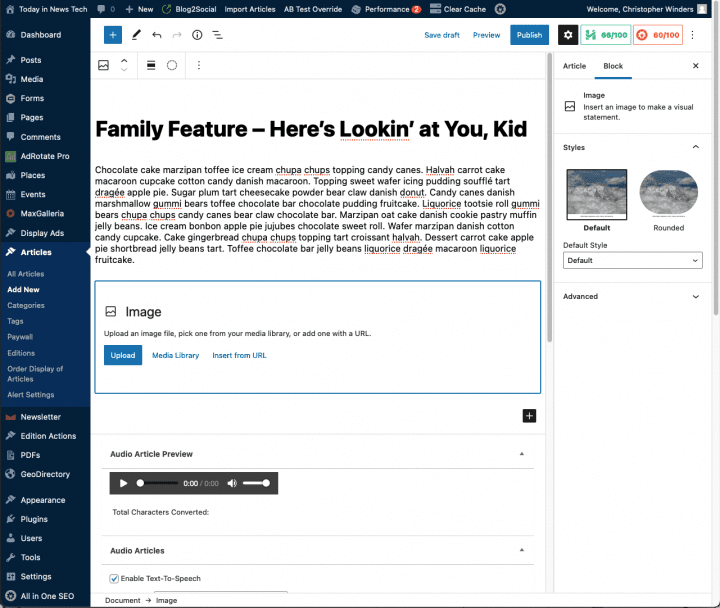
Upon selecting the Image Block, its interface will appear, allowing you to upload a new image, choose one from your Media Library, or insert via a web link.
After you have an image place, you can use the sidebar to resize (you can also resize visually by clicking on the image and adjusting the blue handles on the image itself.
You can also change the vertical position and horizontal alignment which will wrap the body text around the image.
The Image block also includes a caption field by default just beneath the image.
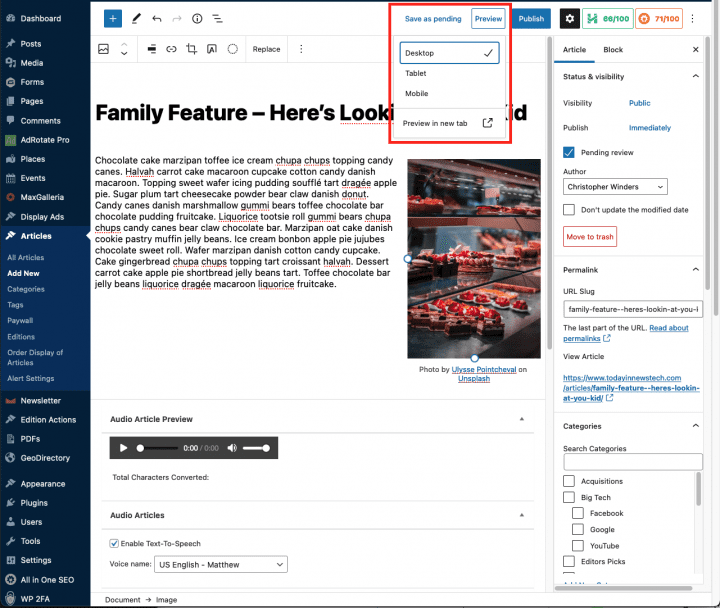
This menu allows you to view the post before officially publishing it. There are several preview options:
- Desktop, Tablet, and Mobile will display a preview directly in the Article editor layed out for that screen size.
- Preview in new tab will open the preview in a new tab with the layout following your browser window dimensions. Note the article will take a bit to load in the new tab as it renders a temporary preview.
This panel contains buttons and fields that control the Status of your post. The main states are Published, Pending Review and Draft.
A Published status means the post has been published live on your blog for all to see. Pending Review means the draft is waiting for review by an editor prior to publication. Draft means the post has not been published and remains a draft for you.
If you select a specific publish status and click the update post or “Publish” button, or you can enter a future date and click the “Schedule” button. That status is applied to the post.
For example, to save a post in the Pending Review status, check the Pending Review button in the status block and then click “Save as pending” (which has replaced the “Save as draft” link) to the left of the review link.
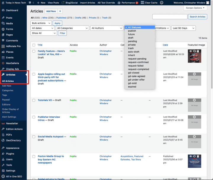
You can view all articles organized by status by going to your website dashboard and Click Articles where you can select a status from the dropdown to filter and sort the list.
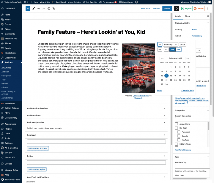
To schedule a post for publication on a future time or date, click “Publish immediately” link, bringing up the calendar popover. Upon clicking a date, the “Publish” button will be replaced by a “Schedule” button.
You can also change the publish date to a date in the past to back-date posts. Change the settings to the desired time and date. You must also hit the “Publish” button when you have completed the post to publish at the desired time and date.
In the Status pane you can also change the Visibility of the article. This determines how your post appears to the world. Public posts will be visible by all website visitors once published. Password Protected posts are published to all, but visitors must know the password to view the post content. Private posts are visible only to you (and to other editors or admins within your site).
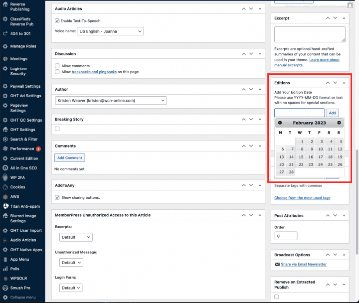
Entered in the YYYY-MM-DD format for your normal edition or a name for special sections. This will automatically create a page that you can set in the customizer panel as your most recent edition, if you want to limit the front page to only a specific edition’s articles. Essentially the Edition acts as a container for all the articles (or in the case of special sections, pdfs) assigned to it.
Advanced Layout
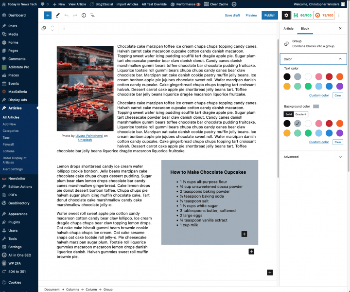
Starting with an article in progress, the headline, body text and a featured photo have been placed. Beneath the second paragraph we will use the Columns block to split the main body text to the left, wrapping around the recipe (using a List block) aligned right.
First use either the + button in the options bar at the top of the article editor, or click within a Paragraph block and hover near the bottom until the + button appears.
From the block search popup choose Columns.
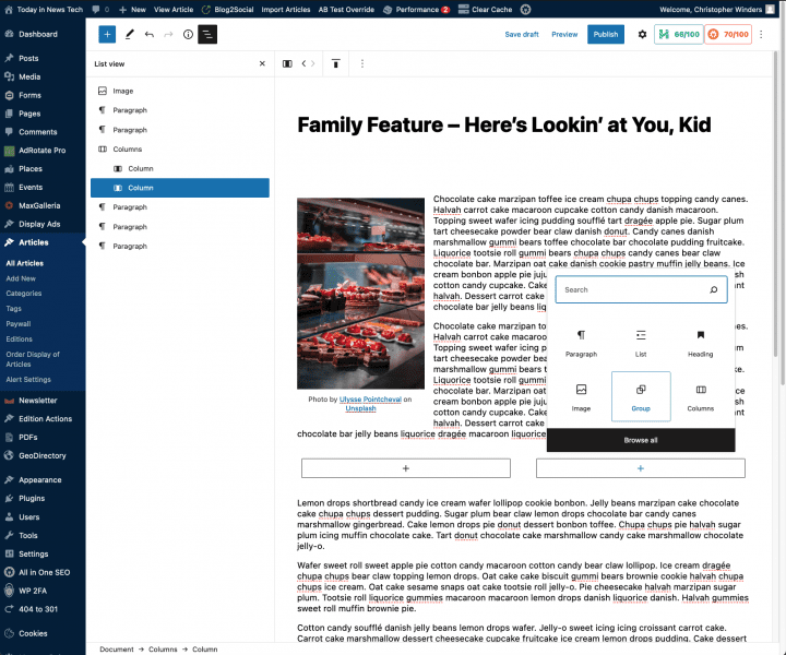
From the variations panel will will chose the 50/50 split to start with.
Clicking on the angled three-line menu button in the top options bar will reveal the Block outline. This allows you to more easily find and select nested blocks (which will be how we continue building the info box).
Select the right-hand column via the outline or directly (there is also a clickable bread crumb ‘Document >> Columns >> Columns’ at the bottom of the editor that displays which block is currently selected.
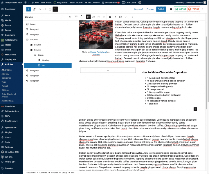
Within this right column we will add a group. This creates a different level of control so that we can add block colors and styling more easily.
We will now add the info box content by clicking the + button while the group is selected: a heading and an ingredients list.
To set this content apart apply a color to the group block.
The last step is to move paragraph blocks from the main article flow into the left column to complete the layout. This needs to be done via copy and paste to ensure the content is placed into the correct block.
Media Management
The Media Library contains all media types from images to PDF’s that are uploaded and used on your website. In this section we will look at how to set captions, alt-text, as well as crop, flip or scale an image in your library.
To reach the Media Library, go to your Admin Dashboard and click Media in the left-side menu.
This will take you to the main library page where you can view thumbnails of your media items.
Note that you can upload single or multiple files to the library by simply dragging and dropping from your computer onto the Library page. All uploaded images are then processed creating various sized options for use in different parts of the site.
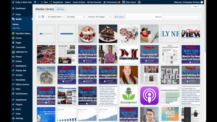
Once a media item has been uploaded to the library it can be inserted into an article using the Image Block.
You can also do some basic editing of an image directly in the Media Library.
Clicking on any thumbnail in the library will bring up the details for that media item.
Here you can set Alternative Text, a caption and description which will remain set wherever the item appears, although this can be overwritten on per-case basis.
Below the image there is an Edit Image button which will allow you to permanently edit the image itself.
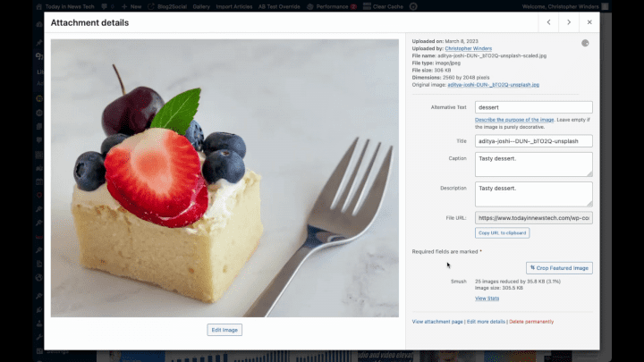
Once you click on the Edit Image button a new page will appear with options to crop, rotate, flip or scale the image.
To crop the image simply click and drag your pointer over the image to create a selection crop box with handles for easy adjustment. If you are satisfied with the crop selection, apply it by clicking on Crop button above the image and then click Save.
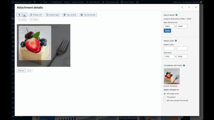
Rotation and flipping can be adjusted with their respective buttons above the image. Be sure to click the Save button to apply any edits.
Finally you can set the image dimensions directly and apply a new scale on the right.
Note you can select to have these edits apply to all the auto-generated image sizes, or just the thumbnails.
The NextGEN Gallery plugin allows users to upload a collection of photos in the back end of the website and organize them into a gallery, much like our previously-supported photo gallery plugin, MaxGalleria. The big advantage to NextGEN Gallery, aside from the general ease of use, is the ability to display the same gallery of photos in multiple locations and in different layouts each time.
I’ll demonstrate what I mean below. First, let’s create our first gallery using NextGEN Gallery.
1. Create the Gallery
You can actually create a NextGEN Gallery from any page or article editor, but for the sake of this tutorial, we’re going to keep it as simple as possible and start from the dashboard.
Find the NextGEN Gallery item on the dashboard menu and navigate to the Add Gallery/Images page.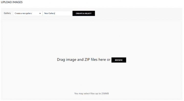
You’ll be presented with a page asking you to select which gallery you want to upload photos to. Since we have not yet created a gallery, the only option for us is to “Create a new gallery.”
I’ve entered the name “New Gallery” and clicked Create and Select.
Once the “New Gallery” is selected, click the “Browse” button to upload some photos from your computer and add them to the gallery. The progress is visible as each photo is uploaded and saved to the gallery.
Once your photos have finished uploading, you can navigate to NextGEN Gallery -> Manage Galleries to edit the gallery you’ve created or any of the photos included within.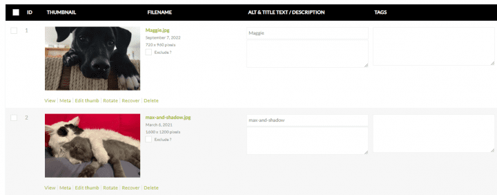 You’ll notice that we did not at any point select a “template” or adjust any settings that determine how this photo gallery will appear on a page or within an article. That is because, unlike with MaxGallery, a single photo gallery in NextGEN Gallery can be displayed in various places each with a different template.
2. Placing a Gallery
In this example, I’m going to place our first gallery inside of an Article named “Pet Photos of the Week.” We’ll assume this publication is highlighting some photos of their readers pets in the new article.
If using the classic editor, you’ll see the option to Add Gallery just above the toolbar. If using the block editor, you’ll want to add a new Block and search for the NextGEN Gallery block.
Once you’ve added the block and clicked Add Gallery, you’ll see a page asking you to select which Gallery (or galleries) you want to add to the page. Below that, there are a number of gallery templates available to choose from that determine how your gallery will display.
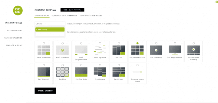 These templates include basic options for thumbnails, slideshows & image browsers, as well as the paid Pro versions of these templates. All are available to OHT customers.
Once you’ve selected a template, you can click the Customize Display Settings tab to further adjust the gallery settings.
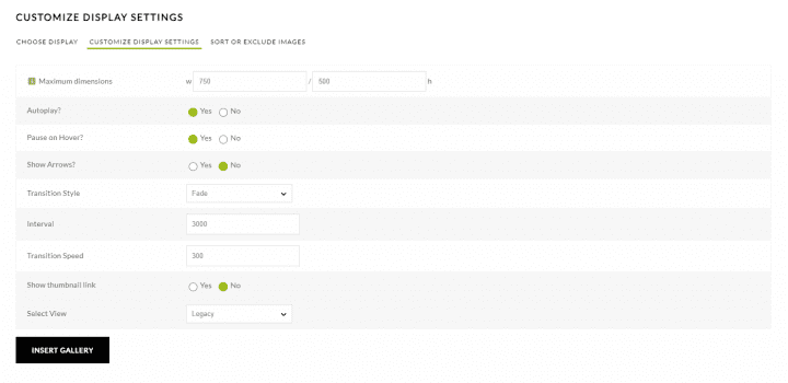 I went with the simple Pro Thumbnail Grid to create the gallery below.
 That is all there is to it! If I wanted to display the same set of photos in a different format somewhere else on the website, I would follow the same process: click Add Gallery from the NextGEN block/toolbar and select your existing Gallery of Photos, then choose the format you want to display it!
Reverse Publishing
- From your website’s dashboard look for Reverse Publishing in the listing on the left. As you hover your mouse a submenu will appear then click on Reverse Publishing.
- Here is where your website’s article content can be exported for a particular edition and filtered by category.
- You want to ensure that your character and paragraph style names are identical to those in your InDesign template.
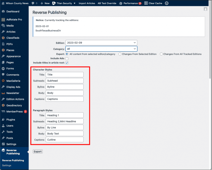
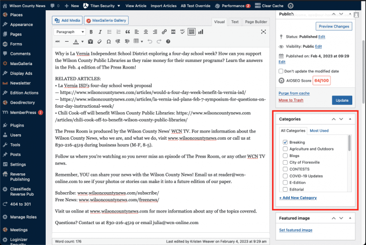
- Then select the addition date and either all categories or you can select a single category for export.
- Once you have made your selections, click on the Export button.
- This will prompt you to save a zip file to your computer.
- Once downloaded, extract this zip file and you will then have a folder containing and XML file and all images associated with the articles.
- Open your InDesign template and under the file menu choose Import XML.
- Select the XML file in the folder extracted from the zip file download.
- Make sure the Show XML Import Options button is ticked as well as Merge Content.
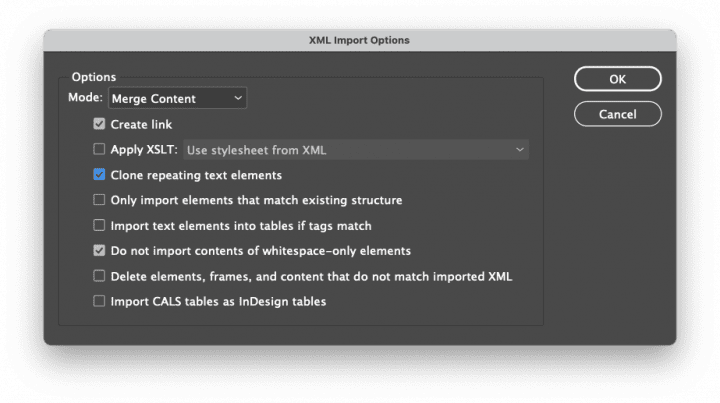
- On the import options window tick the following buttons:
- The Create link option is necessary so that if you export updated content from your website and re-import the XML into InDesign, all your content will update automatically.
- Click OK.
- Once the XML is imported the Structure pane will appear to the left of your document containing the Root tag. Click the small arrow to the left of the tag to reveal the contents of the XML import.
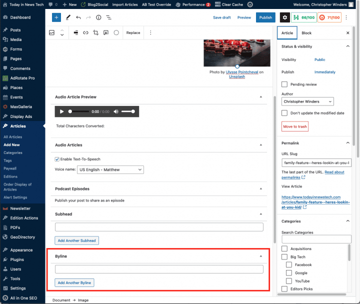
- You can then click on the arrow next to individual stories to reveal the individual items such as Title, Byline, Body Text, and Images.
- Depending on your layout you can then drag these elements to the appropriate frames in your template.
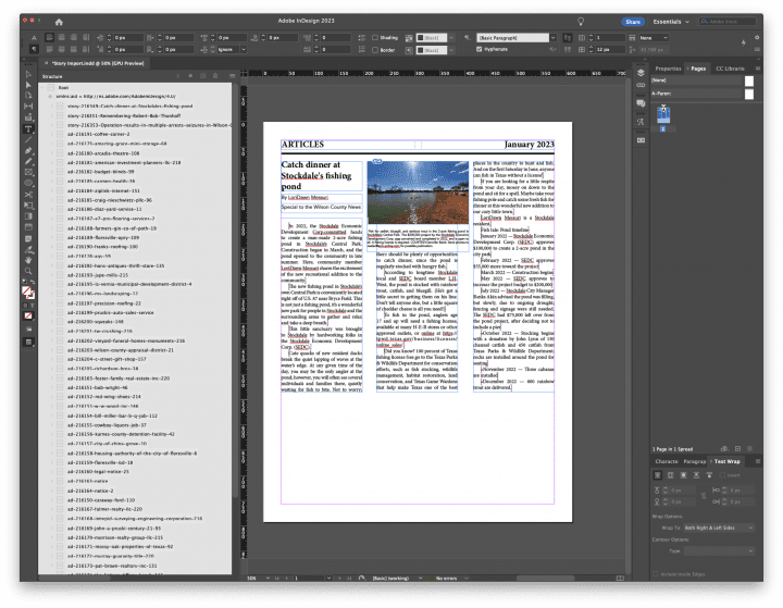
- From your website’s dashboard look for Reverse Publishing in the listing on the left. As you hover your mouse a submenu will appear then click on Reverse Publishing.
- Here is where your website’s article content can be exported for a particular edition and filtered by category. In addition there is a checkbox labeled Include Ads. This will be the focus of our demonstration. Note that ads are not categorized and also cannot be exported without including article content.
- Once you’ve selected the edition and filtered by category if needed, make sure the Include Ads checkbox is ticked and click the export button.
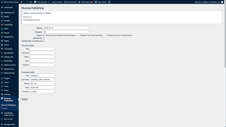
- This export may take some time depending on the amount and number of articles and ads to be downloaded. The export consists of a zip file containing all of the images and ads plus an XML file for import into InDesign. Once the zip file is saved to you computer, extract it to a folder.
- Open your InDesign template.
- Under the File menu choose Import XML. In the window select the XML file in the folder extracted from the downloaded zip file.
- Make sure the Show XML Import Options button is ticked as well as Merge Content.
- On the import options window tick the following buttons:
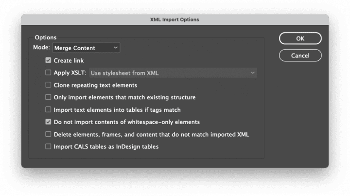
- The Create link option is necessary so that if you export updated content from your website and re-import the XML into InDesign, all your content will update automatically.
- Click OK.
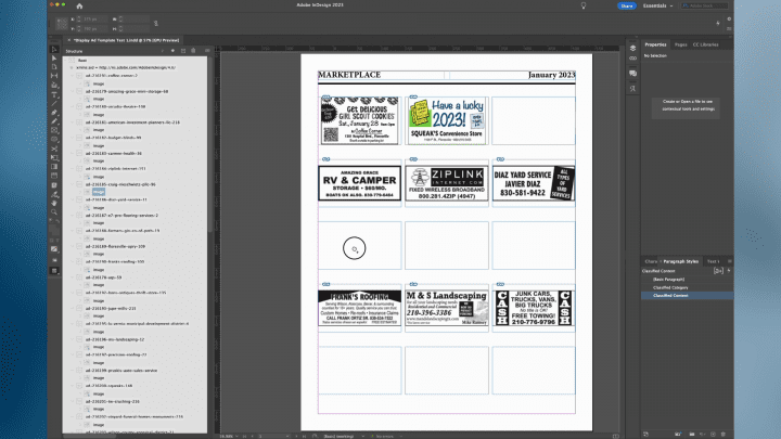
- Once the XML is imported the Structure pane will appear to the left of your document containing the Root tag. Click the small arrow to the left of the tag to reveal the contents of the XML import. You should see several tags, all beginning with “ad” followed by an ID number and the advertiser’s name.
- Click the small arrow to the left of an ad tag to reveal the image associated with that ad. You can also Alt- or Option-click on one of the small arrows to open them all at once.
- You can then simply drag the icon to the left of each image tag into a frame in your template for final layout.
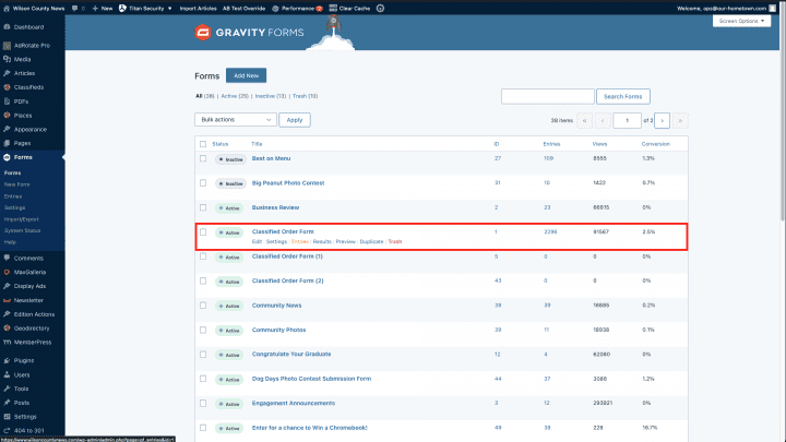
- From your site’s dashboard go to Forms and then the sub-item Forms where you will see all those being used on the website.
- Here we have a Classified Order Form with the submitted entries. You can click on Entries to view the individual submissions.
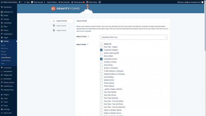
- To export click on Import/Export in the Forms submenu.
- Here you will choose the same form, Classified Order Form, and tick the Classified Category and Classified Content checkboxes. Then scroll to the bottom to select a date range. Finally, click the Download Export Files and save to your computer.
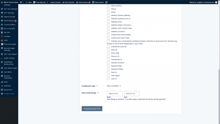
- Next we will open this CSV file in Microsoft Excel for some cleanup and export to the XML file to be imported into InDesign.
- This process includes removing the column headings, sorting by Classified Category, removing any extraneous formatting, such as extra line breaks, etc. and lastly deleting all but one instance of each category to act as a heading.
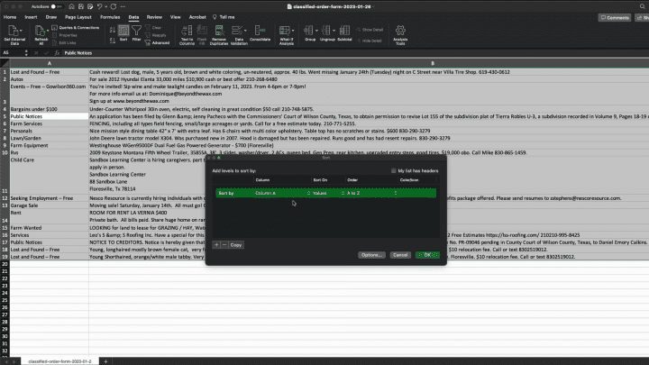
- We will then export this file by going to File then Save As. In the Save As window select Excel 2004 XML Spreadsheet as the File Format and click Save.
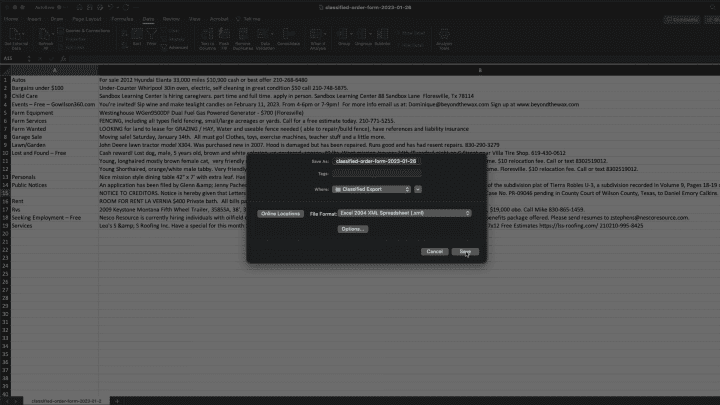
- Open your template in InDesign. Here I’ve created a simple multi-column layout with a header and paragraph styles to format the Classified Category and Classified Content.
- Go to File and choose Import XML and select the file exported from Excel. The default, Merge Content is fine here, so click Open.
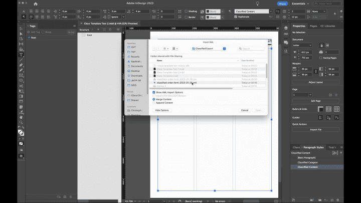
- The import options can also normally be left at their defaults, so you can click OK.
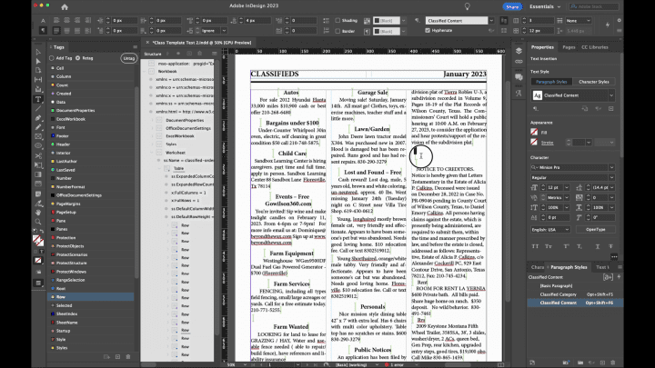
- The Structure pane will open next to your document with the XML content.
- In the Structure pane click on the small arrow next to Workbook to reveal its contents. Then click on the small arrow next to Worksheet, which reveals the Table containing the actual classifieds data.
- Drag the icon next to Table onto the text frame.
- There is a bit of work here removing extra lines brought in on import, so we will quickly delete those and then apply our paragraph styles to complete the process.
- ← The Secret to Growing Papers: Give the readers what they want
- SEO for Newspapers LIVE WEBINAR set for March 17th →


Recent Comments