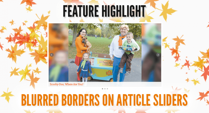
Feature Highlight: Blurred Borders on Article Sliders
Our-Hometown’s Article Slider widgets are a great way to prominently feature some of the more important or interesting stories on your website. However, not every important or interesting story has a high-quality image associated with it, and using low quality or oddly-sized images can result in an ugly-looking slider that seems to zoom in on a random area of whatever image is used – until now.
We are happy to introduce the Blurred Border option to our Article Slider widgets! With this option enabled, the slider will display the entire photo regardless of the height/width ratio, and will use an enlarged, blurred version of the image in the borders to create a more aesthetically pleasing effect in situations where a perfect image is not available.
This feature is NOW AVAILABLE on all of our websites! If you’re interested in enabling this feature, use the Customizer Tool to navigate to your Slider Widget, and mark the checkbox titled, “Enable Blur Border.” (See how.)
Of course, you can always Ask Us To Enable Blurred Borders for you!


Recent Comments