Tips for Improving Mobile Presentation of your Website
|
Click play to LISTEN to the article below
|
At Our-Hometown, we’ve continually emphasized the importance of creating a digital product that can continue to grow and thrive, even should the traditional print newspaper ever go out of fashion. The COVID-19 pandemic put the spotlight on this issue earlier this year as many publishers faced issues with printing and distributing during quarantine, but the shift to mobile web browsing has been a steady trend for over a decade now. According to Statista, roughly 50% of all web traffic worldwide comes from mobile devices.
For this reason, it is important to make sure that your website looks presentable when accessed from a mobile device. You wouldn’t want to turn away any potential readers because your website is too difficult to navigate on their phone. Fortunately, all websites hosted on Our-Hometown’s WordPress Platform are built upon a fully-responsive theme, which means that the content and layout will automatically adjust itself to fit the size of the device the website is being accessed from. In most cases, the responsive nature of our websites is enough to ensure an attractive presentation on mobile devices right out of the box, but we do have a few tips on how you can maintain a quality mobile design moving forward.
 1. Use the Customize Tool to Preview Changes
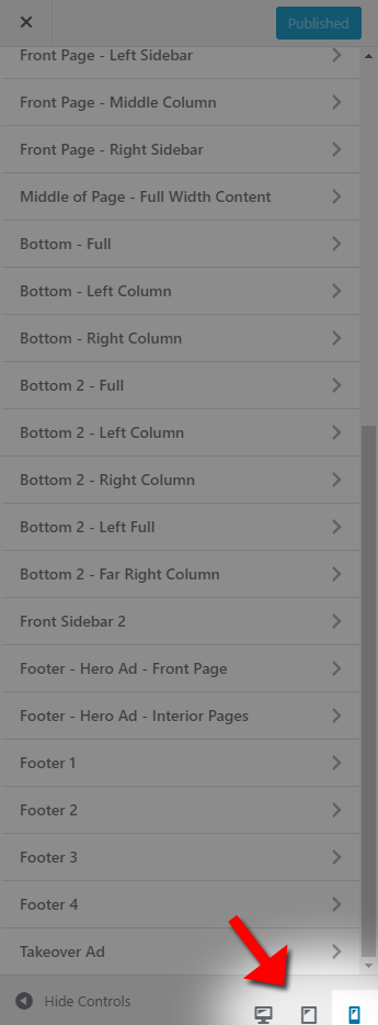
The Customize Tool is a super-powerful feature that lets you quickly edit many of the major components on your website with a visual real-time preview to guide you as you go. You can change colors and fonts, edit navigation menus, and re-arrange or distribute various widgets throughout your website’s template. However, you may not have realized that this tool also gives you the option to preview your changes on different kinds of devices: desktop, tablet, and mobile.
With the Customize tool open, look to the very bottom of the menu and you’ll find three icons, each representing one of these device types. By default, you will be previewing your changes on a desktop screen, but you can quickly switch between previewing the website on any of the three. The three generic preview sizes here should suffice in most cases, but if you’d like to preview your website using a specific device or resolution, you can use your web browser’s Developer Tools to enable Device Mode.
Here is how to do this with Google Chrome; other browsers may have different instructions.
2. Efficient Widget Placement
Contrary to older, now-obsolete configurations in which the mobile and desktop websites were two completely different entities, current responsive technologies allow for a single website to display differently on various devices and screen sizes. Put simply, these responsive web layouts work by collapsing content from a horizontal view to a more condensed vertical view to fit on your mobile device. However, it is important to understand that the same content still exists regardless of what kind of device the site is being viewed from; so when you’re deciding how to distribute article blocks, AdRotate ads and other widgets throughout your site, be cautious of where each widget will show up on mobile.
When the content on your site has to collapse into a vertical view for mobile, it does so in order of where it is displayed on the site: from left-to-right, top-to-bottom.
Example 1: An attractive tile ad may work perfectly when positioned as an AdRotate Widget at the top of the right sidebar when viewed on desktop. However, when viewed from a mobile device, the right sidebar is actually much further down the page because it is the right-most block of content after the header & logo areas, the full-width area, the main slider area, and the optional left-column widget area(*). Any widgets placed in those widget areas, as well as any article/content from the page being viewed, will be displayed before anything in the right column.
Example 2: A three-column layout utilizing the “Front Page – Left Sidebar”, “Front Page – Middle Column” and “Front Page – Right Sidebar” widget areas (*) may make a ton of sense when viewed on a desktop PC, but keep in mind that the “Front Page – Left Sidebar” is going to display above the “Front Page – Middle Column” on mobile devices. If you elect to put a “Featured Stories” section in the middle column, and a less-important category in the left column, it will look a little out of place on mobile when visitors see the less-important articles before the Featured Stories.
(*Note: Available widget areas may vary depending on your site’s theme and layout).
None of this is to say that you shouldn’t utilize the various widget areas on your site. There are ways we can manipulate the collapsing behavior of different widget areas using CSS or JavaScript to correct issues where items appear out of order on mobile, and you can send in a support ticket by e-mailing ops@our-hometown.com if you ever need help with that. However, it is helpful to keep these things in mind when laying out your website.
3. Using Mobile Ads & Groups with AdRotate Pro
Perhaps the most important thing you should do when optimizing your website for mobile devices is to make sure that advertisements on your site look okay on smaller devices. Some ad sizes like standard tile ads and even some skyscraper ads will be fine on mobile because the images are still able to display at their usual size. However, elongated banner ads like Leaderboards that are 728 x 90 pixels or bigger generally do not translate well, because they are too wide and must be condensed so much to fit on the screen that they become illegible to the reader. We want to make sure that your advertisers are getting the best bang for their buck and keep coming back with more ad orders; so let’s look at how we can use AdRotate Pro to set up mobile-only ads that take the place of these leaderboards on mobile devices.
You’ll need to create an Ad Group for your Leaderboard banner ads if you don’t already have one. If you do already have one, edit the existing Leaderboards group. Under the Advanced section, make sure to mark the Mobile Support checkbox to enable mobile support for this group. This tells the ad group to check each ad in the group and only display the ones that are configured to display on the device being used to access the website.
Once your group is created, you need to place an AdRotate Group Widget in the desired location on your homepage using the Customize Tool, and select your new group. If you edited an existing group, your group widget is likely already on the page.
Now you need to assign some ads to this group. You may have noticed when creating advertisements in AdRotate Pro that each ad has an Advanced section where you can select which devices and operating systems the advertisement should show up on: Desktops/Laptops, Smartphones or Tablets. You can also filter the ads by operating system instead of device type if you choose. Remember, these settings are only applied when the Advert is displaying inside of an Ad Group that has Mobile Support enabled.
If you select the “Desktops/Laptops” option while disabling the Smartphones and Tablets option, this advertisement will only show when the visitor is using a desktop or laptop to view the website. Alternatively, if you select “Smartphones” and “Tablets” while disabling the Desktops/Laptops option, then your ad will only show up on mobile devices.
Using these settings, you can assign your full-size 728×90 Leaderboard Advertisements to the Leaderboards group and set it up so that they only show up on Desktops/Laptops. Meanwhile, if your advertiser is able to provide a smaller “mobile ad”, you can set up another Advert to display only on Smartphones & Tablets, and assign it to the same Leaderboards group. As long as every ad in the group is configured properly, full-size leaderboards will only ever show on desktop, and smaller easy-to-read versions will show up on mobile devices.
If you have any question about making adjustments to how your site displays on mobile, reach out to our support team at any time by emailing ops@our-hometown.com!


Recent Comments