Note: This is an available option with Our Hometown’s WordPress platform. If you don’t see it as part of your menu options, you may need to submit a ticket to request turning it on.
If you’d like to use your new gallery in a post or page, you can grab the shortcode in the bottom right of your Gallery Edit page, or use the “Add Gallery” option in the TinyMCE for your post.
From Galleries you have several options. You can go to your Galleries overview page, import a NextGen Gallery into MaxGalleria, adjust your MaxGalleria defaults, or get Support.
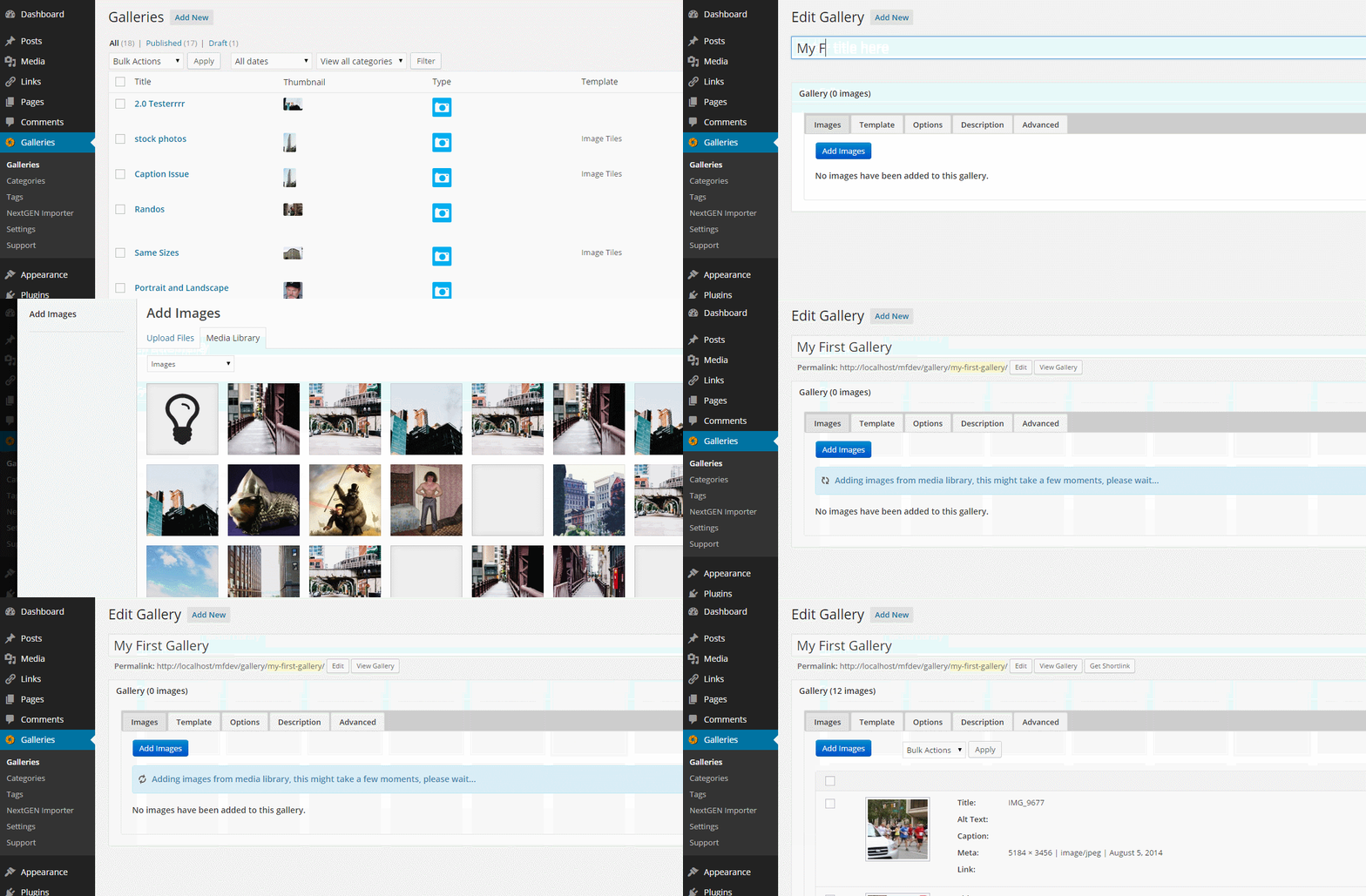
For now, let’s take a look at the Galleries page. Once there you can see your entire list of galleries as well as Add New galleries. Click Add New.
Adding Images
When you first get into your Gallery editor you’ll be prompted to select an Image or Video gallery. Currently MaxGalleria does not support galleries with both images and videos in the same gallery. First, create a title for your gallery. In this example we’ll use “My First Gallery.”
Adding Images is the same as in a post or page. Using the standard WordPress media library you can add previously added images or upload new images to your gallery. The larger the image size, the longer it will take to load so be patient as the images are getting loaded in.

Once the images have loaded you could press Publish and be done, or you can check out the other gallery options. We’ll get to those in a moment, but let’s talk about Videos.
Adding Videos
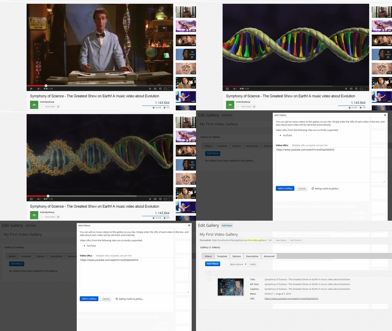
Much like Images, to add Videos, just click “Add Videos” and you’ll get a similar lightbox. Straight out of the box you’ll have the ability to add YouTube videos to your gallery by copying and pasting the video URL. You can add multiple videos at a time, one URL per line.
After clicking “Add To Gallery” your gallery will refresh and a thumbnail from the video or videos will appear as your gallery thumbnail images.

Adjusting Gallery Settings
With the core of MaxGalleria, you have the Image Tiles gallery ready for use. Below are the basic options available to both Video and Images in the Tile layout:
Gallery Skin: MaxGalleria comes packaged with a few standard skins. Currently there are, No Border, Picture Frame, Portal, Portal Dark, Standard, Standard Dark, Tightness and Tightness Dark. Each skin is different in some way, but if you can’t find one that suits your gallery, you can make your own (more on that later).
Thumbnail Columns: Depending on how many videos or images you have in your gallery you may want a different amount of columns. MaxGalleria defaults to five columns, but you can choose anywhere between 1 and 10. Whatever column selection you make, your gallery will stick to that and is responsive, so you’ll have the same number of columns on all devices (larger numbers will adjust automatically on mobile).
Thumbnail Shape: Three options here with Square, Landscape and Portrait. Landscape is especially nice for videos which tend to be in a 16:9 ratio already, converting well to the Landscape shape.
Thumbnail Captions Enabled: For each image you have the ability to add/edit captions. If you’d like those captions to appear when the gallery loads, you’d want to check the checkbox for this option.
Thumbnail Click Opens: End result of a user clicking the thumbnails in the gallery. Options are Lightbox Image, Image Page (Attachment Page), Image Link (the link you’ve set for that image) and Original Image (direct URL of image).
Thumbnail Click New Window: For all options other than Lightbox Image, this indicates where the link of the thumbnail will be opened, a new window or the same window. Unchecked it will open in the same window.
Thumbnail Custom Image Class: Adds a class to every image.
Thumbnail Custom Image Container Class: Adds a class to the image container.
Thumbnail Custom Rel Attribute: Changes the Rel Attribute of the image. The default allows clicking prev/next inside the lightbox to get between the images.
Lightbox Captions Enabled: Much like the captions above, this indicates whether or not, when the lightbox is open, if the captions will show.
Images Per Page: To have video or image tiles appear on more than one page, enter a number here to turn on pagination and to indicate the maximum number of images/videos that should appear on each page.
Lazy Load Enabled: Allows images to be loaded as needed as they come into view in the browser; it increases page load times especially for pages with large images or with a large number of images in a gallery.
Lazy Load Threshold: The number of pixels above the image when lazy loading should begin. The default setting is 0 or none.
Magnific Popup Options
(These settings apply when Thumbnail Click Opens is set to Lightbox Image.)
Align Top Enabled: This will align the top of the image to the top of the page rather than center to image vertically.
Close on Background Click Enabled: Will close the lightbox when the user clicks on the lightbox background.
Close with Escape Key Enabled: Closes the lightbox popup when the escape key is pressed.
Fixed Content Position: The ‘Auto’ selection will set the lightbox’s popup position to be fixed (it can not be scrolled up or down) if the browser supports that property. Selecting ‘On’ will set the popup position to be fixed even if the browser does not support it. Selecting ‘Off’ will allow the lightbox’s popup to be scrolled up or down.
Hide Close Button: Removes the close button that appears on the top right of the lightbox popup.
Lightbox Captions Enabled: Will display the image’s caption below the image in the lightbox.
Overflow Y: When Fixed Content Position is set to ‘Auto’ or ‘On’ this option will display a vertical scroll bar when it is set to ‘Auto’ or ‘Scroll’.
Popup Custom Class: Adds a class to the popup that can be used for adding CSS styling to the popup.
Removal Delay: Specifies the amount of time, in milliseconds, before removing the popup.
Retina Images Enabled: This option allows for the display of high resolution images in place of normal resolution images on high-dpi screens with different a devicePixelRatio. To accomplish this first add normal resolution images to a gallery. Then upload matching high resolution images directly to the WordPress media library. The high resolution images should have file names ending in ‘@2x’; example: image.jpg & image@2x.jpg. The image should have the same URL path as their matching normal resolution images.
Vertical Fit Enabled: Will shrink the size of the image proportionally according to the available height.
Zoom Enabled: Displays a zoom effect when opening and closing a lightbox image. This effect is not available for video tiles.
Zoom Easing: Specifies the CSS3 type of easing. Choices include ease-in-out, ease-in, ease-out, ease and linear.
Zoom Duration: Sets the amount of time for the zoom effect in milliseconds.
Gallery Enabled: When the gallery option of the lightbox is enabled the user can move between the different images or videos in the current gallery by using previous and next arrow buttons that are displayed in the light box.
Gallery Options – these are only available when the Gallery Enabled option is checked.
Navigate By Image Click Enabled: When this option is checked clicking on an image will display the next image in the gallery.
Arrow Button Markup: This option allows you to specify the HTML and CSS selectors of the arrow buttons. The default is “<button title=’%title%’ type=’button’ class=’mfp-arrow mfp-arrow-%dir%’>”. Note that this field does not accept double quote marks. ‘%title%’ will be replaced by the image’s caption if there is one and ‘%dir%’ will be replaced by arrow direction, either ‘left’ or ‘right’.
Left Button Title: Specifies the title attribute of the left button. The default is ‘Previous (Left arrow key)’
Right Button Title: Specifies the title attribute of the right button. The default is ‘Next (Right arrow key)’
Counter Markup: Specifies the HTML and CSS selectors of the counter text on the bottom, right side of the popup. Note that this field does not accept double quote marks. The default markup is “<span class=’mfp-counter’>%curr% of %total%http://dimsemenov.com/plugins/magnific-popup/documentation.html
Gallery Description
For each gallery you can create a description that discusses your gallery or adds extra information for anyone viewing the gallery. If enabled, you can choose to put the description above or below your gallery (default is above).
