Click here to learn more about using the articles widget.
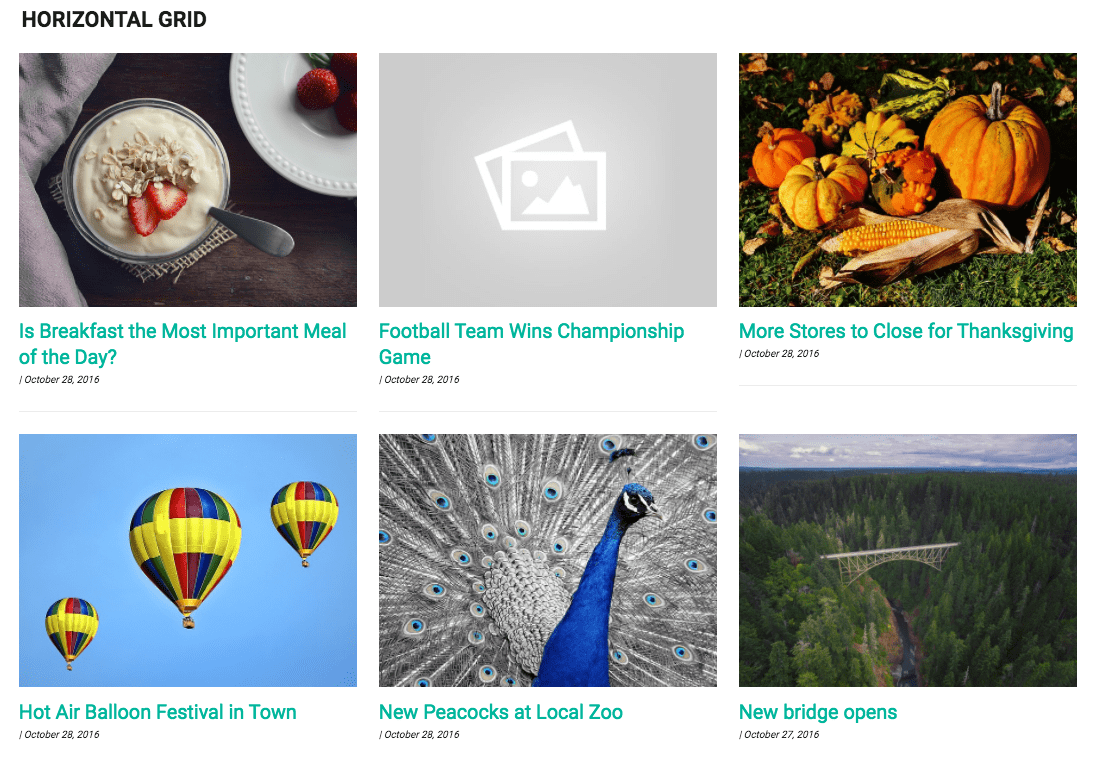
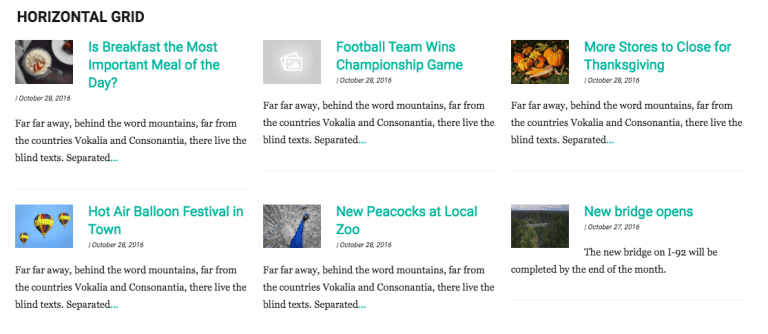
The Horizontal Grid Layout is good for articles with images. It's 3 columns of individual articles, with the thumbnail either above or below your content, or as a thumbnail to the left or right.
This article style is best suited mid-sized to wide widgetized areas, like the slider area or full-width middle column.
You can choose to have article excerpts or no article excerpts, but for when the image is above or below the headline, it tends to look best without an excerpt.
Horizontal Grid w/ Images above Story Headlines

Horizontal Grid w/ Thumbnail & Content Excerpt

Horizontal Grid w/ Thumbnail & No Content Excerpt

